
Ishita Srivastav
Developer
Ishita Srivastav
Developer
Click a button and nothing happens. For half a second, the task disappears and the interface becomes the problem. And you’re left questioning, did the click register, or is something loading? Should I click again or not?
That uncertainty is the problem a microinteraction should solve. Microinteractions are small, single-purpose responses to user actions or changes in system state. They matter because they confirm input, make state changes perceptible, direct attention, and preserve continuity between what a user does and what the interface does next.
Animation can strengthen that feedback, but motion is only useful when it makes the response clearer. Nielsen Norman Group describes microinteractions as trigger-feedback pairs in which a user action or system event produces a narrowly targeted response. Its guidance emphasizes system status, error prevention, and feedback rather than animation for its own sake.
A button compressing under a click can be useful, and a toggle sliding into its new state can make cause and effect easier to see. A loading treatment can reassure someone that an invisible request is still running. But a microinteraction does not become more useful simply because the element rotates, springs, shimmers, scrambles its label, and follows the cursor at the same time.
The animation is the visible layer, while the interaction still has a job underneath it. That distinction is what separates purposeful feedback from decorative movement.
A Microinteraction Is a Feedback Loop, Not Just an Animation
Microinteraction and micro-animation are often treated as synonyms, but they describe different things. A decorative gradient moving indefinitely behind a hero section may be an animation, yet it has no interaction trigger. An error message appearing immediately after validation can be a microinteraction even if nothing moves.
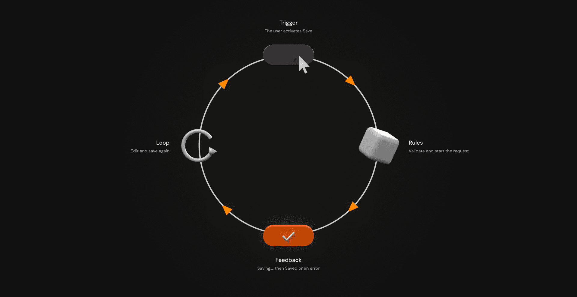
What matters is the relationship between an event, the interface rules around that event, and the feedback the user receives. Dan Saffer's Microinteractions formalized a useful model built around triggers, rules, feedback, and loops or modes, and Nielsen Norman Group also references that framework in its explanation of microinteractions. (Nielsen Norman Group)
Consider an ordinary Save action.
| Part | Save example |
|---|---|
| Trigger | The user activates Save |
| Rules | Validate the data and start the request |
| Feedback | Show pressed or pending state, then saved or error state |
| Loop / mode | Allow another edit and save, or preserve an error state until resolved |
The animation belongs inside that model rather than sitting above it. A slight press response can acknowledge activation, a spinner can communicate pending work, and a check can help completion register. Those visuals are only trustworthy when they represent the actual application state.
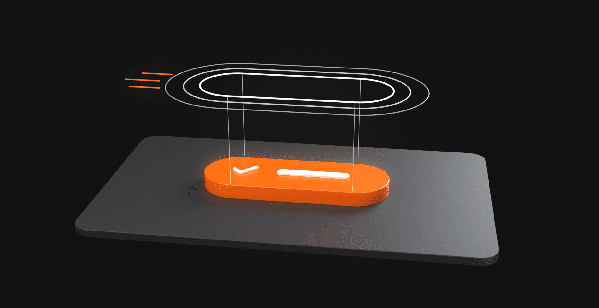
Three ways the same Save button can respond
In the first version, the user clicks Save and the label remains unchanged. The request may be running perfectly, but the interface supplies no evidence. The user has to infer whether the action registered.
In the second version, the button produces a dramatic ripple, bounce, or text scramble and then returns to Save. Something happened visually, but the user still does not know whether the data is saving, whether it succeeded, or whether the motion was simply the button's standard click treatment.
In the third version, the control moves from Save to Saving… and then to Saved, or to a readable error state if the request fails. Now the interaction communicates application state instead of merely acknowledging that a pointer touched the control.
The useful mental model is trigger, rule, state change, and feedback. If animation makes that chain easier to understand, it has a job. If it does not, it has not earned the dependency, attention, or implementation cost.
Why Microinteractions Work: Four Things the Interface Stops Making You Guess
The psychology of microinteractions does not require a speculative story about dopamine every time a heart icon scales slightly. Most useful microinteractions work through simpler interface principles: confirmation, predictability, attention, and continuity.
These mechanisms reduce the amount of interpretation a user has to perform. They help the interface explain what happened, what is happening, and what is likely to happen next.
Confirmation: did the interface receive my input?
Controls need to answer back. A depressed button state, selected toggle, inline validation message, or loading label confirms that an action produced a system response. Without that feedback, the user has to decide whether to wait, repeat the action, or troubleshoot something that may not be broken at all.
This is closely tied to visibility of system status. Nielsen Norman Group includes status communication among the primary roles of microinteractions because the underlying system often performs work that users cannot directly observe. (Nielsen Norman Group)
Predictability: what happens after I act?
Feedback does more than confirm the last action. Repeated interactions teach the user what to expect from the next one. A toggle that responds consistently develops a simple mental model: activate it, see the state change, and know the setting changed.
A form whose validation appears in predictable places becomes easier to recover from. A button that sometimes disables, sometimes launches a spinner, sometimes changes its label without explanation, and sometimes does nothing forces the user to relearn the interaction each time. Good microinteractions reduce that ambiguity by making the system's rules easier to infer.
Attention: what changed?
Movement is perceptually conspicuous. That is both its advantage and its cost. Nielsen Norman Group's animation guidance notes that motion naturally attracts attention, which makes it useful for feedback and state changes but distracting when the movement is unrelated to the user's task.
This is why a new notification can benefit from a short entrance while a permanently oscillating navigation icon becomes visual static. Both move, but only one uses that movement to identify a meaningful change.
Continuity: where did this state come from?
Instantaneous changes sometimes make an interface feel less like a continuous system and more like a collection of unrelated screens. A menu that expands from its trigger can preserve the spatial relationship between the control and the resulting content, while a card moving into a saved collection can communicate where the object went.
Motion can make cause and effect easier to follow, but continuity is not an excuse to animate every layout change. If the relationship is already obvious, instant feedback may be clearer and cheaper.
Why Silence After an Action Feels Wrong
Interfaces conceal most application work from the user. An API call does not look like anything, and neither does writing a record, validating a token, updating React state, or waiting for another service. If the interface does not expose those states deliberately, working software can appear inert.
Imagine a checkout control where the user presses Pay and the request starts immediately, but the button remains visually unchanged for two seconds. The user presses again because there is no evidence that the first activation succeeded. The problem is the interface supplied no usable status.
The fix does not require complex animation. The control might enter a pending state immediately, prevent duplicate submissions, preserve its native semantics, and expose readable status elsewhere in the interface. Motion can reinforce that transition, but text and actual state ownership do the heavy lifting.
Feedback is broader than movement. It can be copy, contrast, iconography, position, sound, state, or a combination of channels. An error message beside a field may outperform a shake animation because it explains what happened instead of merely announcing that something went wrong.
The useful question is what the user needs to know now. Once that is clear, motion becomes an implementation choice rather than the starting assumption.
Motion Makes State Changes Easier to See Because Motion Takes Attention
Suppose a user opens a navigation menu. One version simply swaps the closed interface for an open panel, which may be perfectly sufficient. Another uses a short transition that clearly originates from the menu control, making the relationship between trigger and result easier to follow.
A third version does the same transition while the logo rotates, the menu labels enter with large individual springs, the background blobs accelerate, and the cursor sprouts a particle trail. It may contain the most animation work, yet it contains the least hierarchy.
Motion is an attention budget. Spend it where the interface has something to say. A toggle changing state deserves attention at the moment its value changes, while a validation error deserves attention when the user needs to resolve it.
Unrelated movement competes with those signals. This is one reason high-frequency interactions often benefit from restraint. The first elaborate text scramble may feel authored, but repeated dozens of times during a task, the effect starts competing with the work.
The goal is hierarchy, where animation supports the information architecture instead of becoming the most important thing on the page.
Small Animation Can Change How Waiting Feels, but Context Matters
Waiting states are one area where animation can influence more than simple change detection. A 2026 study published in Displays tested three animation treatments with 705 participants in 10-second mobile waiting scenarios. The researchers found that animation type affected both emotional response and perceived waiting time.
Interactive cartoon animation produced the most favorable perceptions of waiting among the tested conditions, while passive spinner animation produced more neutral emotional responses and more frequent time overestimation. The findings are useful because they are bounded. The researchers frame their guidance around the study's first-exposure, 10-second waiting scope and its cultural context. (ScienceDirect)
The result is not that animations make loading feel faster in every interface. The more defensible conclusion is that the design of waiting feedback can influence how a particular wait is experienced, and different treatments do not produce the same result.
Earlier research on progress indicators illustrates the same risk. In experiments involving online questionnaires, early feedback that made progress appear slower than users expected led to more abandonment and a more negative subjective experience. Encouraging progress feedback could improve the experience, but simply displaying progress did not automatically increase completion. (PubMed Central)
Feedback can therefore help or hurt depending on the promise it makes. An indefinite spinner says work is continuing, while a percentage says the system knows how much work remains. A success check says the operation completed. Those statements are not interchangeable.
If the backend cannot provide meaningful progress, manufacturing a smooth percentage animation may look more informative while actually making the interface less truthful. Likewise, a success animation should follow success rather than predict it.
Delight Is a Bonus. Feedback Is the Job.
There is room for personality in microinteractions, especially on marketing sites, portfolios, and interaction-led experiences where motion contributes to brand perception. A CTA can lean toward the pointer, a product launch can give a primary button a distinctive fill, and character motion can reinforce an expressive visual identity.
The mistake is promoting personality above the task. Frequency, context, and consequence all change what is appropriate. NN/G's animation-duration guidance recommends considering how often users encounter an animation. Frequent interactions generally call for shorter, subtler treatment, while animation that runs too slowly starts to feel like imposed latency. (Nielsen Norman Group)
A campaign CTA and a Delete Account confirmation should not share an interaction philosophy simply because both happen to be buttons. Nor should a frequently used developer-tool control behave like a portfolio centerpiece.
The existence of an effect is not an instruction to use all of it. Good interaction design includes knowing what to remove.
The Production Test: Does the Interaction Still Work Without Motion?
A motion concept becomes real interface work when it has to survive application state, failures, duplicate inputs, keyboard navigation, touch, reduced-motion preferences, and component cleanup. This is where a visually convincing prototype either becomes a robust interaction or falls apart.
Consider a Save button again. The animation should not decide whether saving succeeded. The application should own that state, and the visual treatment should represent it.
A simplified React example might look like this:
"use client"; import { useRef, useState } from "react"; type SaveState = "idle" | "pending" | "success" | "error"; export function SaveButton() { const [state, setState] = useState<SaveState>("idle"); const inFlight = useRef(false); async function handleSave() { if (inFlight.current) return; inFlight.current = true; setState("pending"); try { // Illustrative endpoint only. const response = await fetch("/api/save", { method: "POST", }); if (!response.ok) { throw new Error("Save failed"); } setState("success"); } catch { setState("error"); } finally { inFlight.current = false; } } const label = { idle: "Save", pending: "Saving…", success: "Saved", error: "Try again", }[state]; return ( <> <button type="button" onClick={handleSave} disabled={state === "pending"} className="save-button" > {label} </button> <p aria-live="polite" className="sr-only"> {state === "success" && "Changes saved."} {state === "error" && "Changes could not be saved."} </p> </> );}The /api/save route is illustrative, not a production API contract. A real implementation still needs appropriate request data, validation, server-side error handling, and idempotency where duplicate operations would create risk.
The synchronous inFlight ref prevents two rapidly invoked handlers in the same mounted component from both proceeding before React commits the pending state. That improves the client-side interaction, but backend protections still matter when repeated requests could produce duplicate writes or other irreversible effects.
The component remains intentionally unremarkable. There is no animation library because none is required to establish the interaction correctly. Pending, success, and error are real states, and the control retains native button semantics while status can be announced independently from whatever visual treatment is applied.
Animation can now sit on top of a reliable state model:
.save-button { transition: transform 160ms ease, opacity 160ms ease;} .save-button:active:not(:disabled) { transform: scale(0.98);} @media (prefers-reduced-motion: reduce) { .save-button { transition: none; } .save-button:active:not(:disabled) { transform: none; }}Remove that CSS and the interaction still works. That is a useful production test because the motion enhances feedback without becoming the only representation of state.
For Next.js, browser-dependent animation logic also needs the correct execution boundary. Hooks, pointer tracking, window, observers, layout measurements, canvas, and other browser APIs should not be treated as if they execute identically during server rendering.
A client component establishes where client-side React can run, but browser-dependent setup still needs appropriate lifecycle handling. Any listeners, timelines, observers, or animation frames created by a JavaScript-driven interaction also need cleanup when the component unmounts.
A text hover should not inherit the engineering footprint of a shader scene just because both happen to move. Different interaction classes deserve different implementation choices.
Hover Is Not a Mobile Interaction Model
Desktop prototypes make hover dangerously easy to overvalue. A cursor enters, the control responds, and everyone in the design review nods. Then someone opens the page on a phone and the interaction model changes.
Any information available only through hover is already on shaky ground. Touch users need the action to remain understandable without a persistent hover state, and pointer-following effects need an intentional fallback rather than attempting to recreate mouse behavior badly.
The broader rule is to decorate hover without hiding meaning inside it. The label must remain understandable, press feedback should remain immediate, the tap target must remain usable, and required state should be visible independently of a mouse pointer.
The same interaction may therefore have different expressive layers depending on input method. That is the design responding to the actual device.
Reduced Motion Is Part of the Interaction Design
Reduced motion should be designed alongside the primary interaction rather than added after the motion pass is approved. The CSS prefers-reduced-motion media feature detects when a user has requested an interface that minimizes nonessential movement.
MDN describes the preference in terms of removing, reducing, or replacing motion-based animation rather than eliminating useful feedback. (MDN)
That distinction gives teams better options than a global animation-off switch. A large scale-and-slide confirmation could become a simple opacity change plus readable status text. A magnetic button could stop chasing the pointer while preserving its focus, pressed, loading, and error states.
W3C's WCAG 2.2 Success Criterion 2.3.3 addresses nonessential motion triggered by interaction and requires that such motion be disable-able unless it is essential to the functionality or information being conveyed. It is a Level AAA criterion, and W3C explicitly lists prefers-reduced-motion as one technique for addressing it. (W3C)
That does not turn a reduced-motion media query into an accessibility certificate. Semantic controls still matter, keyboard access still matters, focus indication still matters, and error messages still need to make sense. Motion sensitivity is one part of the interaction rather than the full accessibility surface.
| Standard treatment | Reduced-motion treatment |
|---|---|
| Button compresses slightly | State changes without spatial movement |
| Panel slides into place | Panel appears directly or fades briefly |
| Magnetic pointer response | Magnetic movement removed |
| Characters scramble on hover | Stable label with non-motion emphasis |
| Success icon springs into view | Success icon or text appears immediately |
If the reduced-motion version stops communicating the interaction, the problem is not the preference. The original design was relying on movement to carry information that should have been encoded elsewhere.
CSS, Motion, GSAP, or No Animation?
There is no prize for choosing the largest tool that can move a pixel. The useful decision starts with the interaction and works outward toward the implementation.
Use no animation when the state change is already obvious
A selected tab acquiring a strong visual state may not need motion. Neither does every validation error, checkbox, or destructive confirmation. If animation adds no information, removing it is a legitimate design improvement.
This option is easy to overlook because motion work is visible while restraint is not. Production quality sometimes looks like choosing not to animate something.
Use CSS for simple state transitions
Opacity, color, transforms, and compact hover or press feedback often need no animation runtime. For a simple button response, CSS can keep the relationship between state and presentation easy to inspect while avoiding lifecycle work that the interaction does not need.
That means a small state transition often does not justify a larger abstraction when the platform primitives already express it clearly.
Use Motion when component-level orchestration earns it
When several React-driven visual states need coordinated transitions, layout animation, gestures, or spring behavior, Motion can provide useful primitives. The dependency still needs a reason to exist, and the behavior should remain tied to actual component state.
The library should solve a coordination problem rather than become the starting point for every interaction. That keeps tooling proportional to the job.
Use GSAP when the interaction genuinely needs timeline-level control
More orchestrated sequences, complex timing relationships, or interaction systems with detailed imperative control may justify GSAP. That does not make it the default for a hover fade any more than a WebGL scene is the default for moving a card twelve pixels.
The useful decision framework is what triggered the change, what the user needs to understand, whether motion is the clearest signal, how frequently the interaction occurs, what happens on keyboard and touch, what reduced motion looks like, what application state drives the response, what runtime work the effect introduces, and whether that cost is justified.
What Performance Actually Means for a Small Interaction
A short transform applied to one active element is not in the same cost class as continuous pointer tracking across dozens of nodes. A CSS opacity transition is also not equivalent to repeated DOM measurement or a requestAnimationFrame loop that runs for the lifetime of the page.
For microinteractions, useful performance questions include whether the effect forces repeated layout measurement, whether pointer movement triggers unnecessary React renders, whether event listeners are attached only where needed, and whether timelines, observers, and animation frames are cleaned up.
It is also worth checking whether an animation runtime is being loaded for an effect CSS could handle, whether the effect continues working when it is offscreen, whether several high-frequency interactions compete on the same page, and what happens on a real phone rather than a desktop development machine.
That is the useful meaning of performant in this context. The point is an interaction whose runtime cost is understood and proportionate to its job.
A Practical Microinteraction Audit
Before shipping a microinteraction, audit the whole interaction rather than the isolated animation. The goal is to verify that motion supports a reliable control instead of compensating for missing state, semantics, or feedback.
| Check | Ask |
|---|---|
| Trigger | Is the cause of the response obvious? |
| Trigger | Is the cause of the response obvious? |
| State | Does application state, rather than animation timing, own the result? |
| Feedback | Can the user distinguish pending, success, and failure where relevant? |
| Frequency | Will the motion still feel appropriate on the fiftieth use? |
| Semantics | Is an action still a button and navigation still a link? |
| Keyboard | Can the interaction be operated and understood without a pointer? |
| Touch | Does it work without hover or magnetic behavior? |
| Reduced motion | Is there a meaningful calmer path? |
| Performance | Is the runtime work proportional to the interaction? |
| Failure | What happens when the operation does not succeed? |
| Removal test | If motion disappears, does the task still work? |
The final question catches a great deal because it exposes whether motion is reinforcing the interaction or carrying information the underlying control failed to represent. A resilient microinteraction should remain understandable even when its expressive layer is reduced.
Make Feedback Reliable and Let Motion Earn Its Place
Microinteractions matter because interfaces need to answer back. A button press confirms input, a pending state exposes invisible work, a toggle makes state change legible, and a short transition can preserve continuity between one interface state and another.
Used carefully, motion makes those responses easier to notice and understand. Used indiscriminately, it spends attention without returning useful information. The right starting point is therefore the state rather than the easing curve.
Identify the trigger, decide what the user needs to know, and make success, failure, focus, touch, and reduced-motion behavior real. Then choose the smallest visual response that makes the change clearer.
Sometimes that response will be CSS, while a more composed interaction may justify Motion or GSAP. In other cases, the strongest decision will be an immediate state change with no animation at all.