Loading
Scroll Stack
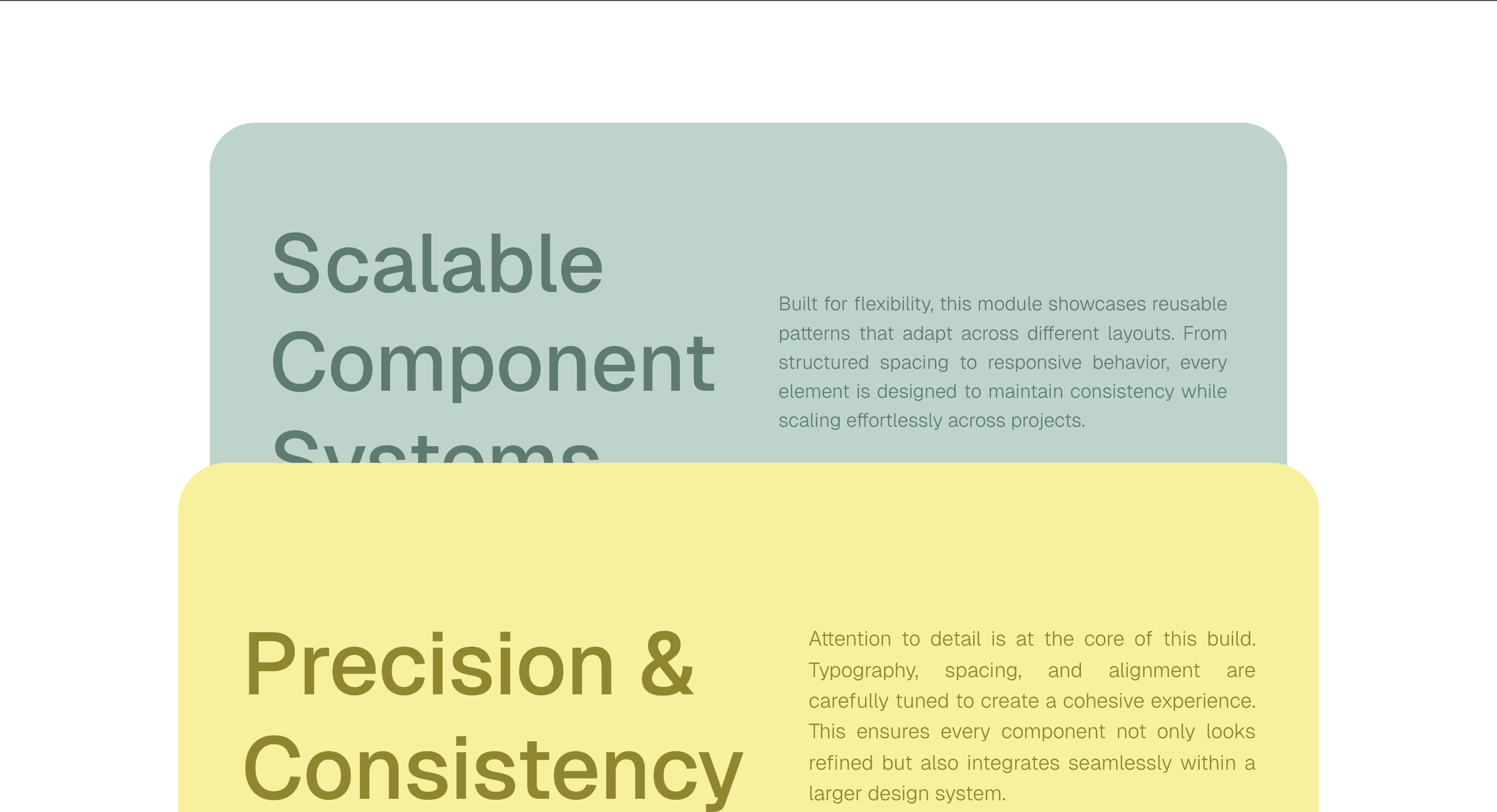
A pinned scroll animation that turns product tours, feature walkthroughs, and chaptered sections into a paced stacked sequence.
Published On: February 10, 2026
Last Updated: August 17, 2026
GSAP
Overview
Scroll Stack is the product tour format. Pin each feature long enough for the claim, the proof, and the next step to land - then hand off.
Use Scroll Stack when a product sequence needs to feel like chapters, not cards stacked on a page. SaaS feature teams and product marketers get the most value here because each section can hold attention long enough for the claim, proof, and next step to register. The page job is paced explanation: every handoff should make the feature story easier to follow.
The production risk is whether the pinned sequence survives a coarse pointer, a mid-page viewport resize, and reduced motion without breaking the chapter structure. If pinning fails, the same content must still read as a clean vertical sequence.
Install Command
This is a Pro Effect.
You can preview it now. Upgrade to Pro for instant install access.
Usage Code
This is a Pro Effect.
You can preview it now. Upgrade to Pro for instant install access.
Component Code
This is a Pro Effect.
You can preview it now. Upgrade to Pro for instant install access.
This is a Pro Effect.
You can preview it now. Upgrade to Pro for instant install access.
Example Production Use Case
A SaaS feature team building a platform walkthrough: Scroll Stack keeps each feature in view long enough to be read, then hands off cleanly to the next stage. The outcome is clarity: the visitor knows where the product story is going without fighting the scrollbar.
Best Used For
- SaaS feature tours where each chapter needs enough time for claim, proof, and next step.
- SaaS feature tours and platform walkthroughs that need each chapter held long enough to read.
- Converts passive feature scanning into an ordered product argument - each panel is the next step in a buying decision.
Not For
Not for short landing pages, comparison tables, forms, or docs where people need to scan and act quickly.
Not for routes where users frequently land mid-page from search - pinned chapters assume a top-to-bottom read order.
Performance Budget
Animate transform and opacity, avoid layout reads in scroll handlers, pre-size media, and clean up timelines/listeners when the route changes.
Accessibility and Mobile
The animated sequence must match DOM order. On mobile, replace pinned or horizontal mechanics with stacked sections, native swipe, or static cards.
Common Mistakes
- Using more than 6 panels without giving each a distinct claim - stacked chapters without distinct arguments feel like a carousel.
- Keeping desktop pinning or horizontal movement on touch devices without a clean fallback.
- Leaving pinned sections active in URL history, causing unexpected back-button behavior.
Changelog
v1.1.0
Jul 21, 2026Added prefers-reduced-motion support: cards no longer scale down while stacking (stays at scale 1), remaining crossfade keeps a linear (none) ease
v1.0.0
Feb 10, 2026Initial release
Props
| Prop | Type | Default | Description |
|---|---|---|---|
sectionBgColor | color | #ffffff | Background color of the section. |
cardRadius | number | 45 | Corner rounding on each card, in px (desktop only - tablet/mobile keep their own responsive radius). |
Frequently Asked Questions
Can Scroll Stack work without GSAP ScrollTrigger?
The defining mechanic is pinning each chapter and advancing it as you scroll, so any pin-and-scrub approach can drive it - the engine matters less than holding each panel in view long enough to read. If scroll-linking isn't available, the same sections must still render as a clean vertical stack in DOM order. Confirm which scroll engine the shipped component uses before substituting your own.
How do I keep Scroll Stack from breaking same-page anchor navigation?
Pinned sections change the scroll distance between anchors, so a jump to an in-page target can land mid-pin. Resolve anchor targets against the pinned layout, or release the pin before a programmatic scroll, and re-test every in-page link once the timeline is built. With reduced motion or pinning disabled, anchors behave normally because the content is a plain vertical sequence.
What is the minimum panel count that makes Scroll Stack worth using?
Below three or four chapters the pin-and-hold rhythm costs more attention than it returns, and a normal section reveal reads faster. Use it when you have at least three feature chapters that each carry a distinct claim, proof, and next step. Past six panels, split into two sequences rather than stretching one.
How should Scroll Stack behave on iOS Safari?
iOS Safari's dynamic toolbar changes viewport height mid-scroll, which can jump a pinned chapter, so size pins to a stable viewport unit and re-measure on resize. Where pinning feels unstable on touch, fall back to stacked sections or native swipe so the chapters still read in order. Validate on a real device rather than a desktop emulator.
When is Scroll Stack better than a feature comparison table?
Use Scroll Stack when the story is sequential and each feature builds toward a buying decision. Use a comparison table when visitors are weighing parallel options and need to scan side by side. If users frequently arrive mid-page from search, the table is safer, because Scroll Stack assumes a top-to-bottom read.
Can I adapt Scroll Stack to my brand and ship it with confidence?
Yes. The public effect proves the pattern; brand-adaptation work fits the motion to your design system with motion rules, a performance budget, fallback design, source handoff, and implementation notes. The resulting component lives in your codebase, so you own it.
Request a Custom Scroll Animation
Need a custom effect? Tell us what to create.


