Loading
Sticky Content Wrapper
A sticky scroll layout that keeps one core claim fixed while supporting proof, visuals, or steps move beside it.
Published On: June 4, 2026
Last Updated: August 17, 2026
GSAPLenis
Overview
Sticky Content Wrapper keeps the argument still while the evidence moves. It is built for product pages that need focus, not fireworks.
Use Sticky Content Wrapper when one idea should stay anchored while proof changes beside it. SaaS feature storytelling and product tours are the natural fit because the visitor can keep the main claim in view while supporting cards, visuals, or steps move around it. The page job is clarity: one idea stays stable while the evidence changes.
The risk in production is reading order. The sticky column must not trap attention, overlap content, or disappear before the supporting material has finished on smaller screens.
Install Command
npx hyperiux add sticky-content-wrapperUsage Code
page.jsx
import StickyContentWrapper from "@/components/effects/sticky-content-wrapper";
import { ReactLenis } from"lenis/react";

export default function Page() {
 return (
     <ReactLenis root>
 <StickyContentWrapper />
     </ReactLenis>
 );
}
Component Code
index.jsx
// Built using Hyperiux Vault: https://vault.hyperiux.com
import { StickyContentComp } from "./StickyContentComp";
const stickyItems = [
    {
        heading: "Designed for Modern Living",
        paragraph: "Thoughtfully crafted residences that seamlessly blend architecture, comfort, and lifestyle-creating spaces where design enhances everyday living.",
        list: [
            "• Open layouts with natural light",
            "• Premium materials and finishes",
            "• Smart and sustainable design",
        ],
        link: { href: "#", text: "Explore Residences" },
        image: "https://pub-8abee449136941f5b0a1cd2c014534e9.r2.dev/vault-listing-images/assets-images/v-01.jpg",
    },
    {
        heading: "Locations That Matter",
        paragraph: "Strategically located developments offering seamless connectivity to business hubs, education centers, and lifestyle destinations.",
        list: [
            "• Close to key urban corridors",
            "• Excellent transport connectivity",
            "• Surrounded by lifestyle hubs",
        ],
        link: { href: "#", text: "View Locations" },
        image: "https://pub-8abee449136941f5b0a1cd2c014534e9.r2.dev/vault-listing-images/assets-images/v-02.jpg",
    },
    {
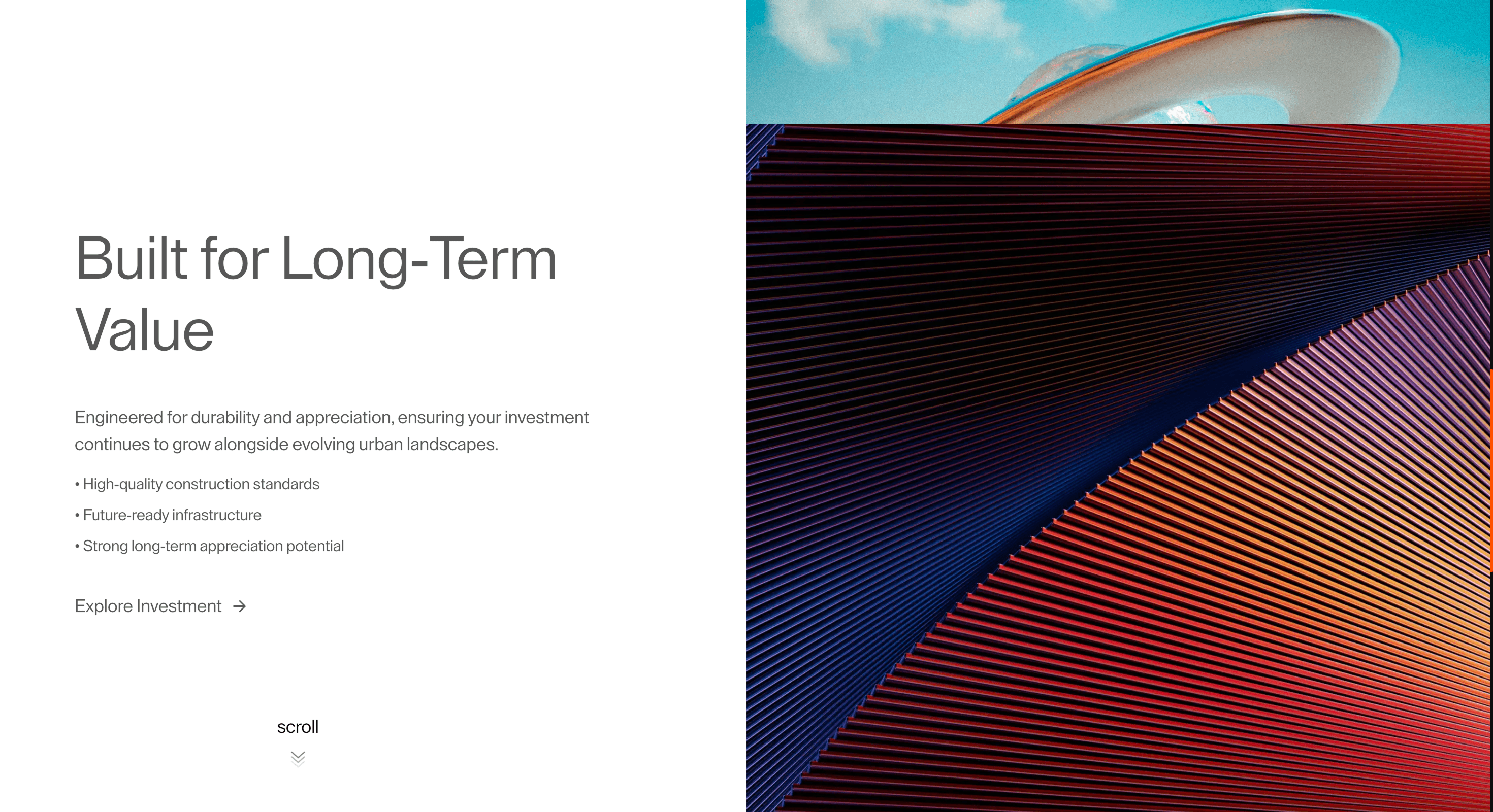
        heading: "Built for Long-Term Value",
        paragraph: "Engineered for durability and appreciation, ensuring your investment continues to grow alongside evolving urban landscapes.",
        list: [
            "• High-quality construction standards",
            "• Future-ready infrastructure",
            "• Strong long-term appreciation potential",
        ],
        link: { href: "#", text: "Explore Investment" },
        image: "https://pub-8abee449136941f5b0a1cd2c014534e9.r2.dev/vault-listing-images/assets-images/v-03.jpg",
    },
    {
        heading: "Crafted for Elevated Experiences",
        paragraph: "From curated amenities to refined interiors, every detail is designed to deliver a seamless and elevated lifestyle experience.",
        list: [
            "• World-class lifestyle amenities",
            "• Thoughtfully designed interiors",
            "• Community-driven living spaces",
        ],
        link: { href: "#", text: "View Amenities" },
        image: "https://pub-8abee449136941f5b0a1cd2c014534e9.r2.dev/vault-listing-images/assets-images/v-04.jpg",
    },
];
export default function StickyContentWrapper({ bgColor = "#ffffff", contentEnterYPercent = 2, contentTransitionDuration = 0.9, initialImageScale = 1.5, activeImageScale = 1.2, exitImageScale = 1, }) {
    return (<section>
 <StickyContentComp items={stickyItems} leftClassName="text-black" bgColor={bgColor} contentEnterYPercent={contentEnterYPercent} contentExitYPercent={-2} contentTransitionDuration={contentTransitionDuration} contentDelay={0.35} initialImageScale={initialImageScale} activeImageScale={activeImageScale} exitImageScale={exitImageScale}/>
 </section>);
}
StickyContentComp.jsx
"use client";
import React, { useLayoutEffect, useRef } from "react";
import gsap from "gsap";
import ScrollTrigger from "gsap/dist/ScrollTrigger";
import { useLenis } from "lenis/react";
gsap.registerPlugin(ScrollTrigger);
// True when the user has asked the OS to minimise animation. Safe to call
// during render - returns false on the server.
function prefersReducedMotion() {
    if (typeof window === "undefined")
        return false;
    return window.matchMedia?.("(prefers-reduced-motion: reduce)")?.matches ?? false;
}
const getParagraphs = (item) => {
    if (Array.isArray(item.paragraphs))
        return item.paragraphs;
    if (Array.isArray(item.paragraph))
        return item.paragraph;
    return item.paragraph ? [item.paragraph] : [];
};
const getListItems = (item) => {
    if (Array.isArray(item.list))
        return item.list;
    if (Array.isArray(item.listItems))
        return item.listItems;
    return [];
};
const getLink = (item) => {
    if (item.link)
        return item.link;
    if (item.href) {
        return {
            href: item.href,
            text: item.linkText || item.cta || "Learn more",
        };
    }
    return null;
};
const renderStickyContent = (item) => {
    const paragraphs = getParagraphs(item);
    const listItems = getListItems(item);
    const link = getLink(item);
    return (<div className="flex h-full w-full flex-col text-black">
      {item.heading && <h3 className="font-medium">{item.heading}</h3>}

      {paragraphs.map((paragraph, paragraphIndex) => (<p key={`paragraph-${paragraphIndex}`}>{paragraph}</p>))}

      {listItems.length > 0 && (<ul className="flex flex-col ">
          {listItems.map((listItem, listIndex) => (<li key={`list-${listIndex}`}>{listItem}</li>))}
        </ul>)}

      {link?.href && (<a href={link.href} onClick={(e) => {
                e.preventDefault();
            }} className={`group mt-[1vw] inline-flex w-fit items-center gap-2 text-[1.2vw] leading-[1.2] no-underline ${link.className || ""}`} target={link.target} rel={link.rel || (link.target === "_blank" ? "noreferrer" : undefined)}>
          <span className="relative inline-block w-fit after:absolute after:bottom-[-2%] after:left-0 after:h-[1.5px] after:w-full after:origin-right after:scale-x-0 after:bg-current after:transition-transform after:duration-500 after:ease-[cubic-bezier(0.62,0.05,0.01,0.99)] after:content-[''] group-hover:after:origin-left group-hover:after:scale-x-100 group-focus-visible:after:origin-left group-focus-visible:after:scale-x-100">
            {link.text || link.label || "Learn more"}
          </span>
          <svg className="h-[1em] w-[1em] flex-none transition-transform duration-300 group-hover:-rotate-45 group-focus-visible:-rotate-45" viewBox="0 0 24 24" fill="none" aria-hidden="true">
            <path d="M5 12h14M13 5l7 7-7 7" stroke="currentColor" strokeWidth="2" strokeLinecap="round" strokeLinejoin="round"/>
          </svg>
        </a>)}
    </div>);
};
export function StickyContentComp({ items = [], className = "", leftClassName = "", rightClassName = "", contentClassName = "", imageClassName = "", containerHeight, bgColor = "#ffffff", contentEnterYPercent = 12, contentExitYPercent = -12, contentTransitionDuration = 0.8, contentDelay = 0.28, stepGap = 2, enableImageScaleFlow = true, initialImageScale = 1.5, activeImageScale = 1.2, exitImageScale = 1, }) {
    // State & refs
    const sectionRef = useRef(null);
    const stickyRef = useRef(null);
    const contentRefsRef = useRef([]);
    const imageRefsRef = useRef([]);
    const lenis = useLenis();
    // Effects
    useLayoutEffect(() => {
        if (!sectionRef.current || !stickyRef.current || !items.length) {
            return;
        }
        const reducedMotion = prefersReducedMotion();
        const context = gsap.context(() => {
            // Initial element state
            const contents = contentRefsRef.current;
            const images = imageRefsRef.current;
            contents.forEach((content, index) => {
                gsap.set(content, {
                    autoAlpha: index === 0 ? 1 : 0,
                    yPercent: index === 0 ? 0 : contentEnterYPercent,
                    zIndex: items.length - index,
                });
            });
            // Reduced motion: images crossfade in place - no clip-path wipe or
            // scale, so only the active image is visible at a time via autoAlpha.
            images.forEach((image, index) => {
                gsap.set(image, {
                    autoAlpha: reducedMotion ? (index === 0 ? 1 : 0) : 1,
                    zIndex: items.length - index,
                    clipPath: "inset(0% 0% 0% 0%)",
                    scale: reducedMotion
                        ? 1
                        : enableImageScaleFlow
                            ? index === 0
                                ? activeImageScale
                                : initialImageScale
                            : 1,
                    transformOrigin: "center center",
                });
            });
            // Scroll timeline
            const totalTimelineDuration = Math.max(1, (items.length - 1) * stepGap);
            const snapValues = items.length > 1
                ? Array.from({ length: items.length }, (_, index) => index / (items.length - 1))
                : [0];
            const timeline = gsap.timeline({
                scrollTrigger: {
                    trigger: sectionRef.current,
                    start: "top top",
                    end: "bottom bottom",
                    scrub: 1,
                    snap: (items.length > 1
                        ? {
                            snapTo: snapValues,
                            duration: { min: 0.2, max: 0.5 },
                            ease: "power2.inOut",
                            delay: 0,
                            inertia: false,
                            onStart: () => {
                                lenis?.stop();
                            },
                            onComplete: () => {
                                lenis?.start();
                            },
                        }
                        : false),
                },
            });
            items.forEach((_, index) => {
                if (index === items.length - 1) {
                    return;
                }
                const currentContent = contents[index];
                const nextContent = contents[index + 1];
                const currentImage = images[index];
                const nextImage = images[index + 1];
                const stepStart = index * stepGap;
                const nextContentStart = stepStart + contentTransitionDuration + contentDelay;
                timeline
                    .to(currentContent, {
                    autoAlpha: 0,
                    yPercent: contentExitYPercent,
                    duration: contentTransitionDuration,
                    ease: "power2.inOut",
                }, stepStart)
                    .fromTo(nextContent, {
                    autoAlpha: 0,
                    yPercent: contentEnterYPercent,
                }, {
                    autoAlpha: 1,
                    yPercent: 0,
                    duration: contentTransitionDuration,
                    ease: "power2.inOut",
                }, nextContentStart)
                    .to(currentImage, reducedMotion
                    ? { autoAlpha: 0, duration: stepGap, ease: "none" }
                    : {
                        clipPath: "inset(0% 0% 100% 0%)",
                        scale: enableImageScaleFlow ? exitImageScale : 1,
                        duration: stepGap,
                        ease: "none",
                    }, stepStart);
                if (reducedMotion) {
                    timeline.to(nextImage, { autoAlpha: 1, duration: stepGap, ease: "none" }, stepStart);
                }
                else if (enableImageScaleFlow) {
                    timeline.to(nextImage, {
                        scale: activeImageScale,
                        duration: stepGap,
                        ease: "none",
                    }, stepStart);
                }
            });
            timeline.duration(totalTimelineDuration);
            ScrollTrigger.refresh();
        }, sectionRef);
        // Cleanup
        return () => context.revert();
    }, [
        items,
        lenis,
        contentEnterYPercent,
        contentExitYPercent,
        contentTransitionDuration,
        contentDelay,
        stepGap,
        enableImageScaleFlow,
        initialImageScale,
        activeImageScale,
        exitImageScale,
    ]);
    if (!items.length) {
        return null;
    }
    return (<section ref={sectionRef} className={`flex w-screen justify-between relative ${className}`} style={{
            height: containerHeight || `${items.length * 100}vh`,
            backgroundColor: bgColor,
        }}>
       <div className="fixed bottom-10 left-[20%] z-30 -translate-x-1/2  flex flex-col gap-[0.5vw] justify-center text-black items-center ">
       <p className="text-lg text-black">
        scroll
       </p>

                    <svg width="20" height="28" className="size-[1.5vw]" viewBox="0 0 20 28" fill="none" xmlns="http://www.w3.org/2000/svg">
                        <style>{`
                  .chev1 { animation: fadeDown 1.4s ease-in-out infinite; }
                  .chev2 { animation: fadeDown 1.4s ease-in-out 0.22s infinite; }
                  .chev3 { animation: fadeDown 1.4s ease-in-out 0.44s infinite; }
                  @keyframes fadeDown {
                    0%   { opacity: 0.08; transform: translateY(-3px); }
                    50%  { opacity: 0.55; transform: translateY(2px); }
                    100% { opacity: 0.08; transform: translateY(-3px); }
                  }
                `}</style>
                        <polyline className="chev1 stroke-current" points="2,2 10,9 18,2" stroke="black" strokeWidth="1.4" fill="none" strokeLinecap="round" strokeLinejoin="round"/>
                        <polyline className="chev2 stroke-current" points="2,10 10,17 18,10" stroke="black" strokeWidth="1.4" fill="none" strokeLinecap="round" strokeLinejoin="round"/>
                        <polyline className="chev3 stroke-current" points="2,18 10,25 18,18" stroke="black" strokeWidth="1.4" fill="none" strokeLinecap="round" strokeLinejoin="round"/>
                    </svg>
                </div>
      <div ref={stickyRef} className="sticky top-0 flex h-screen w-full justify-between max-[1025px]:h-screen max-[1025px]:flex-col-reverse max-[1025px]:justify-start max-[1025px]:px-[5vw] max-md:px-[6vw]">
        <div className={`relative h-full w-[42%] max-[1025px]:h-[55%] max-[1025px]:w-full ${leftClassName}`} style={{ backgroundColor: bgColor }}>
          {items.map((item, index) => (<div key={`content-${index}`} ref={(element) => {
                contentRefsRef.current[index] = element;
            }} className={`absolute inset-0 h-full w-full pl-[5vw] pt-[35%] opacity-0 [&_a]:mb-[1vw] [&_a]:text-[1.2vw] [&_h3]:mb-[2.5vw] [&_h3]:text-[4vw] [&_li]:mb-[0.5vw] [&_li]:text-[1.05vw] [&_p]:mb-[1vw] [&_p]:text-[1.2vw] [&_ul]:mb-[1vw] max-[1025px]:pl-0 max-[1025px]:pt-[7%] max-[1025px]:[&_a]:mb-[3vw] max-[1025px]:[&_a]:text-[2.8vw] max-[1025px]:[&_h3]:mb-[4vw] max-[1025px]:[&_h3]:text-[5.5vw] max-[1025px]:[&_li]:mb-[1vw] max-[1025px]:[&_li]:text-[2.5vw] max-[1025px]:[&_p]:mb-[3vw] max-[1025px]:[&_p]:text-[2.8vw] max-[1025px]:[&_ul]:mb-[4vw] max-md:pt-[10%] max-md:[&_a]:text-[4.5vw] max-md:[&_h3]:text-[7.5vw] max-md:[&_li]:text-[4vw] max-md:[&_p]:text-[4.5vw] ${contentClassName}`}>
              {renderStickyContent(item)}
            </div>))}
        </div>

        <div className={`relative h-full w-1/2 overflow-hidden max-[1025px]:mt-[7vh] max-[1025px]:h-[37%] max-[1025px]:w-full max-[1025px]:rounded-[3.5vw] ${rightClassName}`}>
          {items.map((item, index) => (<div key={`image-${index}`} ref={(element) => {
                imageRefsRef.current[index] = element;
            }} className={`absolute inset-0 h-full w-full opacity-0 ${imageClassName}`}>
              <img src={item.image} alt={item.alt || item.imageAlt || `sticky-image-${index + 1}`} className="h-full w-full object-cover" width={item.width || 1080} height={item.height || 1080}/>
            </div>))}
        </div>
      </div>
    </section>);
}
Example Production Use Case
A SaaS team building a product tour: Sticky Content Wrapper keeps the core capability fixed while proof, screenshots, and use cases change beside it. The outcome is clarity: the visitor can connect each supporting detail back to the same product promise.
Best Used For
- Product stories where one central claim should stay anchored while proof changes beside it.
- Product pages where one claim stays anchored while proof scrolls past it.
- Keeps the core claim visible while proof changes around it, so product tours feel focused instead of scattered.
Not For
Not for sections where every item has equal weight or users need to jump straight to a specific answer.
Not for mobile layouts unless the pinned idea becomes a clean vertical sequence.
Performance Budget
Animate transform and opacity, avoid layout reads in scroll handlers, pre-size media, and clean up timelines/listeners when the route changes.
Accessibility and Mobile
The animated sequence must match DOM order. On mobile, replace pinned or horizontal mechanics with stacked sections, native swipe, or static cards.
Common Mistakes
- Making the sticky claim too long to read while evidence moves.
- Letting the sticky column overlap its proof on short viewports.
- Pairing unrelated evidence with the anchored message.
Changelog
v1.0.1
Jul 30, 2026Added reduced-motion support.
v1.0.0
Jul 21, 2026Initial release
Props
| Prop | Type | Default | Description |
|---|---|---|---|
bgColor | color | #ffffff | Background color of the sticky section, including the gap between the content and image panes. |
contentEnterYPercent | number | 2 | Vertical offset (% of content height) each content block starts from before sliding into place. |
contentTransitionDuration | number | 0.9 | Duration of each content block's enter/exit transition on the scroll timeline. |
initialImageScale | number | 1.5 | Scale of an image before it becomes the active image. |
activeImageScale | number | 1.2 | Scale of the image while it is active on screen. |
exitImageScale | number | 1 | Scale of an image after it has exited. |
Frequently Asked Questions
What makes Sticky Content Wrapper different from a standard scroll reveal?
A reveal animates an element in once; this holds one column still while supporting evidence scrolls past it, keeping a claim anchored across several beats of proof. The value is sustained focus, not a single entrance. Use it when an argument needs to stay on screen while examples change beside it.
How should Sticky Content Wrapper simplify on mobile devices?
Two-column sticky layouts rarely fit a phone, so stack the anchored content above or between its evidence and let the page scroll normally. Don't pin on short viewports where the sticky element would cover the content it explains. Reduced-motion users get the same stacked, readable order.
What should developers test before shipping Sticky Content Wrapper?
Check the sticky element releases cleanly at the end of its range, doesn't overlap the footer, and re-measures on viewport resize and dynamic mobile toolbars. Verify it never traps focus or hides the content it describes. Confirm the stacked fallback presents the same material in order.
Which content structure works best with Sticky Content Wrapper?
One stable thesis paired with a sequence of supporting items; a feature explained while screenshots advance, or a claim backed by rotating proof. It needs enough scrolling evidence to justify pinning; a single short pairing doesn't. Keep the sticky side concise so it reads while the rest moves.
When should I avoid Sticky Content Wrapper even if the preview looks good?
Avoid it when both columns are long, when the page is short, or when the sticky element would obscure key content on smaller screens. If the relationship between the anchored claim and the moving evidence isn't obvious, the pin just feels like the page is stuck. Skip it on utility routes where scanning beats focus.
Can I adapt Sticky Content Wrapper to my product page and brand?
Yes, adaptation work tunes the pin range, the pairing logic, and the responsive fallback to your layout, with motion rules, a performance budget, fallback design, source handoff, and implementation notes. You keep the component in your own codebase.
Request a Custom Scroll Effect
Need a custom effect? Tell us what to create.


