Loading
Scroll Distortion
An experimental scroll effect that bends or warps selected visuals as users move between sections.
Published On: June 11, 2026
Last Updated: August 17, 2026
GSAPLenisThree.js
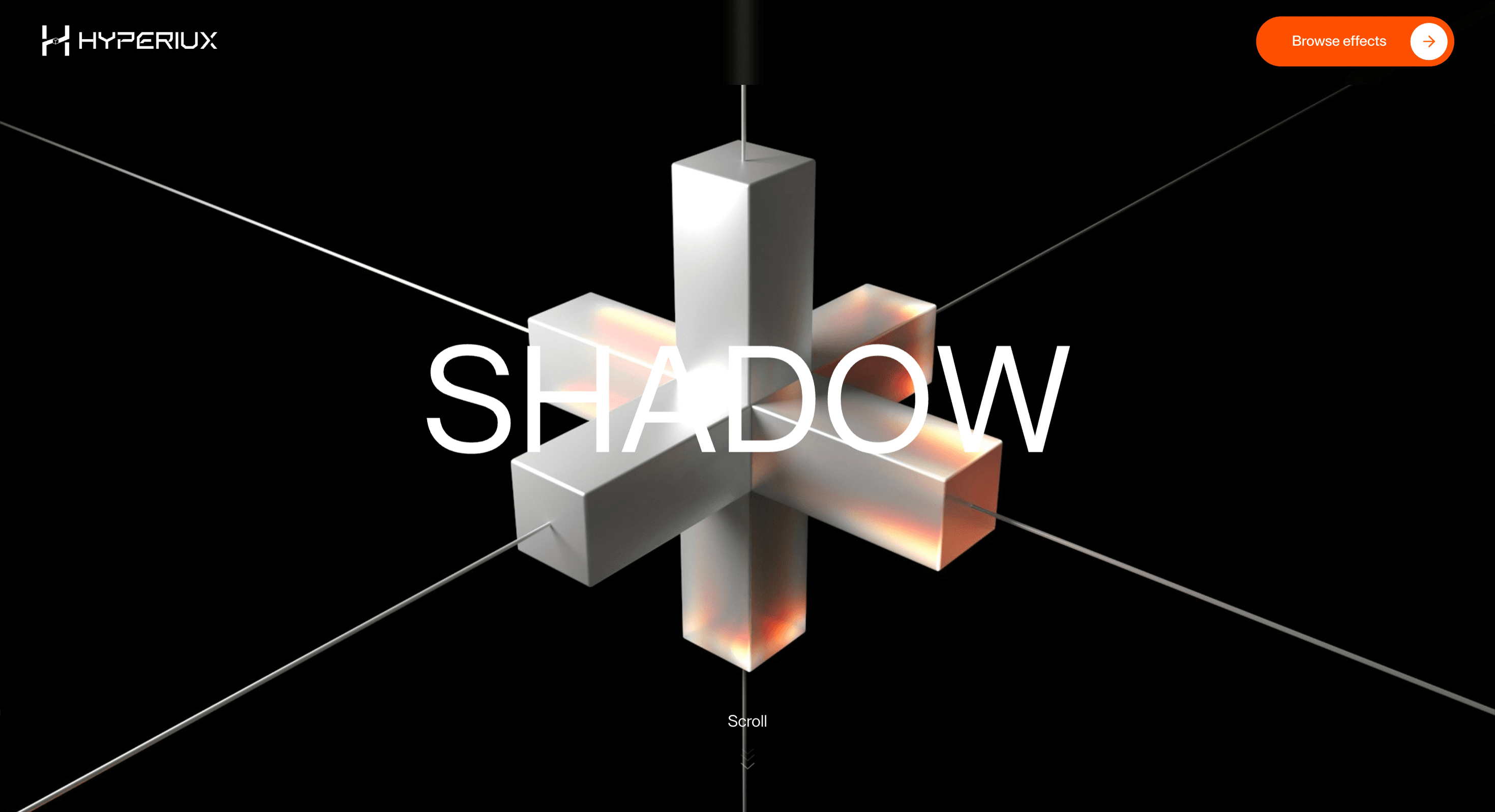
Overview
Scroll Distortion bends the surface between sections. Use it where the transition is the message.
Use Scroll Distortion when the brand can tolerate a page surface that bends under pressure. Creative studios, AI launches, and experimental brand pages are the right audience because the effect is expressive before it is explanatory. The page job is tension: scroll should make the surface feel reactive without making the message harder to read.
The production risk is distortion strength. If the warp affects text, CTAs, or layout edges too aggressively, the effect stops feeling premium and starts feeling broken.
Install Command
This is a Pro Effect.
You can preview it now. Upgrade to Pro for instant install access.
Usage Code
This is a Pro Effect.
You can preview it now. Upgrade to Pro for instant install access.
Component Code
This is a Pro Effect.
You can preview it now. Upgrade to Pro for instant install access.
This is a Pro Effect.
You can preview it now. Upgrade to Pro for instant install access.
Example Production Use Case
A creative studio launching an experimental microsite: Scroll Distortion bends selected visuals as the visitor moves, turning scroll pressure into part of the brand language. The outcome is tension: the page feels alive without sacrificing the headline or CTA.
Best Used For
- Experimental brand pages where distortion is the transition language, not a readability tax.
- Experimental brand pages where the transition between sections is the hook.
- Gives experimental brand pages a memorable transition surface without pretending the distortion belongs on every route.
Not For
Not for reading-heavy sections, product comparison, pricing, or any content where distortion would fight legibility.
Not for pages with body copy visible during the distortion zone - legibility during motion is a WCAG concern.
Performance Budget
Animate transform and opacity, avoid layout reads in scroll handlers, pre-size media, and clean up timelines/listeners when the route changes.
Accessibility & Mobile
The animated sequence must match DOM order. On mobile, replace pinned or horizontal mechanics with stacked sections, native swipe, or static cards.
Common Mistakes
- Warping text, forms, or CTA zones instead of transition surfaces.
- Letting sticky headers enter the distorted layer.
- Using strong surface bending for visitors who prefer reduced motion.
Changelog
v1.0.1
Jul 21, 2026Added reduced-motion transitions.
v1.0.0
Jul 20, 2026Initial release
Props
| Prop | Type | Default | Description |
|---|---|---|---|
distortionStrength | number | 0.8 | Strength of the displacement distortion during transitions. |
rgbShift | number | 0.05 | Amount of RGB channel separation during the distortion. |
distortionScale | number | 0.15 | Scale of the fold and stretch distortion while transitioning. |
transitionDuration | number | 1.25 | Duration of each image distortion transition. |
Frequently Asked Questions
What distortion amplitude is safe with nearby body text?
Keep amplitude low enough that text never visibly warps while it's being read — distortion belongs on the transition between sections, not under a paragraph. If copy sits inside the affected region, reduce the effect or exclude the text from the distorted layer. When in doubt, dial it back; the cue should be felt more than seen.
How does Scroll Distortion interact with sticky headers?
A distorted surface can drag a sticky header into the warp or cause it to jitter at boundaries, so keep the header on its own compositing layer outside the distorted region. Test the handoff at the top and bottom of the effect where sticky elements pin and release. The header must stay legible and stable throughout.
Is Scroll Distortion safe for vestibular-sensitive users?
Surface-bending motion is exactly the kind of effect that can trigger discomfort, so it must honor reduced-motion preferences and present a flat, undistorted fallback. Never make the distortion the only way to access content. Treat the static path as the default and the distortion as an enhancement for users who haven't opted out.
What fallback should Scroll Distortion use for reduced motion?
Replace the warp with a plain transition between sections — a simple fade or an instant cut — keeping all content readable and in order. The sections themselves don't change; only the connective motion is removed. This is a presentation layer, so removing it should never remove meaning.
Does Scroll Distortion affect screen reader output?
No, provided the distortion is a visual layer over real HTML — screen readers traverse the DOM, not the rendered warp. Keep all copy and headings in the document and ensure focus order is unaffected by the effect. If any content exists only inside the distorted render, move it into the DOM.
Request a Custom Scroll Effect
Need a custom effect? Tell us what to create.


