Loading
Parallax Gallery
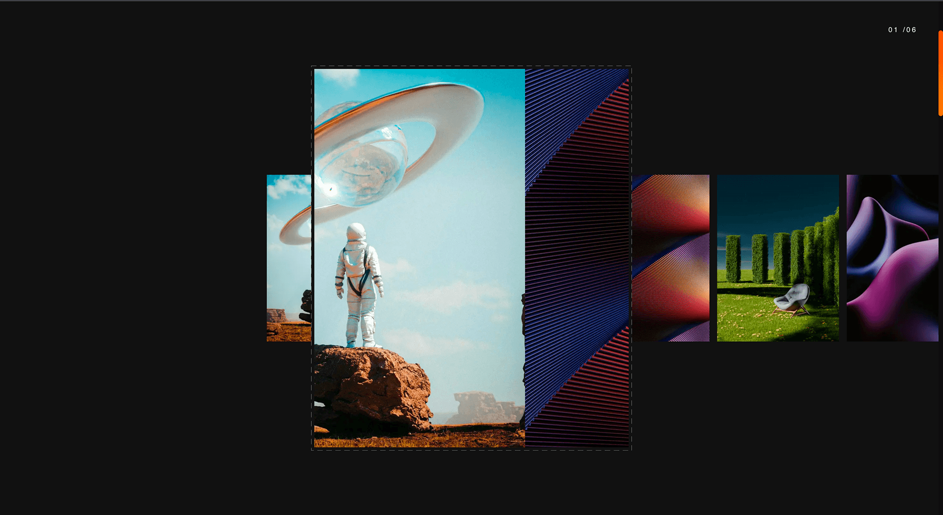
A multi-column parallax gallery where images drift at different speeds to create depth for editorial, fashion, photography, and visual campaign pages.
Published On: June 4, 2026
Last Updated: August 17, 2026
GSAP
Overview
Depth before explanation: Parallax Gallery is how atmosphere starts before a word is read.
Use Parallax Gallery when visual atmosphere matters more than step-by-step explanation. Editorial teams, fashion brands, photography studios, and image-led campaigns benefit most because the effect makes a collection feel curated rather than arranged. The page job is atmosphere: visitors should sense depth and pace before they begin comparing images.
In production, the risk is parallax distance. Too much offset creates layout shift, weakens text alignment, and turns the gallery into motion noise on mobile.
Install Command
This is a Pro Effect.
You can preview it now. Upgrade to Pro for instant install access.
Usage Code
This is a Pro Effect.
You can preview it now. Upgrade to Pro for instant install access.
Component Code
This is a Pro Effect.
You can preview it now. Upgrade to Pro for instant install access.
This is a Pro Effect.
You can preview it now. Upgrade to Pro for instant install access.
Example Production Use Case
A photography studio relaunching its portfolio page: Parallax Gallery lets image columns drift at different depths, giving the impression of a curated body of work rather than a flat grid. The outcome is atmosphere: visitors browse longer before deciding whether to make contact.
Best Used For
- Editorial or lifestyle galleries where atmosphere should arrive before detailed product comparison.
- Editorial, fashion, and lifestyle pages that want atmosphere before the spec sheet.
- Extends editorial or fashion pages without requiring more copy - the depth is the argument.
Not For
Not for ecommerce catalogues, image-heavy archives, or pages where speed-to-grid matters more than atmosphere.
Not for pages where image loading speed is the primary conversion variable - parallax offsets add render cycles.
Performance Budget
Animate transform and opacity, avoid layout reads in scroll handlers, pre-size media, and clean up timelines/listeners when the route changes.
Accessibility and Mobile
The animated sequence must match DOM order. On mobile, replace pinned or horizontal mechanics with stacked sections, native swipe, or static cards.
Common Mistakes
- Setting column offset so large that images partially exit the viewport before the section ends.
- Running the same multi-speed drift on touch instead of reducing it to a stable image stack.
- Loading unoptimized images into parallax columns - parallax adds render cost; unoptimized images multiply it.
Changelog
v1.0.1
Jul 23, 2026Added reduced motion support.
v1.0.0
Jul 20, 2026Initial release
Props
| Prop | Type | Default | Description |
|---|---|---|---|
bgColor | color | #111111 | Background color of the gallery section. |
borderColor | color | rgba(255, 255, 255, 0.5) | Color of the dashed border around the center frame. |
rotationDeg | number | 6 | Max rotation (degrees) applied to off-center slides as they scroll past. |
offscreenScale | number | 1.2 | Scale applied to off-center slides relative to the centered one. |
frameScale | number | 1 | Multiplier on the center frame's width/height. |
Frequently Asked Questions
How much parallax offset is too much on small viewports?
On phones, large offsets create visible gaps and judder because there's little vertical room for layers to separate, so reduce the per-column speed delta sharply or drop to a single speed. A few percent of differential is usually enough to read as depth without breaking the layout. If the columns can't separate cleanly, collapse to a static gallery.
Does Parallax Gallery create layout shift on initial render?
It can, if image dimensions aren't reserved before load — the layered columns shift as media arrives and that hits CLS. Set explicit width/height or aspect-ratio on every image and size the column containers up front. Done right, the parallax is a transform applied after layout, not a change to layout itself.
What image loading strategy protects Core Web Vitals?
Reserve space for every image, prioritize the first in-view column for LCP, and lazy-load the rest as they approach the viewport. Serve appropriately sized, compressed assets so a multi-column gallery doesn't ship oversized files. Transforms should touch only compositor properties so scrolling stays off the main thread.
How should Parallax Gallery columns collapse on mobile?
Stack the columns into a single readable sequence in DOM order and either remove the speed differential or keep a very gentle one. The point on mobile is the imagery, not the depth trick, so prioritize fast, stable rendering. Reduced-motion users should see the same images as a static gallery.
Is Parallax Gallery suitable for product photography pages?
Yes, when atmosphere should precede the spec sheet — editorial, fashion, and lifestyle product pages benefit from the slow drift. It's a poor fit where shoppers need to compare items precisely, since differential motion makes side-by-side scanning harder. Use it for the hero or story section, then hand off to a static grid for the catalogue.
Request a Custom Scroll Effect
Need a custom effect? Tell us what to create.


