Loading
Helix Slider
A Three.js-powered image slider for portfolios, campaign pages, visual archives, product showcases, and experimental landing pages where cards should move through space instead of sitting in a flat row.
Published On: February 10, 2026
Last Updated: September 10, 2026
GSAPLenis
Overview
Helix Slider turns a collection of visuals into a spatial image system.
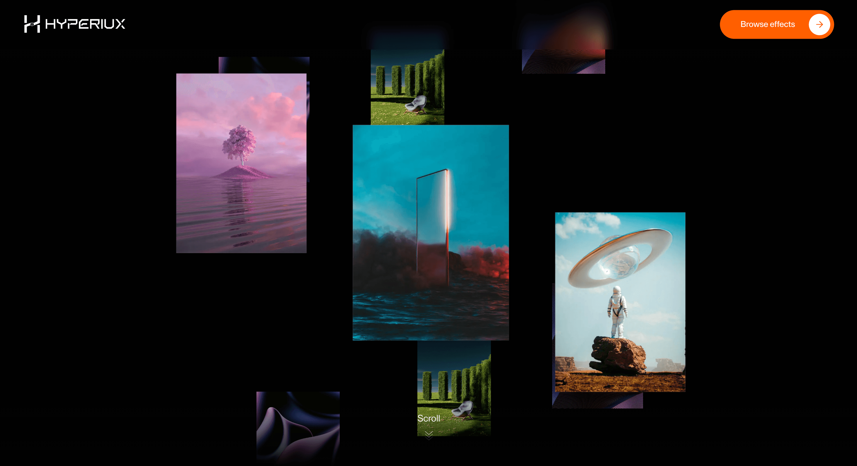
Cards are positioned along a helix-like path, giving the gallery vertical rhythm, depth, rotation, and layered movement. Instead of treating each image as a flat slide, the component places the collection inside a 3D scene where panels can orbit, drift, face the camera, and pass through focus as the animation runs.
Use Helix Slider when a page needs a stronger visual world than a conventional carousel can provide. It works for creative portfolios, digital galleries, launch visuals, motion-led case studies, product-world imagery, interactive archives, WebGL-heavy landing pages, and experimental brand sections where depth is part of the story.
The page job is dimensional browsing. The visitor should feel that the image set has space, rhythm, and movement, but still understand what they are looking at. The helix should make the gallery feel authored, not make the content look like it was launched into orbit without supervision.
Install Command
This is a Pro Effect.
You can preview it now. Upgrade to Pro for instant install access.
Usage Code
This is a Pro Effect.
You can preview it now. Upgrade to Pro for instant install access.
Component Code
This is a Pro Effect.
You can preview it now. Upgrade to Pro for instant install access.
This is a Pro Effect.
You can preview it now. Upgrade to Pro for instant install access.
Example Production Use Case
A creative studio can use Helix Slider as a visual archive section where selected projects rotate through a dimensional spiral. Each card becomes part of a larger field, giving the page a sense of range, movement, and technical craft before the visitor enters the full work index.
The outcome is visual presence. The section does not behave like another flat carousel; it turns the image set into a spatial product moment.
A SaaS or AI product page can use the same component for interface fragments, generative visuals, workflow screens, or product-world panels where the brand wants to signal technical depth without building a full interactive 3D environment from scratch.
Best Used For
• Creative portfolios and agency pages where image presentation needs depth.
• WebGL-led landing pages where a normal carousel would feel too flat.
• Campaign galleries, digital archives, and product-world sections.
• AI, developer-tool, cyber, and experimental brand pages where 3D motion supports the identity.
• Visual showcases where the collection matters as a system, not only as individual slides.
Not For
Not for dense ecommerce catalogues, documentation, pricing sections, comparison tables, forms, testimonials, or content users need to scan quickly.
Not for weak or inconsistent image sets. A helix can make strong visuals feel dimensional; it cannot turn random assets into a curated world.
Not for pages that cannot afford WebGL cost. If the site already has heavy shaders, video backgrounds, and scroll scenes, adding another 3D gallery without budgets is not ambition. It is a performance incident with better lighting.
Performance Budget
Cap DPR, optimise textures, limit visible panels, and avoid unnecessary geometry. Use useFrame carefully; do not push expensive React state updates through the render loop. Keep per-frame work inside Three.js refs wherever possible.
Pause or reduce motion when the section is offscreen. Avoid loading large textures before the section is likely to be viewed. On lower-power devices, reduce panel count, texture size, rotation speed, and any expensive material treatment.
A practical target is to keep the scene visually rich but operationally boring: stable frame pacing, limited GPU pressure, no memory spikes, and no surprise battery tax.
Accessibility and Mobile
Provide a non-WebGL content equivalent when the gallery communicates meaningful work, products, or projects. The images should have meaningful alt text or supporting DOM content outside the canvas where appropriate, because canvas-rendered imagery is not automatically accessible as structured page content.
On mobile, simplify the scene. Reduce panel count, camera movement, rotation depth, and texture size. Consider a static preview, horizontal fallback, or simplified DOM carousel if the WebGL version becomes cramped.
For reduced motion, stop continuous rotation, remove pointer-reactive drift, and show a stable gallery state or static fallback. The user should not have to orbit through motion to understand the section.
Common Mistakes
• Treating a WebGL slider like a normal CSS carousel.
• Loading oversized textures for small panels.
• Updating React state inside useFrame on every tick.
• Making the helix too dense for the images to be understood.
• Forgetting a mobile fallback.
• Putting meaningful content only inside canvas without an accessible equivalent.
• Running the scene continuously when it is offscreen.
• Using 3D depth when the page only needed a clean image grid.
Changelog
v1.2.0
Sep 10, 2026Rebuilt as a WebGL rotating gallery with drag, wheel momentum, and idle autoplay.
v1.1.0
Jul 24, 2026Added prefers-reduced-motion support (ported from the docs copy): shows a notice explaining the continuous scroll-driven rotation can't be reduced to a static fade.
v1.0.0
Feb 10, 2026Initial release
Props
| Prop | Type | Default | Description |
|---|---|---|---|
autoplaySpeed | number | 0.12 | Idle movement speed; 0 stops autoplay. |
radius | number | 2.8 | Width of the spiral. |
turns | number | 3.3 | Number of spiral twists. |
cardScale | number | 1 | Scales image cards proportionally. |
dragSensitivity | number | 0.006 | How strongly the gallery responds to dragging. |
inertiaDecay | number | 2.2 | Higher values stop movement sooner after release. |
background | color | #0d0d0d | Gallery background. |
Frequently Asked Questions
What is Helix Slider?
Helix Slider is a React and Three.js image slider that arranges visual panels along a spiral or helix-like 3D path.
What stack does Helix Slider use?
Helix Slider uses three and @react-three/fiber. The key React Three Fiber APIs are Canvas, useFrame, and useThree.
When should I use Helix Slider?
Use it for portfolios, campaign galleries, product-world visuals, creative archives, WebGL landing pages, and experimental brand sections where an image set should feel dimensional.
Is Helix Slider the same as a normal carousel?
No. A normal carousel usually moves DOM slides in a flat sequence. Helix Slider renders panels inside a WebGL scene and positions them in 3D space.
Does Helix Slider work with Next.js?
Yes, but it should run as a client component. Three.js scenes, pointer tracking, viewport measurement, and frame-loop animation should stay out of server components.
How do I keep Helix Slider performant?
Optimise textures, cap DPR, limit panel count, avoid React state updates inside useFrame, clean up resources, and pause or simplify the scene when it is offscreen.
How do I keep Helix Slider accessible?
Do not rely on the canvas as the only source of meaningful content. Provide alt text, captions, labels, or a DOM-based content equivalent where the images communicate important information.
What should reduced motion do?
Reduced motion should stop continuous rotation, pointer-reactive drift, depth travel, and long camera movement. Show a stable scene, static image set, or simpler fallback.
Can Helix Slider work on mobile?
Yes, with tuning. Reduce panel count, texture size, rotation intensity, and camera movement. For some layouts, a simpler DOM carousel may be the better mobile fallback.
Can Hyperiux adapt Helix Slider for a real brand system?
Yes. A custom version should define helix geometry, texture rules, camera behavior, pointer interaction, DPR limits, mobile fallback, accessibility treatment, reduced-motion behavior, source handoff, and implementation notes.
Request a Custom Scroll Effect Animation
Need a custom effect? Tell us what to create.


