Loading
Orbit Flip Slider
A layout-switching image carousel for portfolios, lookbooks, visual archives, and campaign pages where a group of images should feel rearrangeable rather than locked into one static grid.
GSAP
Overview
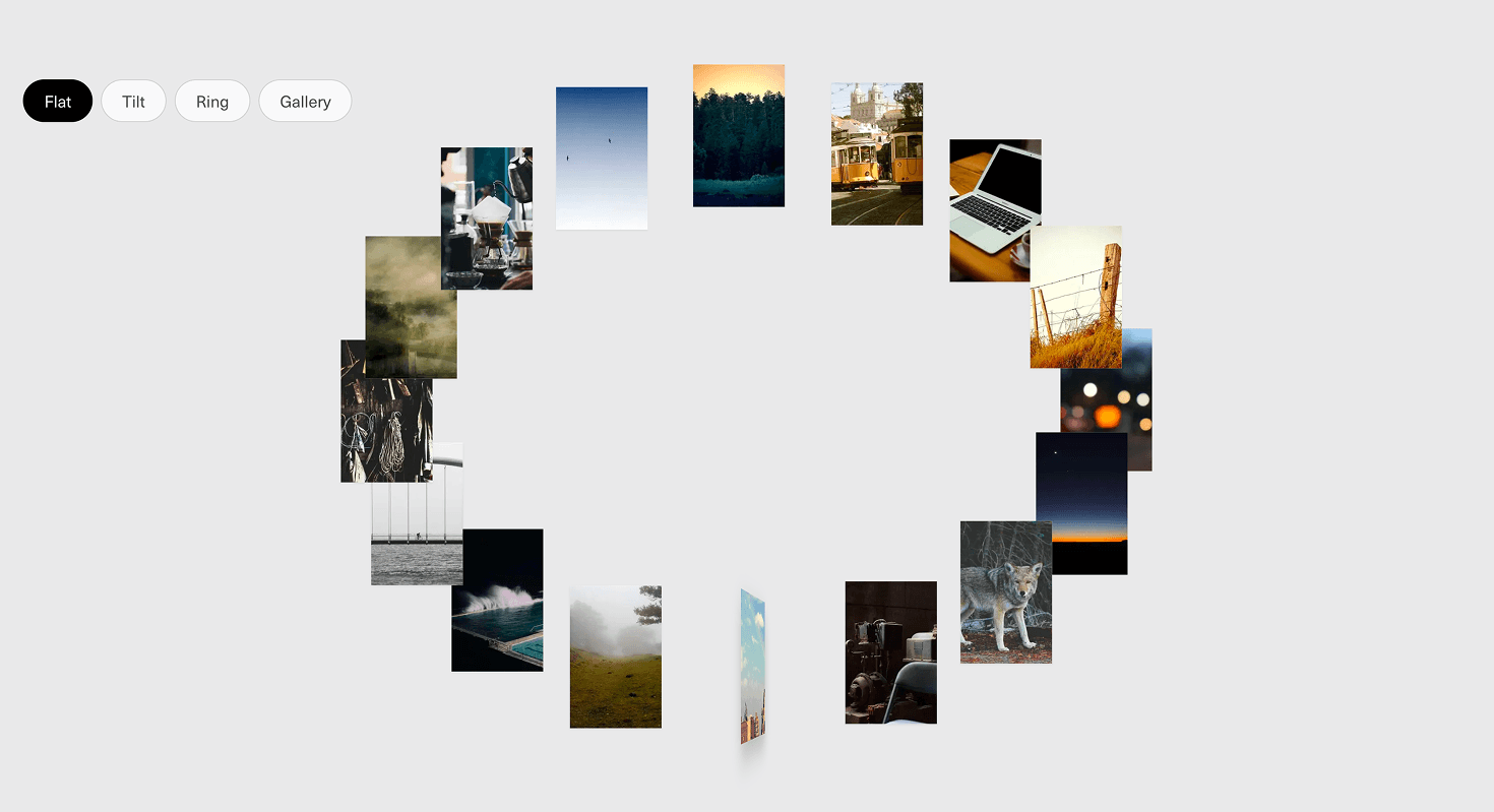
Orbit Flip Slider turns an image set into a shape-shifting visual system.
The same group of cards can reorganize across different viewing modes: a ring-like orbit, a tilted spatial arrangement, a flatter row, or a gallery-style spread. Cards move, flip, rotate, and settle into the selected layout while preserving the image collection as one connected set.
Use Orbit Flip Slider when the experience is about browsing a visual collection, not just moving from slide one to slide two. It works for portfolio indexes, photography sets, campaign assets, fashion and lifestyle lookbooks, creative archives, moodboards, studio pages, and editorial galleries where the arrangement itself can become part of the interaction.
The page job is exploration. The visitor should feel that the collection can be inspected from different visual systems without losing orientation. The effect should make the gallery feel alive, not make the user wonder where half the images went.
Install Command
npx hyperiux add orbit-flip-sliderUsage Code
page.jsx
import OrbitFlipSlider from '@/components/effects/orbit-flip-slider'

const Page = () => {
 return (
 <>
 <OrbitFlipSlider/>
 </>
 )
}

export default Page
Component Code
index.jsx
// Built using Hyperiux Vault: https://vault.hyperiux.com
"use client";
import { gsap } from "gsap";
import { Flip } from "gsap/dist/Flip";
import React, { useCallback, useEffect, useRef, useState, useSyncExternalStore } from "react";
function usePrefersReducedMotion() {
    return useSyncExternalStore((callback) => {
        if (typeof window === "undefined")
            return () => { };
        const mediaQueryList = window.matchMedia("(prefers-reduced-motion: reduce)");
        mediaQueryList.addEventListener("change", callback);
        return () => mediaQueryList.removeEventListener("change", callback);
    }, () => (typeof window === "undefined" ? false : window.matchMedia?.("(prefers-reduced-motion: reduce)")?.matches ?? false), () => false);
}
gsap.registerPlugin(Flip);
const MODES = [
    { key: "flat", label: "Flat" },
    { key: "tilt", label: "Tilt" },
    { key: "ring", label: "Ring" },
    { key: "gallery", label: "Gallery" },
];
const degToRad = (deg) => (deg * Math.PI) / 180;
const MOBILE_BREAKPOINT = 768;
const MOBILE_FLAT_RADIUS_X_SCALE = 0.55;
const MOBILE_TILT_RADIUS_X_SCALE = 0.6;
const MOBILE_TILT_RADIUS_Y_SCALE = 0.8;
const MOBILE_RING_SCALE = 0.6;
const MOBILE_GALLERY_SCALE = 0.6;
const getBaseOrbitRadius = (count, cardWidth, cardHeight, imageGap) => {
    const baseSpan = Math.max(cardWidth, cardHeight) + imageGap;
    return Math.max((count * baseSpan) / (2 * Math.PI) * 0.62, baseSpan * 0.9);
};
const buildCoverflowLayout = (count, containerW, containerH, sizes, params) => {
    const cx = containerW / 2;
    const camDist = params.radius * params.camDistFactor;
    const tilt = degToRad(params.tiltDeg);
    const positionScaleStrength = params.positionScaleStrength ?? 1;
    const sizeScaleStrength = params.sizeScaleStrength ?? 0.42;
    return sizes.map((size, i) => {
        const thetaDeg = params.offsetDeg + (i / count) * 360;
        const theta = degToRad(thetaDeg);
        const px = params.radius * Math.sin(theta);
        const pz0 = -params.radius * Math.cos(theta);
        const py = -pz0 * Math.sin(tilt);
        const pz = pz0 * Math.cos(tilt);
        const scale = Math.max(camDist / (camDist + pz), 0.05);
        const positionScale = 1 + (scale - 1) * positionScaleStrength;
        const sizeScale = 1 + (scale - 1) * sizeScaleStrength;
        return {
            x: cx + px * positionScale,
            y: containerH * params.anchorY + py * positionScale,
            width: size.w * sizeScale,
            height: size.h * sizeScale,
            zIndex: Math.round(scale * 1000) + 1,
        };
    });
};
const applyZRotation = (boxes, cx, cy, zDeg) => {
    if (!zDeg)
        return boxes;
    const rad = degToRad(zDeg);
    const cos = Math.cos(rad);
    const sin = Math.sin(rad);
    return boxes.map((box) => {
        const dx = box.x - cx;
        const dy = box.y - cy;
        return {
            ...box,
            x: cx + dx * cos - dy * sin,
            y: cy + dx * sin + dy * cos,
        };
    });
};
const applyRadiusScale = (boxes, cx, cy, baseRadius, radiusX, radiusY) => {
    const sx = radiusX / baseRadius;
    const sy = radiusY / baseRadius;
    if (sx === 1 && sy === 1)
        return boxes;
    return boxes.map((box) => ({
        ...box,
        x: cx + (box.x - cx) * sx,
        y: cy + (box.y - cy) * sy,
    }));
};
const applyUniformScale = (boxes, cx, cy, scale) => {
    if (scale === 1)
        return boxes;
    return boxes.map((box) => ({
        ...box,
        x: cx + (box.x - cx) * scale,
        y: cy + (box.y - cy) * scale,
        width: box.width * scale,
        height: box.height * scale,
    }));
};
const applyTransform = (boxes, cx, cy, baseRadius, t) => {
    const radiusScaled = applyRadiusScale(boxes, cx, cy, baseRadius, baseRadius * t.radiusX, baseRadius * t.radiusY);
    const scaled = applyUniformScale(radiusScaled, cx, cy, t.scale);
    return applyZRotation(scaled, cx, cy, t.z);
};
const buildLayout = (mode, count, containerW, containerH, sizes, transforms, imageGap, rotationOffsetDeg = 0) => {
    const cx = containerW / 2;
    const cy = containerH / 2;
    const cardWidth = sizes[0]?.w ?? 140;
    const cardHeight = sizes[0]?.h ?? 200;
    const baseRadius = getBaseOrbitRadius(count, cardWidth, cardHeight, imageGap);
    if (mode === "flat") {
        const f = transforms.flat;
        const rx = baseRadius * f.radiusX;
        const ry = baseRadius * f.radiusY;
        const boxes = sizes.map((size, i) => {
            const angle = (i / count) * Math.PI * 2 - Math.PI / 2 + degToRad(rotationOffsetDeg);
            return {
                x: cx + rx * Math.cos(angle),
                y: cy + ry * Math.sin(angle),
                width: size.w,
                height: size.h,
                zIndex: i + 1,
            };
        });
        return applyUniformScale(boxes, cx, cy, f.scale);
    }
    const t = transforms[mode];
    const radius = mode === "gallery" ? baseRadius * 1.55 : baseRadius * 1.12;
    const anchorY = 0.5;
    const camDistFactor = mode === "gallery" ? 1.55 : 1.75;
    const positionScaleStrength = mode === "gallery" ? 0.28 : 0.45;
    const sizeScaleStrength = mode === "gallery" ? 0.16 : 0.42;
    const boxes = buildCoverflowLayout(count, containerW, containerH, sizes, {
        radius,
        tiltDeg: t.x,
        camDistFactor,
        offsetDeg: -90 + t.y + rotationOffsetDeg,
        anchorY,
        positionScaleStrength,
        sizeScaleStrength,
    });
    const transformed = applyTransform(boxes, cx, containerH * anchorY, radius, t);
    if (!t.moveY)
        return transformed;
    return transformed.map((box) => ({ ...box, y: box.y + t.moveY }));
};
const OrbitFlipSliderComp = ({ items = [], backgroundColor = "#e9e9ea", imageWidth = 140, imageHeight = 200, imageGap = 0, roundedness = 0, enableHoverMovement = true, hoverMoveY = -8, perspectiveRotateValue = 180, perspectiveRotateDirection = "right", rotate = true, rotateSpeed = 4, stopRotationOnHover = true, flatRadiusX = 1, flatRadiusY = 1, flatScale = 1, ringRotateX = 31, ringRotateY = 56, ringRotateZ = -25, ringRadiusX = 1.5, ringRadiusY = 0.65, ringScale = 0.6, tiltRotateX = 70, tiltRotateY = 0, tiltRotateZ = 0, tiltRadiusX = 1.2, tiltRadiusY = 1, tiltScale = 1, tiltMoveY = 325, galleryRotateX = 10, galleryRotateY = 0, galleryRotateZ = 0, galleryRadiusX = 1, galleryRadiusY = 1, galleryScale = 1, }) => {
    const FLIP_DURATION_SECONDS = 0.9;
    const trackRef = useRef(null);
    const modeRef = useRef("flat");
    const isFlipAnimatingRef = useRef(false);
    const flipResumeTimeoutRef = useRef(null);
    const rotationOffsetRef = useRef(0);
    const hoveredCardCountRef = useRef(0);
    const [activeMode, setActiveMode] = useState("flat");
    const reducedMotion = usePrefersReducedMotion();
    const sizes = items.map(() => ({ w: imageWidth, h: imageHeight }));
    const transforms = {
        flat: {
            radiusX: flatRadiusX,
            radiusY: flatRadiusY,
            scale: flatScale,
        },
        tilt: {
            x: tiltRotateX,
            y: tiltRotateY,
            z: tiltRotateZ,
            radiusX: tiltRadiusX,
            radiusY: tiltRadiusY,
            scale: tiltScale,
            moveY: tiltMoveY,
        },
        ring: {
            x: ringRotateX,
            y: ringRotateY,
            z: ringRotateZ,
            radiusX: ringRadiusX,
            radiusY: ringRadiusY,
            scale: ringScale,
            moveY: 0,
        },
        gallery: {
            x: galleryRotateX,
            y: galleryRotateY,
            z: galleryRotateZ,
            radiusX: galleryRadiusX,
            radiusY: galleryRadiusY,
            scale: galleryScale,
            moveY: 0,
        },
    };
    const applyLayout = useCallback((mode, animate) => {
        const track = trackRef.current;
        if (!track)
            return;
        const cards = gsap.utils.toArray(".orbit-flip-slider-card", track);
        if (!cards.length)
            return;
        const { width, height } = track.getBoundingClientRect();
        const isMobile = window.innerWidth < MOBILE_BREAKPOINT;
        const responsiveTransforms = isMobile
            ? {
                ...transforms,
                flat: { ...transforms.flat, radiusX: transforms.flat.radiusX * MOBILE_FLAT_RADIUS_X_SCALE },
                tilt: {
                    ...transforms.tilt,
                    radiusX: transforms.tilt.radiusX * MOBILE_TILT_RADIUS_X_SCALE,
                    radiusY: transforms.tilt.radiusY * MOBILE_TILT_RADIUS_Y_SCALE,
                },
                ring: { ...transforms.ring, scale: transforms.ring.scale * MOBILE_RING_SCALE },
                gallery: { ...transforms.gallery, scale: transforms.gallery.scale * MOBILE_GALLERY_SCALE },
            }
            : transforms;
        const layout = buildLayout(mode, cards.length, width, height, sizes, responsiveTransforms, imageGap, rotationOffsetRef.current);
        const commit = () => {
            cards.forEach((card, i) => {
                const box = layout[i];
                gsap.set(card, {
                    x: box.x,
                    y: box.y,
                    xPercent: -50,
                    yPercent: -50,
                    width: box.width,
                    height: box.height,
                    zIndex: box.zIndex,
                });
            });
        };
        if (!animate || reducedMotion) {
            commit();
            return;
        }
        const state = Flip.getState(cards);
        commit();
        isFlipAnimatingRef.current = true;
        if (flipResumeTimeoutRef.current !== null)
            window.clearTimeout(flipResumeTimeoutRef.current);
        flipResumeTimeoutRef.current = window.setTimeout(() => {
            isFlipAnimatingRef.current = false;
            flipResumeTimeoutRef.current = null;
        }, FLIP_DURATION_SECONDS * 1000);
        Flip.from(state, {
            duration: FLIP_DURATION_SECONDS,
            ease: "power3.inOut",
            stagger: 0.015,
            absolute: true,
        });
    }, [
        sizes,
        reducedMotion,
        imageWidth,
        imageHeight,
        imageGap,
        flatRadiusX,
        flatRadiusY,
        flatScale,
        ringRotateX,
        ringRotateY,
        ringRotateZ,
        ringRadiusX,
        ringRadiusY,
        ringScale,
        tiltRotateX,
        tiltRotateY,
        tiltRotateZ,
        tiltRadiusX,
        tiltRadiusY,
        tiltScale,
        tiltMoveY,
        galleryRotateX,
        galleryRotateY,
        galleryRotateZ,
        galleryRadiusX,
        galleryRadiusY,
        galleryScale,
    ]);
    useEffect(() => {
        const ctx = gsap.context(() => {
            applyLayout(modeRef.current, false);
            const handleResize = () => applyLayout(modeRef.current, false);
            window.addEventListener("resize", handleResize);
            return () => window.removeEventListener("resize", handleResize);
        }, trackRef);
        return () => ctx.revert();
    }, [items.length]);
    const didMountTransforms = useRef(false);
    useEffect(() => {
        if (!didMountTransforms.current) {
            didMountTransforms.current = true;
            return;
        }
        applyLayout(modeRef.current, true);
    }, [
        imageWidth,
        imageHeight,
        imageGap,
        flatRadiusX,
        flatRadiusY,
        flatScale,
        ringRotateX,
        ringRotateY,
        ringRotateZ,
        ringRadiusX,
        ringRadiusY,
        ringScale,
        tiltRotateX,
        tiltRotateY,
        tiltRotateZ,
        tiltRadiusX,
        tiltRadiusY,
        tiltScale,
        tiltMoveY,
        galleryRotateX,
        galleryRotateY,
        galleryRotateZ,
        galleryRadiusX,
        galleryRadiusY,
        galleryScale,
    ]);
    const handleModeChange = (mode) => {
        if (mode === modeRef.current)
            return;
        modeRef.current = mode;
        setActiveMode(mode);
        applyLayout(mode, true);
    };
    useEffect(() => {
        if (!rotate || reducedMotion)
            return;
        let rafId;
        let lastTime = performance.now();
        const tick = (now) => {
            const dt = (now - lastTime) / 1000;
            lastTime = now;
            const paused = isFlipAnimatingRef.current || (stopRotationOnHover && hoveredCardCountRef.current > 0);
            if (!paused) {
                rotationOffsetRef.current += rotateSpeed * dt;
                applyLayout(modeRef.current, false);
            }
            rafId = requestAnimationFrame(tick);
        };
        rafId = requestAnimationFrame(tick);
        return () => cancelAnimationFrame(rafId);
    }, [rotate, rotateSpeed, stopRotationOnHover, reducedMotion, applyLayout]);
    const handleCardEnter = useCallback((e) => {
        hoveredCardCountRef.current += 1;
        if (reducedMotion || !enableHoverMovement || window.innerWidth < MOBILE_BREAKPOINT)
            return;
        const card = e.currentTarget;
        const inner = card.querySelector(".orbit-flip-slider-card-inner");
        if (!inner)
            return;
        const rotateY = perspectiveRotateDirection === "left"
            ? -Math.abs(perspectiveRotateValue)
            : Math.abs(perspectiveRotateValue);
        gsap.killTweensOf(inner);
        gsap.to(inner, {
            y: hoverMoveY,
            rotateY,
            boxShadow: "0 14px 26px rgba(0,0,0,0.2)",
            duration: 0.8,
            ease: "back.out(2.2)",
        });
    }, [enableHoverMovement, hoverMoveY, perspectiveRotateDirection, perspectiveRotateValue, reducedMotion]);
    const handleCardLeave = useCallback((e) => {
        hoveredCardCountRef.current = Math.max(0, hoveredCardCountRef.current - 1);
        if (reducedMotion || !enableHoverMovement || window.innerWidth < MOBILE_BREAKPOINT)
            return;
        const card = e.currentTarget;
        const inner = card.querySelector(".orbit-flip-slider-card-inner");
        if (!inner)
            return;
        gsap.killTweensOf(inner);
        gsap.to(inner, {
            y: 0,
            rotateY: 0,
            boxShadow: "0 1px 2px rgba(0,0,0,0.08)",
            duration: 0.7,
            ease: "back.out(2.2)",
        });
    }, [enableHoverMovement, reducedMotion]);
    return (<div className="relative flex h-screen w-full flex-col overflow-hidden" style={{ backgroundColor }}>


      <div ref={trackRef} className="relative w-full flex-1 overflow-hidden">
        {items.map((item, i) => (<div key={item.id ?? i} className="orbit-flip-slider-card absolute left-0 top-0" onMouseEnter={handleCardEnter} onMouseLeave={handleCardLeave} style={{ perspective: "500px" }}>
            <div className="orbit-flip-slider-card-inner relative h-full w-full overflow-hidden bg-white" style={{
                borderRadius: `${roundedness}px`,
                boxShadow: "0 1px 2px rgba(0,0,0,0.08)",
                transformStyle: "preserve-3d",
            }}>
              <img src={item.image} alt={item.alt ?? `Selected work ${i + 1}`} className="absolute inset-0 h-full w-full object-cover" draggable={false}/>
            </div>
          </div>))}
      </div>
        <div className="absolute top-20 left-6">
        <div className="flex flex-wrap items-center gap-2">
          {MODES.map((m) => (<button key={m.key} type="button" onClick={() => handleModeChange(m.key)} className={`rounded-full border px-5 py-2 text-sm transition-colors duration-300 ${activeMode === m.key
                ? "border-black bg-black text-white"
                : "border-black/15 bg-white/70 text-black/70 hover:bg-black/10"}`}>
              {m.label}
            </button>))}
        </div>
      </div>
    </div>);
};
const defaultItems = Array.from({ length: 16 }, (_, i) => ({
    id: i,
    image: `https://picsum.photos/seed/orbit-flip-slider-${i}/400/500`,
    alt: `Selected work ${i + 1}`,
}));
const OrbitFlipSlider = ({ items = defaultItems, backgroundColor = "#e9e9ea", imageWidth = 140, imageHeight = 200, imageGap = 0, roundedness = 0, enableHoverMovement = true, hoverMoveY = -8, perspectiveRotateValue = 180, perspectiveRotateDirection = "right", rotate = true, rotateSpeed = 4, stopRotationOnHover = true, flatRadiusX = 1, flatRadiusY = 1, flatScale = 1, ringRotateX = 31, ringRotateY = 56, ringRotateZ = -25, ringRadiusX = 1.5, ringRadiusY = 0.65, ringScale = 0.6, tiltRotateX = 70, tiltRotateY = 0, tiltRotateZ = 0, tiltRadiusX = 1.2, tiltRadiusY = 1, tiltScale = 1, tiltMoveY = 325, galleryRotateX = 10, galleryRotateY = 0, galleryRotateZ = 0, galleryRadiusX = 1, galleryRadiusY = 1, galleryScale = 1, }) => {
    return (<OrbitFlipSliderComp items={items} backgroundColor={backgroundColor} imageWidth={imageWidth} imageHeight={imageHeight} imageGap={imageGap} roundedness={roundedness} enableHoverMovement={enableHoverMovement} hoverMoveY={hoverMoveY} perspectiveRotateValue={perspectiveRotateValue} perspectiveRotateDirection={perspectiveRotateDirection} rotate={rotate} rotateSpeed={rotateSpeed} stopRotationOnHover={stopRotationOnHover} flatRadiusX={flatRadiusX} flatRadiusY={flatRadiusY} flatScale={flatScale} ringRotateX={ringRotateX} ringRotateY={ringRotateY} ringRotateZ={ringRotateZ} ringRadiusX={ringRadiusX} ringRadiusY={ringRadiusY} ringScale={ringScale} tiltRotateX={tiltRotateX} tiltRotateY={tiltRotateY} tiltRotateZ={tiltRotateZ} tiltRadiusX={tiltRadiusX} tiltRadiusY={tiltRadiusY} tiltScale={tiltScale} tiltMoveY={tiltMoveY} galleryRotateX={galleryRotateX} galleryRotateY={galleryRotateY} galleryRotateZ={galleryRotateZ} galleryRadiusX={galleryRadiusX} galleryRadiusY={galleryRadiusY} galleryScale={galleryScale}/>);
};
export default OrbitFlipSlider;
Example Production Use Case
A photography portfolio can use Orbit Flip Slider to let visitors shift a visual series between ring, flat, and gallery arrangements. The same images stay present, but the layout changes how the collection feels: curated, exploratory, cinematic, or scan-friendly.
The outcome is agency over presentation. The visitor can experience the work as a sequence, a constellation, or a gallery without leaving the section.
A fashion campaign or creative studio page can use the same effect for launch assets, moodboards, behind-the-scenes stills, or project visuals where arrangement contributes to the story.
Best Used For
- Photography portfolios and visual case-study sections.
- Fashion, lifestyle, art, and campaign galleries.
- Studio pages where a visual archive needs a more interactive presentation.
- Product image sets where multiple viewing modes help exploration.
- Editorial pages where layout change is part of the experience.
Not For
Not for dense product grids, ecommerce catalogues, comparison tables, pricing content, documentation, testimonials that need quick scanning, or image sets with hundreds of items.
Not for pages where users need predictable sorting and fast filtering. A visual orbit is not a replacement for information architecture.
Not for low-quality images. Motion can arrange a weak image set, but it cannot make it worth studying.
Performance Budget
Keep the image count controlled, optimise image assets, lazy-load where appropriate, and animate transform and opacity instead of layout properties. Avoid expensive filters, unbounded 3D transforms, or constant recalculation across every pointer move.
Do not render full-resolution images for every card if smaller display sizes are enough. The slider should feel fluid before it feels fancy.
Accessibility and Mobile
Use semantic buttons for view-mode controls. Provide visible focus states, active states, and readable labels. Preserve a logical reading and tab order even when the visual layout changes.
On mobile, simplify layouts. A full orbit may become cramped, so use a flat, stacked, or swipe-friendly version. For reduced motion, switch layouts instantly or with a minimal fade and no flip, orbit, or depth movement.
Common Mistakes
- Using too many images.
- Making view modes visually impressive but functionally confusing.
- Hiding active control state.
- Letting cards overlap important text or controls.
- Ignoring mobile layout simplification.
- Applying the effect to image sets that need filtering, sorting, or direct comparison.
- Forgetting to optimise image sizes.
Changelog
v1.0.0
Aug 20, 2026Initial release
API Reference
| Prop | Type | Default | Description |
|---|---|---|---|
backgroundColor | string | #e9e9ea | Background color behind the ring. |
imageWidth | number | 90 | Width of each image card in pixels. |
imageHeight | number | 140 | Height of each image card in pixels. |
imageGap | number | 0 | Extra spacing between image cards in pixels. |
roundedness | number | 0 | Image card corner radius in pixels. |
enableHoverMovement | boolean | true | Enables the hover lift and perspective tilt on image cards. |
hoverMoveY | number | -8 | Vertical movement applied to the image card on hover, in pixels. |
perspectiveRotateValue | number | 180 | How far each card rotates on hover, in degrees. |
perspectiveRotateDirection | string | right | Direction each card rotates on hover. |
rotate | boolean | true | Continuously and slowly rotates the ring of cards. |
rotateSpeed | number | 4 | Speed of the automatic rotation, in degrees per second. |
stopRotationOnHover | boolean | true | Pauses the automatic rotation while the pointer is hovering the slider. |
flatRadiusX | number | 1.6 | Horizontal stretch of the flat circle, as a multiplier of its base radius. |
flatRadiusY | number | 1.2 | Vertical stretch of the flat circle, as a multiplier of its base radius. |
ringRadiusX | number | 1.5 | Horizontal stretch of the ring, as a multiplier of its base radius. |
ringRadiusY | number | 1.2 | Vertical stretch of the ring, as a multiplier of its base radius. |
tiltRadiusX | number | 1.9 | Horizontal stretch of the tilt view, as a multiplier of its base radius. |
tiltRadiusY | number | 1.5 | Vertical stretch of the tilt view, as a multiplier of its base radius. |
galleryRadiusX | number | 1.3 | Horizontal stretch of the gallery coverflow, as a multiplier of its base radius. |
galleryRadiusY | number | 1.5 | Vertical stretch of the gallery coverflow, as a multiplier of its base radius. |
Frequently Asked Questions
What is Orbit Flip Slider?
Orbit Flip Slider is a React image carousel that rearranges cards between different visual layouts such as orbit, tilt, flat, and gallery-style views.
When should I use Orbit Flip Slider?
Use it for portfolios, visual archives, lookbooks, campaign galleries, photography sets, and creative pages where the image arrangement is part of the experience.
Is Orbit Flip Slider the same as a normal carousel?
No. A normal carousel usually moves through one item or row. Orbit Flip Slider changes the layout state of the image collection itself.
How many images work best?
A controlled set works best. Around 8 to 16 images is usually easier to manage than a large catalogue, depending on layout and performance.
Can Orbit Flip Slider work on mobile?
Yes, but the layout should simplify. Use a flatter, stacked, or swipe-friendly arrangement instead of forcing a full orbit into a small screen.
How do I keep Orbit Flip Slider accessible?
Use real buttons for layout controls, visible focus states, active state labels, meaningful image alt text, and a logical reading order that does not depend on the visual orbit.
What should reduced motion do?
Reduced motion should remove flips, orbit transitions, depth movement, and long layout travel. Switch states instantly or with a minimal fade.
Can Hyperiux adapt Orbit Flip Slider for a real brand system?
Yes. A custom version should define image ratios, layout modes, card physics, control behavior, mobile fallback, accessibility handling, reduced-motion states, image optimisation, source handoff, and implementation notes.
Request a Custom Carousel Animation
Need a custom effect? Tell us what to create.


