Loading
Ellipse Carousel
An elliptical image carousel for portfolios, visual archives, campaign pages, moodboards, and brand-led sections where the collection should feel spatial, light, and explorable.
GSAP
Overview
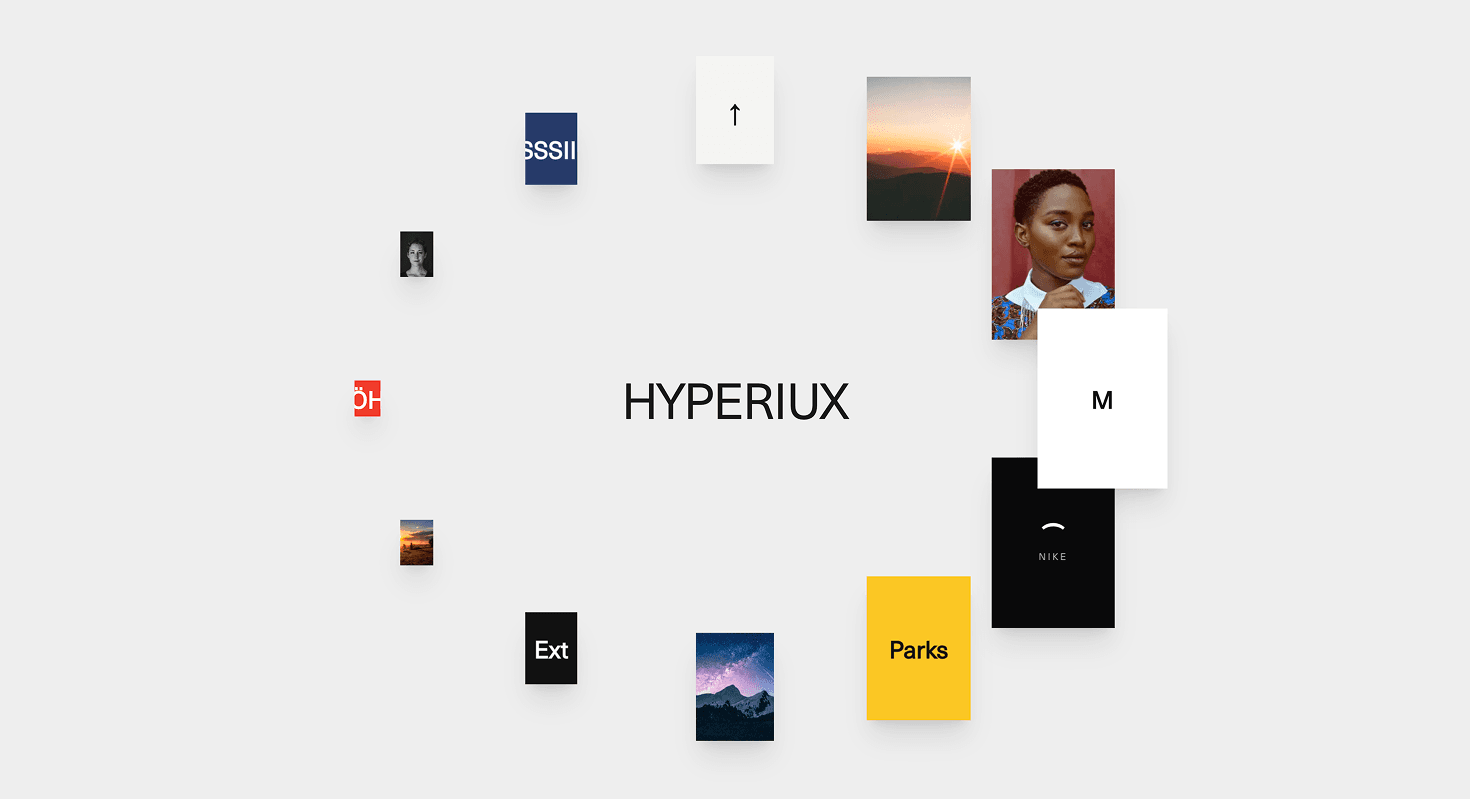
Ellipse Carousel turns a group of cards into an orbital composition.
Cards sit around an elliptical path, giving the section a sense of distribution rather than linear progression. The centre can hold a brand word, title, product name, or core message while the surrounding cards move as a connected visual field. The result feels airy, editorial, and gallery-like.
Use Ellipse Carousel when the goal is not just to move from slide to slide, but to create a spatial relationship between the central idea and the surrounding visuals. It works for creative portfolios, photography sets, campaign assets, travel and lifestyle galleries, brand moodboards, studio pages, and product-world presentations.
The page job is atmosphere and orientation. The visitor should feel the collection moving around a clear centre, not floating randomly across the screen. Ellipse motion works when the layout feels intentional. Without that centre, it is just scattered cards doing cardio.
Install Command
npx hyperiux add ellipse-carouselUsage Code
page.jsx
import EllipseCarousel from '@/components/effects/ellipse-carousel'

const Page = () => {
 return (
 <>
 <EllipseCarousel/>
 </>
 )
}

export default Page
Component Code
index.jsx
// Built using Hyperiux Vault: https://vault.hyperiux.com
"use client";
import { gsap } from "gsap";
import { useCallback, useEffect, useLayoutEffect, useRef, useState } from "react";
const MOBILE_BREAKPOINT = 768;
const MOBILE_RADIUS_X_SCALE = 1.45;
const MOBILE_RADIUS_Y_SCALE = 0.82;
const MOBILE_CARD_SCALE = 0.75;
const REDUCED_MOTION_QUERY = "(prefers-reduced-motion: reduce)";
function usePrefersReducedMotion() {
    const [reducedMotion, setReducedMotion] = useState(false);
    useEffect(() => {
        const mediaQuery = window.matchMedia?.(REDUCED_MOTION_QUERY);
        if (!mediaQuery)
            return;
        const update = () => setReducedMotion(mediaQuery.matches);
        update();
        mediaQuery.addEventListener?.("change", update);
        return () => mediaQuery.removeEventListener?.("change", update);
    }, []);
    return reducedMotion;
}
const EllipseCarouselComp = ({ items = [], backgroundColor = "#eeeeee", centerLabel, showCenterLabel = true, cardWidth = 130, cardHeight = 180, cardAspect = 0.9, minScale = 0.2, radiusXRatio = 0.25, radiusYRatio = 0.36, autoPlay = true, holdDuration = 1, stepDuration = 0.7, stepEase = "power2.inOut", pauseOnHover = true, draggable = true, dragSensitivity = 1, className = "", }) => {
    const stageRef = useRef(null);
    const cardRefs = useRef([]);
    const reducedMotion = usePrefersReducedMotion();
    const [isMobile, setIsMobile] = useState(false);
    const total = items.length;
    const rotationRef = useRef(0);
    const hoveredRef = useRef(false);
    const hoverCountRef = useRef(0);
    const draggingRef = useRef(false);
    const lastAngleRef = useRef(0);
    const dragOriginRef = useRef({ left: 0, top: 0 });
    const settleTweenRef = useRef(null);
    const autoplayTweenRef = useRef(null);
    const autoplayDelayRef = useRef(null);
    const geometryRef = useRef({
        cx: 0,
        cy: 0,
        radiusX: 320,
        radiusY: 260,
        cardW: cardWidth,
        cardH: cardHeight ?? cardWidth / cardAspect,
    });
    useEffect(() => {
        const updateIsMobile = () => {
            setIsMobile(window.innerWidth < MOBILE_BREAKPOINT);
        };
        updateIsMobile();
        window.addEventListener("resize", updateIsMobile);
        return () => window.removeEventListener("resize", updateIsMobile);
    }, []);
    const measure = useCallback(() => {
        const stage = stageRef.current;
        if (!stage)
            return;
        const width = stage.offsetWidth;
        const height = stage.offsetHeight;
        const cardScale = isMobile ? MOBILE_CARD_SCALE : 1;
        const radiusXScale = isMobile ? MOBILE_RADIUS_X_SCALE : 1;
        const radiusYScale = isMobile ? MOBILE_RADIUS_Y_SCALE : 1;
        geometryRef.current = {
            cx: width / 2,
            cy: height / 2,
            radiusX: width * radiusXRatio * radiusXScale,
            radiusY: height * radiusYRatio * radiusYScale,
            cardW: cardWidth * cardScale,
            cardH: (cardHeight ?? cardWidth / cardAspect) * cardScale,
        };
    }, [cardAspect, cardHeight, cardWidth, isMobile, radiusXRatio, radiusYRatio]);
    useLayoutEffect(() => {
        measure();
        const stage = stageRef.current;
        if (!stage || typeof ResizeObserver === "undefined") {
            window.addEventListener("resize", measure);
            return () => window.removeEventListener("resize", measure);
        }
        const observer = new ResizeObserver(measure);
        observer.observe(stage);
        return () => observer.disconnect();
    }, [measure]);
    const render = useCallback(() => {
        if (!total)
            return;
        const { cx, cy, radiusX, radiusY, cardW, cardH } = geometryRef.current;
        const rotation = rotationRef.current;
        const step = (Math.PI * 2) / total;
        for (let i = 0; i < total; i += 1) {
            const card = cardRefs.current[i];
            if (!card)
                continue;
            const theta = i * step + rotation;
            const cosT = Math.cos(theta);
            const sinT = Math.sin(theta);
            const scale = minScale + (1 - minScale) * ((cosT + 1) / 2);
            const w = cardW * scale;
            const h = cardH * scale;
            const x = cx + radiusX * cosT - w / 2;
            const y = cy + radiusY * sinT - h / 2;
            card.style.width = `${w}px`;
            card.style.height = `${h}px`;
            card.style.transform = `translate3d(${x}px, ${y}px, 0)`;
            card.style.zIndex = `${Math.round(scale * 1000)}`;
        }
    }, [minScale, total]);
    const stopAutoplay = useCallback(() => {
        autoplayDelayRef.current?.kill();
        autoplayTweenRef.current?.kill();
        autoplayDelayRef.current = null;
        autoplayTweenRef.current = null;
    }, []);
    const scheduleNextStep = useCallback(() => {
        if (!autoPlay || reducedMotion || !total)
            return;
        autoplayDelayRef.current = gsap.delayedCall(holdDuration, () => {
            if (draggingRef.current || (pauseOnHover && hoveredRef.current)) {
                scheduleNextStep();
                return;
            }
            const step = (Math.PI * 2) / total;
            const state = { r: rotationRef.current };
            autoplayTweenRef.current = gsap.to(state, {
                r: state.r - step,
                duration: stepDuration,
                ease: stepEase,
                onUpdate: () => {
                    rotationRef.current = state.r;
                    render();
                },
                onComplete: scheduleNextStep,
            });
        });
    }, [autoPlay, holdDuration, pauseOnHover, reducedMotion, render, stepDuration, stepEase, total]);
    useEffect(() => {
        render();
        scheduleNextStep();
        return () => stopAutoplay();
    }, [render, scheduleNextStep, stopAutoplay]);
    useEffect(() => {
        const stage = stageRef.current;
        if (!stage || !draggable || !total)
            return;
        const pointerAngle = (e) => {
            const { cx, cy, radiusX, radiusY } = geometryRef.current;
            const rect = dragOriginRef.current;
            const localX = e.clientX - rect.left;
            const localY = e.clientY - rect.top;
            return Math.atan2((localY - cy) / radiusY, (localX - cx) / radiusX);
        };
        const onPointerDown = (e) => {
            if (e.button !== 0 && e.pointerType === "mouse")
                return;
            stopAutoplay();
            settleTweenRef.current?.kill();
            settleTweenRef.current = null;
            draggingRef.current = true;
            const rect = stage.getBoundingClientRect();
            dragOriginRef.current = { left: rect.left, top: rect.top };
            lastAngleRef.current = pointerAngle(e);
            stage.setPointerCapture(e.pointerId);
            stage.style.cursor = "grabbing";
        };
        const onPointerMove = (e) => {
            if (!draggingRef.current)
                return;
            const angle = pointerAngle(e);
            let delta = angle - lastAngleRef.current;
            delta = ((delta + Math.PI) % (Math.PI * 2) + Math.PI * 2) % (Math.PI * 2) - Math.PI;
            lastAngleRef.current = angle;
            rotationRef.current += delta * dragSensitivity;
            render();
        };
        const endDrag = (e) => {
            if (!draggingRef.current)
                return;
            draggingRef.current = false;
            stage.style.cursor = "grab";
            if (stage.hasPointerCapture(e.pointerId))
                stage.releasePointerCapture(e.pointerId);
            const step = (Math.PI * 2) / total;
            const target = Math.round(rotationRef.current / step) * step;
            const state = { r: rotationRef.current };
            if (reducedMotion) {
                rotationRef.current = target;
                render();
                scheduleNextStep();
                return;
            }
            settleTweenRef.current = gsap.to(state, {
                r: target,
                duration: 0.5,
                ease: "power3.out",
                onUpdate: () => {
                    rotationRef.current = state.r;
                    render();
                },
                onComplete: () => {
                    settleTweenRef.current = null;
                    scheduleNextStep();
                },
            });
        };
        stage.addEventListener("pointerdown", onPointerDown);
        stage.addEventListener("pointermove", onPointerMove);
        stage.addEventListener("pointerup", endDrag);
        stage.addEventListener("pointercancel", endDrag);
        return () => {
            stage.removeEventListener("pointerdown", onPointerDown);
            stage.removeEventListener("pointermove", onPointerMove);
            stage.removeEventListener("pointerup", endDrag);
            stage.removeEventListener("pointercancel", endDrag);
            settleTweenRef.current?.kill();
        };
    }, [dragSensitivity, draggable, reducedMotion, render, scheduleNextStep, stopAutoplay, total]);
    const onCardPointerEnter = useCallback(() => {
        hoverCountRef.current += 1;
        hoveredRef.current = true;
    }, []);
    const onCardPointerLeave = useCallback(() => {
        hoverCountRef.current = Math.max(0, hoverCountRef.current - 1);
        hoveredRef.current = hoverCountRef.current > 0;
    }, []);
    if (!total)
        return null;
    return (<section className={`relative h-[100dvh] w-full overflow-hidden select-none ${className}`} style={{ backgroundColor }}>
      <div ref={stageRef} tabIndex={0} role="region" aria-label="Ellipse card carousel" className={`absolute inset-0 touch-pan-y outline-none ${draggable ? "cursor-grab" : ""}`}>
        {showCenterLabel && centerLabel ? (<div className="pointer-events-none absolute inset-0 z-0 flex items-center justify-center">
            <span className="text-[3.4vw] font-medium tracking-tight text-black/90">{centerLabel}</span>
          </div>) : null}

        {items.map((item, i) => (<div key={i} ref={(el) => {
                cardRefs.current[i] = el;
            }} onPointerEnter={onCardPointerEnter} onPointerLeave={onCardPointerLeave} className="absolute left-0 top-0 overflow-hidden shadow-xl will-change-transform">
            {item.src ? (<img src={item.src} alt={item.alt ?? ""} draggable={false} className="absolute inset-0 h-full w-full pointer-events-none select-none object-cover"/>) : (<div className="flex h-full w-full flex-col items-center justify-center gap-1 p-3 text-center" style={{ backgroundColor: item.bgColor ?? "#111111", color: item.textColor ?? "#ffffff" }}>
                {item.title ? <span className="text-2xl font-black leading-none">{item.title}</span> : null}
                {item.subtitle ? (<span className="text-[0.6rem] uppercase tracking-[0.2em] opacity-70">{item.subtitle}</span>) : null}
              </div>)}
          </div>))}
      </div>
    </section>);
};
const defaultItems = [
    { bgColor: "#f5f5f2", textColor: "#111111", title: "↑" },
    {
        src: "https://images.unsplash.com/photo-1500534623283-312aade485b7?w=600&h=900&fit=crop",
        alt: "Coastal landscape painting",
    },
    {
        src: "https://images.unsplash.com/photo-1531123897727-8f129e1688ce?w=600&h=900&fit=crop",
        alt: "Studio portrait",
    },
    { bgColor: "#ffffff", textColor: "#111111", title: "M" },
    { bgColor: "#0a0a0a", textColor: "#ffffff", title: "⌒", subtitle: "Nike" },
    { bgColor: "#f2c94c", textColor: "#111111", title: "Parks" },
    {
        src: "https://images.unsplash.com/photo-1519681393784-d120267933ba?w=600&h=900&fit=crop",
        alt: "Mountain range",
    },
    { bgColor: "#111111", textColor: "#ffffff", title: "Ext" },
    {
        src: "https://images.unsplash.com/photo-1470252649378-9c29740c9fa8?w=600&h=900&fit=crop",
        alt: "Night sky",
    },
    { bgColor: "#dd4b39", textColor: "#ffffff", title: "ÖH" },
    {
        src: "https://images.unsplash.com/photo-1506863530036-1efeddceb993?w=600&h=900&fit=crop",
        alt: "Profile portrait",
    },
    { bgColor: "#2b3a67", textColor: "#ffffff", title: "SSSIII" },
];
const EllipseCarousel = ({ items = defaultItems, centerLabel = "Ellipse Carousel", showCenterLabel = true, ...rest }) => {
    return (<EllipseCarouselComp items={items} centerLabel={centerLabel} showCenterLabel={showCenterLabel} {...rest}/>);
};
export default EllipseCarousel;
Example Production Use Case
A studio homepage can use Ellipse Carousel to surround the brand name with selected project stills, references, and campaign fragments. The central word remains still while the surrounding cards suggest range, taste, and momentum.
The outcome is brand atmosphere. The visitor gets a sense of the studio’s visual world before reading the service details.
A travel, fashion, or photography page can use the same component to create a lightweight visual archive where images feel connected through motion rather than locked into a conventional grid.
Best Used For
- Creative portfolios and studio homepages where image atmosphere matters.
- Campaign, fashion, travel, lifestyle, and photography galleries.
- Brand moodboards and visual archives.
- Product-world sections where surrounding visuals support one central idea.
- Editorial landing pages where the layout should feel spatial without becoming heavy.
Not For
Not for dense catalogues, search-driven galleries, pricing content, documentation, comparison tables, forms, or content that needs linear reading.
Not for image sets with no visual relationship. Ellipse Carousel can arrange a collection beautifully, but it cannot create curation where none exists.
Not for sections where the centre message must compete with large moving cards.
Performance Budget
Control the number of cards, optimise images, set fixed card dimensions, and animate transform and opacity rather than layout properties. Recalculate positions only on meaningful resize changes.
Avoid large shadows, oversized images, and constant animation loops when the carousel is outside the viewport. The field should feel light, not like every card is carrying a rendering invoice.
Accessibility and Mobile
Preserve a logical reading order even when cards are visually distributed around the ellipse. Use real controls if the carousel is interactive, and provide accessible labels for image cards, active states, or view changes where applicable.
On mobile, simplify the ellipse into a stacked, swipeable, or flatter orbital layout. Keep the central message visible and avoid placing tiny cards too close to screen edges. For reduced motion, render a static ellipse, a simple grid, or a minimal fade between states.
Common Mistakes
- Making the layout look random instead of elliptical.
- Letting cards overlap the central message.
- Using too many small images.
- Forgetting alt text or accessible treatment for visual cards.
- Running continuous motion even when the section is offscreen.
- Forcing the desktop ellipse onto mobile.
- Using the effect for content that needs direct comparison or filtering.
Changelog
v1.0.0
Aug 21, 2026Initial release
API Reference
| Prop | Type | Default | Description |
|---|---|---|---|
backgroundColor | string | #eeeeee | Background fill behind the carousel stage. |
showCenterLabel | boolean | true | Shows or hides the center label. |
cardWidth | number | 130 | Card width at the largest active position, in pixels. |
cardHeight | number | 180 | Card height at the largest active position, in pixels. |
minScale | number | 0.2 | Minimum scale applied to the farthest cards on the ellipse. |
radiusXRatio | number | 0.25 | Horizontal ellipse radius as a fraction of the stage width. |
radiusYRatio | number | 0.36 | Vertical ellipse radius as a fraction of the stage height. |
autoPlay | boolean | true | Automatically advances the carousel by one card at a time. |
holdDuration | number | 1 | Seconds to hold on the active card before advancing. |
stepDuration | number | 0.7 | Seconds for the snap transition between cards. |
pauseOnHover | boolean | true | Pauses autoplay while hovering a card. |
draggable | boolean | true | Allows users to drag the ellipse by hand. |
dragSensitivity | number | 1 | Multiplier on the carousel's angular drag response. |
Frequently Asked Questions
What is Ellipse Carousel?
Ellipse Carousel is a React carousel or visual layout effect that positions image cards around an elliptical path or orbital field.
When should I use Ellipse Carousel?
Use it for portfolios, moodboards, image archives, campaign pages, photography sets, lifestyle galleries, and brand sections where visuals should surround a central idea.
Is Ellipse Carousel the same as Orbit Flip Slider?
No. Orbit Flip Slider focuses on switching between multiple layout modes. Ellipse Carousel focuses on one elliptical spatial arrangement around a central point.
Can the centre contain text?
Yes. The centre can hold a brand name, title, product name, section heading, or short message. Keep it stable and readable.
How many cards work best?
A controlled set works best. Too many cards can make the ellipse feel cluttered, especially on smaller screens.
How do I keep Ellipse Carousel accessible?
Use meaningful alt text for content images, hide decorative cards where appropriate, preserve logical reading order, and provide keyboard-accessible controls when interaction is available.
What should reduced motion do?
Reduced motion should remove orbit travel, repeated floating, and depth movement. Use a static ellipse, simple grid, or minimal fade.
Can Hyperiux adapt Ellipse Carousel for a real brand system?
Yes. A custom version should define ellipse geometry, card size, image ratios, central content behavior, motion rhythm, mobile fallback, accessibility states, reduced-motion handling, source handoff, and implementation notes.
Request a Custom Carousel Animation
Need a custom effect? Tell us what to create.


