Loading
Hover Stack
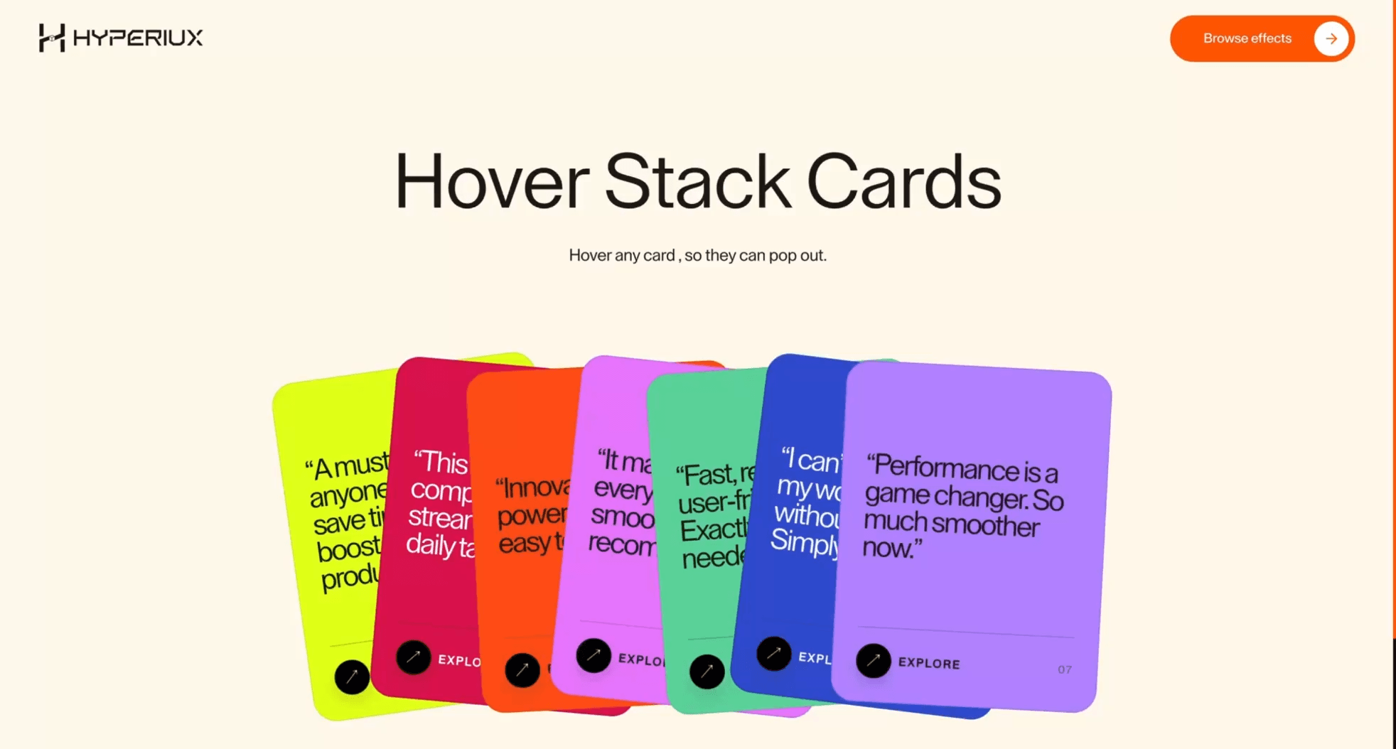
A card interaction component where hover or focus adds shallow depth to service, proof, and feature card groups.
Published On: June 4, 2026
Last Updated: August 17, 2026
Vanilla JS
Overview
Hover Stack adds motion to a component that already has a job: cards respond to hover with depth.
Use Hover Stack when a short group of cards should gain shallow depth on exploration. The hover state should add craft while the default card still contains the full heading, copy, and link.
The main risk is overlap. Hover motion must not cover neighbouring links, hide card copy, or make the section unusable on coarse pointers.
Install Command
npx hyperiux add hover-stackUsage Code
page.jsx
import HoverStack from '@/components/effects/hover-stack'

const page = () => {
  return (
    <>
    <HoverStack/>
    </>
  )
}
Component Code
index.jsx
// Built using Hyperiux Vault: https://vault.hyperiux.com
import React from "react";
import { HoverStackComp } from "./HoverStackComp";
const cards = [
    {
        id: 1,
        quote: "A must-have for anyone looking to save time and boost productivity.",
        tag: "Efficiency",
        bg: "#E4FF1A",
        accent: "text-[#1A1A1A]",
    },
    {
        id: 2,
        quote: "This tech has completely streamlined my daily tasks.",
        tag: "Workflow",
        bg: "#DD1155",
        accent: "text-[#ffffff]",
    },
    {
        id: 3,
        quote: "Innovative and powerful, yet so easy to use!",
        tag: "Simplicity",
        bg: "#FF5714",
        accent: "text-[#1A1A1A]",
    },
    {
        id: 4,
        quote: "It made everything smoother. Highly recommend!",
        tag: "Reliability",
        bg: "#E980FC",
        accent: "text-[#1A1A1A]",
    },
    {
        id: 5,
        quote: "Fast, reliable, and user-friendly. Exactly what I needed.",
        tag: "Speed",
        bg: "#67D6A3",
        accent: "text-[#1A1A1A]",
    },
    {
        id: 6,
        quote: "I can’t imagine my workflow without it now. Simply amazing!",
        tag: "Impact",
        bg: "#3454D1",
        accent: "text-[#ffffff]",
    },
    {
        id: 7,
        quote: "Performance is a game changer. So much smoother now.",
        tag: "Performance",
        bg: "#B98CFF",
        accent: "text-[#1A1A1A]",
    },
];
const HoverStack = ({ cardWidth = 280, cardHeight = 360, overlap = 96, pushDistance = 235, hoverLift = 30, spread = 24, rotation = 7, duration = 0.35, accentColor = "transparent", }) => {
    return (<>
            <section className="w-full h-fit bg-[#fff9ec] py-[10%] max-md:py-[20%] overflow-hidden flex flex-col gap-[7vw] justify-center items-center">
                <div className="flex flex-col w-full justify-center items-center gap-[1vw] max-md:gap-[3vw] text-center text-[#1a1a1a]">
                <h1 className=" text-[5.5vw] max-md:text-[9vw] max-[1025px]:text-[7vw]">
                    Hover Stack Cards
                </h1>
                <p className="text-[1.2vw] max-[1025px]:hidden">
                    Hover any card , so they can pop out.
                </p>

                </div>

                <HoverStackComp cards={cards} cardWidth={cardWidth} cardHeight={cardHeight} overlap={overlap} pushDistance={pushDistance} hoverLift={hoverLift} spread={spread} rotation={rotation} duration={duration} accentColor={accentColor}/>
            </section>
        </>);
};
export default HoverStack;
HoverStackComp.jsx
"use client";
import React, { useEffect, useMemo, useState } from "react";
const PRESET_ROTATIONS = [-8, 4, -3, 5, -4, 6, 3, -6, 2, -5];
const BREAKPOINT = 1025;
const HoverStackComp = ({ cards = [], cardWidth = 280, cardHeight = 360, overlap = 92, hoverLift = 28, pushDistance = 110, spread = 24, rotation = 7, duration = 0.35, accentColor = "transparent", className = "", }) => {
    const [activeIndex, setActiveIndex] = useState(null);
    const [isSmallScreen, setIsSmallScreen] = useState(false);
    const [hasMounted, setHasMounted] = useState(false);
    const [reduceMotion, setReduceMotion] = useState(() => typeof window !== "undefined" &&
        (window.matchMedia?.("(prefers-reduced-motion: reduce)")?.matches ?? false));
    useEffect(() => {
        const checkWidth = () => {
            setIsSmallScreen(window.innerWidth < BREAKPOINT);
        };
        checkWidth();
        setHasMounted(true);
        window.addEventListener("resize", checkWidth);
        return () => {
            window.removeEventListener("resize", checkWidth);
        };
    }, []);
    useEffect(() => {
        const mq = window.matchMedia?.("(prefers-reduced-motion: reduce)");
        if (!mq)
            return;
        const onChange = (event) => {
            setReduceMotion(event.matches);
            if (event.matches)
                setActiveIndex(null);
        };
        setReduceMotion(mq.matches);
        mq.addEventListener?.("change", onChange);
        return () => mq.removeEventListener?.("change", onChange);
    }, []);
    const preparedCards = useMemo(() => {
        const rotationScale = rotation / 7;
        return cards.map((card, index) => {
            const presetRotation = PRESET_ROTATIONS[index % PRESET_ROTATIONS.length] +
                (index % 2 === 0 ? 0 : 1);
            const baseX = index * overlap;
            return {
                ...card,
                _rotation: presetRotation * rotationScale,
                _baseX: baseX,
                _baseZ: index + 1,
            };
        });
    }, [cards, overlap, rotation]);
    const getCardStyle = (card, index) => {
        const isActive = activeIndex === index;
        const hasActive = activeIndex !== null;
        let x = card._baseX;
        let y = 0;
        let rotate = card._rotation;
        let zIndex = card._baseZ;
        let scale = 1;
        if (reduceMotion) {
            // No lift / push / rotate snap — only raise z-index so the card is readable.
            if (isActive)
                zIndex = 999;
            return {
                "--card-width": `${cardWidth}px`,
                "--card-height": `${cardHeight}px`,
                transform: `translate3d(${x}px, ${y}px, 0) rotate(${rotate}deg) scale(1)`,
                zIndex,
                transition: "none",
                background: card.bg,
            };
        }
        let boxShadow;
        if (hasActive) {
            if (index < activeIndex) {
                x -= pushDistance;
                y -= spread * 0.4;
            }
            else if (index > activeIndex) {
                x += pushDistance;
                y += spread * 0.4;
            }
            if (isActive) {
                x = card._baseX;
                y = -hoverLift;
                rotate = 0;
                zIndex = 999;
                scale = 1.035;
                boxShadow = `0 0 0 3px ${accentColor}`;
            }
        }
        const activeMs = Math.max(0, duration) * 1000;
        const transition = isActive
            ? `transform ${activeMs}ms cubic-bezier(0.22, 1.6, 0.32, 1), box-shadow ${activeMs * (900 / 700)}ms cubic-bezier(0.22, 1.6, 0.32, 1)`
            : hasActive
                ? `transform ${activeMs}ms cubic-bezier(0.22, 1, 0.36, 1), box-shadow ${activeMs}ms cubic-bezier(0.22, 1, 0.36, 1)`
                : `transform ${activeMs * (480 / 700)}ms cubic-bezier(0.4, 0, 0.2, 1), box-shadow ${activeMs * (380 / 700)}ms cubic-bezier(0.4, 0, 0.2, 1)`;
        return {
            "--card-width": `${cardWidth}px`,
            "--card-height": `${cardHeight}px`,
            transform: `translate3d(${x}px, ${y}px, 0) rotate(${rotate}deg) scale(${scale})`,
            zIndex,
            transition,
            background: card.bg,
            boxShadow,
        };
    };
    const totalWidth = preparedCards.length > 0
        ? preparedCards.at(-1)._baseX + cardWidth
        : cardWidth;
    if (!hasMounted) {
        return null;
    }
    return (<div className={`relative w-full px-[7vw] ${className}`}>
      {isSmallScreen ? (<div className="flex flex-col gap-[8.8vw]">
          {cards.map((card, index) => (<div key={card.id ?? index} className={`relative flex min-h-[58.667vw] w-full cursor-default select-none flex-col justify-between overflow-hidden rounded-[4.8vw] border border-black/10 p-[4.8vw] ${card.accent || ""}`} style={{
                    background: card.bg,
                }}>
              <div />

              <div className="relative z-2 flex flex-1 items-center">
                <p className="m-0 max-w-full text-[4vw] max-md:text-[4.5vw] leading-[1.05] tracking-[-0.04em]">
                  “{card.quote}”
                </p>
              </div>

              <div className="relative z-2 flex flex-col gap-[3.2vw]">
                <div className="h-[0.267vw] w-full bg-black/20"/>

                <div className="flex items-center justify-between gap-[3.2vw]">
                  <div className="flex items-center gap-[2.1vw]">
                    <div className="flex size-[8.5vw] items-center justify-center rounded-full border border-black/10 bg-black text-[0.82rem] text-white shadow-[0_0.586vw_1.367vw_rgba(0,0,0,0.12)]">
                      ↗
                    </div>

                    <span className="text-[2.667vw] font-semibold uppercase tracking-[0.14em]">
                      Explore
                    </span>
                  </div>

                  <span className="text-[2.6vw] uppercase tracking-[0.16em] opacity-70">
                    0{index + 1}
                  </span>
                </div>
              </div>
            </div>))}
        </div>) : (<div className="relative mx-auto" style={{
                "--stack-width": `${totalWidth}px`,
                "--stack-height": `${cardHeight + (reduceMotion ? 0 : hoverLift) + 24}px`,
                width: "var(--stack-width)",
                height: "var(--stack-height)",
            }}>
          {preparedCards.map((card, index) => (<div key={card.id ?? index} className={`absolute left-0 top-0 flex h-[var(--card-height)] w-[var(--card-width)] origin-[center_center] cursor-pointer select-none flex-col justify-between overflow-hidden rounded-[1.667vw] border border-black/10 p-[1.667vw] will-change-transform ${card.accent || ""}`} style={getCardStyle(card, index)} onMouseEnter={() => setActiveIndex(index)} onMouseLeave={() => setActiveIndex(null)}>
              <div />

              <div className="relative z-2 flex flex-1 items-center">
                <p className="m-0 max-w-[92%] text-[1.9rem] leading-[0.95] tracking-tighter">
                  “{card.quote}”
                </p>
              </div>

              <div className="relative z-2 flex flex-col gap-[1.111vw]">
                <div className="h-[0.069vw] w-full bg-black/20"/>

                <div className="flex items-center justify-between gap-[1.111vw]">
                  <div className="flex items-center gap-[0.556vw]">
                    <div className="flex size-[2.5vw] items-center justify-center rounded-full border border-black/10 bg-black text-[0.9rem] text-white shadow-[0_0.417vw_0.972vw_rgba(0,0,0,0.12)]">
                      ↗
                    </div>

                    <span className="text-[0.833vw] font-semibold uppercase tracking-[0.14em]">
                      Explore
                    </span>
                  </div>

                  <span className="text-[0.764vw] uppercase tracking-[0.16em] opacity-70">
                    0{index + 1}
                  </span>
                </div>
              </div>
            </div>))}
        </div>)}
    </div>);
};
export { HoverStackComp };
Example Production Use Case
An agency service page can use Hover Stack to give service cards a shallow sense of depth on exploration. The hover state adds craft while each card still reads as a normal link or content block.
Best Used For
- Service and proof-card groups where depth on hover makes exploration feel crafted.
- Desktop sections that still work as a normal stack of cards on touch devices.
- Card groups where hover depth adds craft while the non-hover state remains complete.
Not For
Not for mobile-first sections, dense comparison cards, or content where hover depth hides information users need to compare.
Performance Budget
Animate transform and shadow with restraint, keep layers small, and avoid large blur or filter effects on the whole card group.
Accessibility and Mobile
Mirror hover states with focus states, keep links reachable in order, and flatten the stack into normal cards on coarse pointers.
Common Mistakes
- Letting hover depth cover neighbouring card links.
- Forgetting focus-visible states.
- Using hover to reveal required copy.
Changelog
v1.0.1
Jul 30, 2026Added reduced-motion support and configurable stack controls.
v1.0.0
Jul 21, 2026Initial release
Props
| Prop | Type | Default | Description |
|---|---|---|---|
cardWidth | number | 280 | Width of each card in pixels. |
cardHeight | number | 360 | Height of each card in pixels. |
overlap | number | 96 | Horizontal overlap between resting cards in pixels. |
pushDistance | number | 235 | Distance neighboring cards are pushed aside on hover. |
hoverLift | number | 30 | Vertical lift applied to the hovered card in pixels. |
spread | number | 24 | Distance cards spread while hovered. |
rotation | number | 7 | Rotation amount applied to stacked items. |
duration | number | 0.35 | Hover animation duration. |
accentColor | color | transparent | Outline color shown around the active card. Transparent by default. |
Frequently Asked Questions
When should I use Hover Stack?
Use it when a card group needs items responding to hover with depth.
How should Hover Stack handle focus and links?
Cards should remain real links or contain real links in DOM order. Focus-visible states must stay visible and cannot be covered by neighbouring cards.
How should Hover Stack simplify on mobile?
Flatten the stack into normal cards with tap-safe spacing. Touch users should not need hover depth to understand the section.
Can Hover Stack improve service-card browsing?
Yes, when depth makes a small card group feel more crafted. It becomes noise when the card copy, links, or focus states are harder to scan.
What should reduced motion do for Hover Stack?
Remove hover depth, delayed transforms, and floating motion while keeping the card layout and focus states intact.
Request a Custom Creative Component Animation
Need a custom effect? Tell us what to create.


