Loading
Infinite Carousel
Let users drag, tap, or browse through looping cards when the section needs momentum instead of a hard first-to-last ending.
Published On: June 4, 2026
Last Updated: August 17, 2026
GSAPLucide-react
Overview
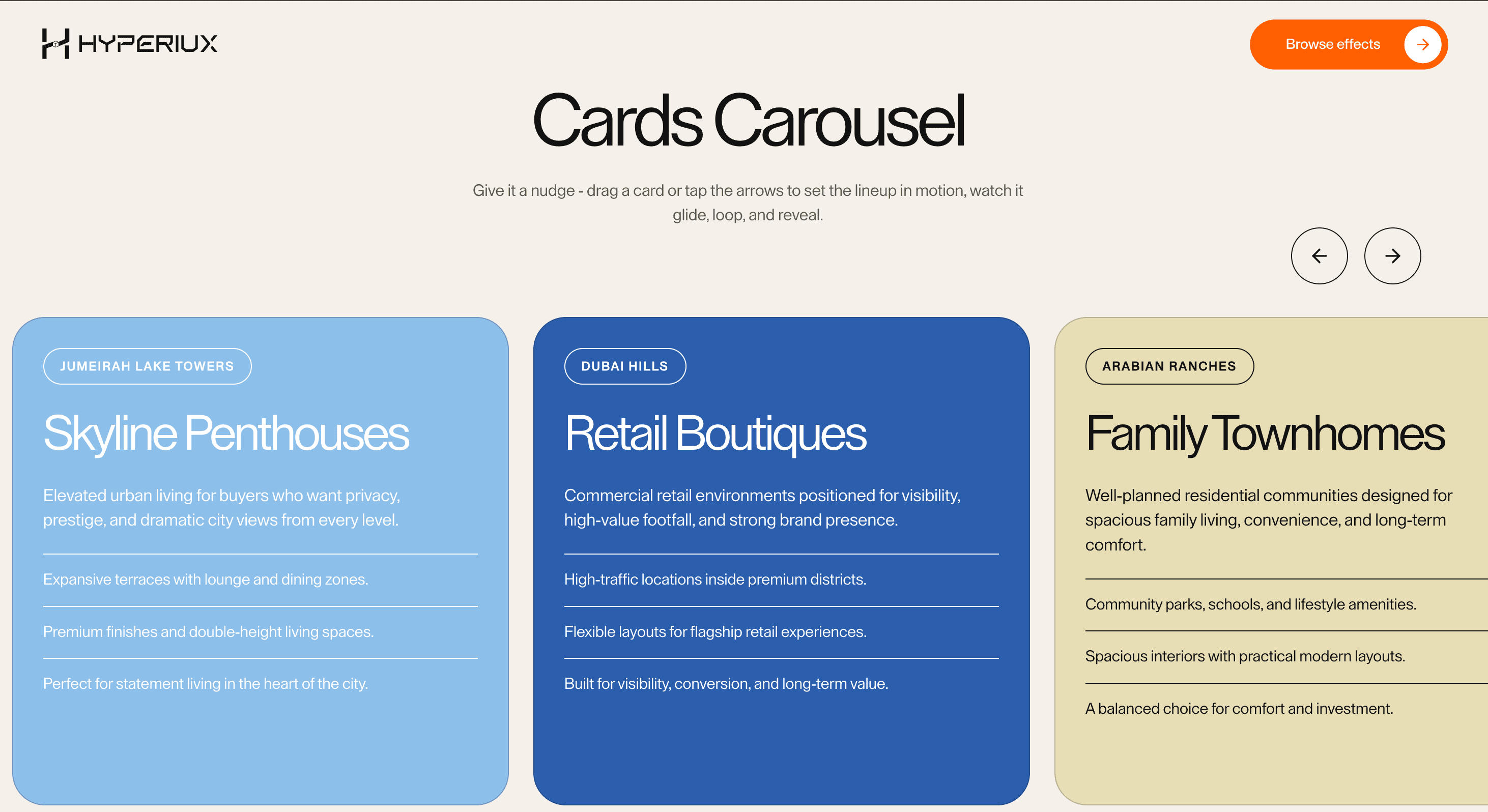
Infinite Carousel keeps a card sequence in motion. Drag it, tap it, nudge it, and the lineup keeps arriving.
Use Infinite Carousel when a small set of cards should feel browseable without a hard end. It fits product showcases, property listings, campaign cards, feature highlights, and visual collections where the user can explore at their own pace. The page job is momentum: the next card should feel close without hiding the current one.
The production risk is fake infinity. Looping carousels often duplicate slides visually and accidentally confuse focus order, screen readers, analytics, or active-state logic. The loop can be visual; the content model still needs to remain honest.
Install Command
This is a Pro Effect.
You can preview it now. Upgrade to Pro for instant install access.
Usage Code
This is a Pro Effect.
You can preview it now. Upgrade to Pro for instant install access.
Component Code
This is a Pro Effect.
You can preview it now. Upgrade to Pro for instant install access.
This is a Pro Effect.
You can preview it now. Upgrade to Pro for instant install access.
Example Production Use Case
A property landing page can use Infinite Carousel to let visitors drag through a set of premium locations and property types. The outcome is momentum: the browsing interaction feels fluid while each card still carries a clear title, description, and decision cue.
Best Used For
- Product, property, and campaign card sets where browsing is exploratory.
- Visual collections where drag and arrow controls make the section feel active.
- Medium-sized card groups where looping helps movement but does not replace discovery.
Not For
Not for pricing, legal copy, critical proof, comparison tables, or content users must see all at once.
Not for long card archives where filtering, search, or a grid would serve the visitor better.
Performance Budget
Keep card count reasonable, lazy-load heavy media, avoid expensive re-renders during drag, and clean up pointer and animation listeners on unmount.
Accessibility and Mobile
Provide arrow buttons, keyboard access, visible focus, and swipe support. Screen readers should encounter each real item once. Reduced-motion users should get a non-looping or static sequence.
Common Mistakes
- Duplicating looped cards in the accessibility tree.
- Autoplaying the carousel without pause or user control.
- Making drag the only way to reach hidden cards.
Changelog
v1.0.1
Jul 28, 2026Added reduced-motion support and configurable carousel controls.
v1.0.0
Jun 4, 2026Initial release
Props
| Prop | Type | Default | Description |
|---|---|---|---|
draggable | boolean | true | Allows dragging the carousel with pointer/touch input. |
gap | number | 32 | Spacing between carousel items. |
cardSize | number | 1 | Multiplier applied to card width and height. |
cardWidth | number | 512 | Desktop card width in pixels. |
cardHeight | number | 52 | Card minimum height in viewport height units. |
Frequently Asked Questions
When should I use Infinite Carousel?
Use it when a card set benefits from continuous, user-controlled browsing rather than a hard first-to-last sequence.
How do I keep an infinite loop accessible?
Keep the source items unique, hide cloned visual duplicates from assistive technology, and maintain predictable focus order.
Should Infinite Carousel autoplay?
Only if it pauses on hover, focus, touch, and reduced motion. User-driven drag and controls are usually better.
When is a grid better?
Use a grid when users need to scan, compare, filter, or see all items before making a choice.
What should happen on mobile?
Support swipe and reachable controls. Keep cards large enough to read and avoid drag behavior that fights vertical page scroll.
Can Hyperiux adapt Infinite Carousel for a real product page?
Yes. A custom version should define card structure, loop behavior, controls, accessibility states, mobile fallback, analytics events, and source handoff.
Request a Custom Carousel Animation
Need a custom effect? Tell us what to create.


