Loading
Grid Scale
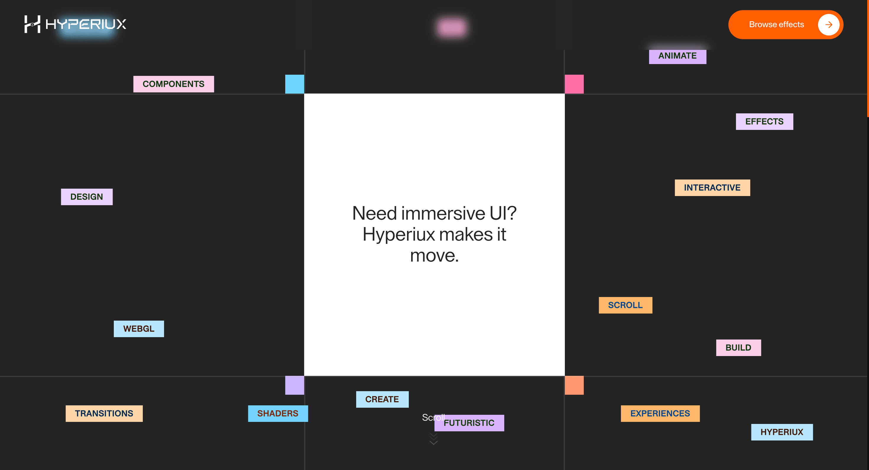
A scroll-linked grid effect that scales selected cards to guide attention toward the most important item.
Published On: June 4, 2026
Last Updated: August 17, 2026
GSAP
Overview
Grid Scale makes a product grid choose its emphasis. The most important card grows at the moment it should be noticed.
Use Grid Scale when a feature grid needs one item to gain weight at the right scroll moment. SaaS feature grids and product callout sections are the right fit because the effect can guide priority without replacing the grid. The page job is emphasis: the differentiating capability becomes harder to miss.
The main risk is transform overflow. Scale values must not create layout-affecting overflow, clipped focus outlines, or cumulative layout shift during scroll.
Install Command
This is a Pro Effect.
You can preview it now. Upgrade to Pro for instant install access.
Usage Code
This is a Pro Effect.
You can preview it now. Upgrade to Pro for instant install access.
Component Code
This is a Pro Effect.
You can preview it now. Upgrade to Pro for instant install access.
Example Production Use Case
A SaaS team building a pricing page with a feature comparison grid: Grid Scale anchors each row with a scale event so the most important capability arrives with weight rather than sitting flat in a table. The outcome is emphasis: the differentiating feature is harder to scroll past.
Best Used For
- Pricing or feature grids where one card deserves emphasis without breaking the table structure.
- Pricing or product grids where one featured item deserves a beat of prominence.
- Turns feature-grid scanning into emphasis, making the differentiating card harder to miss.
Not For
- Not for dense matrices where every row and column needs equal scanning weight.
- Not for grids where emphasis would misrepresent feature priority or pricing logic.
Performance Budget
Animate transform and opacity, avoid layout reads in scroll handlers, pre-size media, and clean up timelines/listeners when the route changes.
Accessibility and Mobile
The animated sequence must match DOM order. On mobile, replace pinned or horizontal mechanics with stacked sections, native swipe, or static cards.
Common Mistakes
- Scaling with width or height instead of transform.
- Letting enlarged cards clip focus outlines or overlap neighbors.
- Emphasizing a card that is not actually the priority.
Changelog
v1.0.1
Jul 23, 2026Added reduced-motion support and fixed scroll-trigger positioning.
v1.0.0
Jul 20, 2026Initial release
Props
| Prop | Type | Default | Description |
|---|---|---|---|
bgColor | color | #242424 | Background color of the section. |
panelColor | color | #ffffff | Background color of the expanding center panel. |
convergeStagger | number | 0.7 | Total stagger spread (seconds) as the floating keyword pills converge to center. |
Frequently Asked Questions
What makes Grid Scale different from a standard scroll reveal?
Rather than revealing items, it lets a grid choose emphasis: the key card grows at the moment it should be noticed while the others hold. The scaling directs attention within an existing layout. Use it when one item in a set deserves a beat of prominence as the user reaches it.
How should Grid Scale simplify on mobile devices?
On a single-column phone layout there's no grid to emphasize, so reduce scaling to a subtle highlight or drop it and present the cards in order. Avoid scale transforms that cause reflow. Reduced-motion users see the grid at its resting size.
What should developers test before shipping Grid Scale?
Confirm scaling uses transforms (not width/height) so it doesn't trigger layout shift, that the enlarged card doesn't overlap neighbors or clip, and that focus order is unchanged. Test across breakpoints where the grid reflows. Verify the static layout reads well on its own.
Which content structure works best with Grid Scale?
A grid where one item is genuinely more important a featured plan, a hero product, a primary capability. It's pointless when all items are equal. Make the emphasized item the one you actually want clicked.
When should I avoid Grid Scale even if the preview looks good?
Avoid it when every card is equal weight, when scaling would obscure adjacent content, or on a single-column layout. If the emphasis doesn't map to a real priority, it just adds noise. Skip it where a static highlight communicates the same thing.
Request a Custom Scroll Effect Animation
Need a custom effect? Tell us what to create.


