Loading
Shear Wipe
A slanted wipe transition that cuts between routes, sections, or content states with a sharp angled motion.
Published On: August 12, 2026
Last Updated: August 17, 2026
GSAP
Overview
Shear Wipe lets users move between related content states without leaving the page.
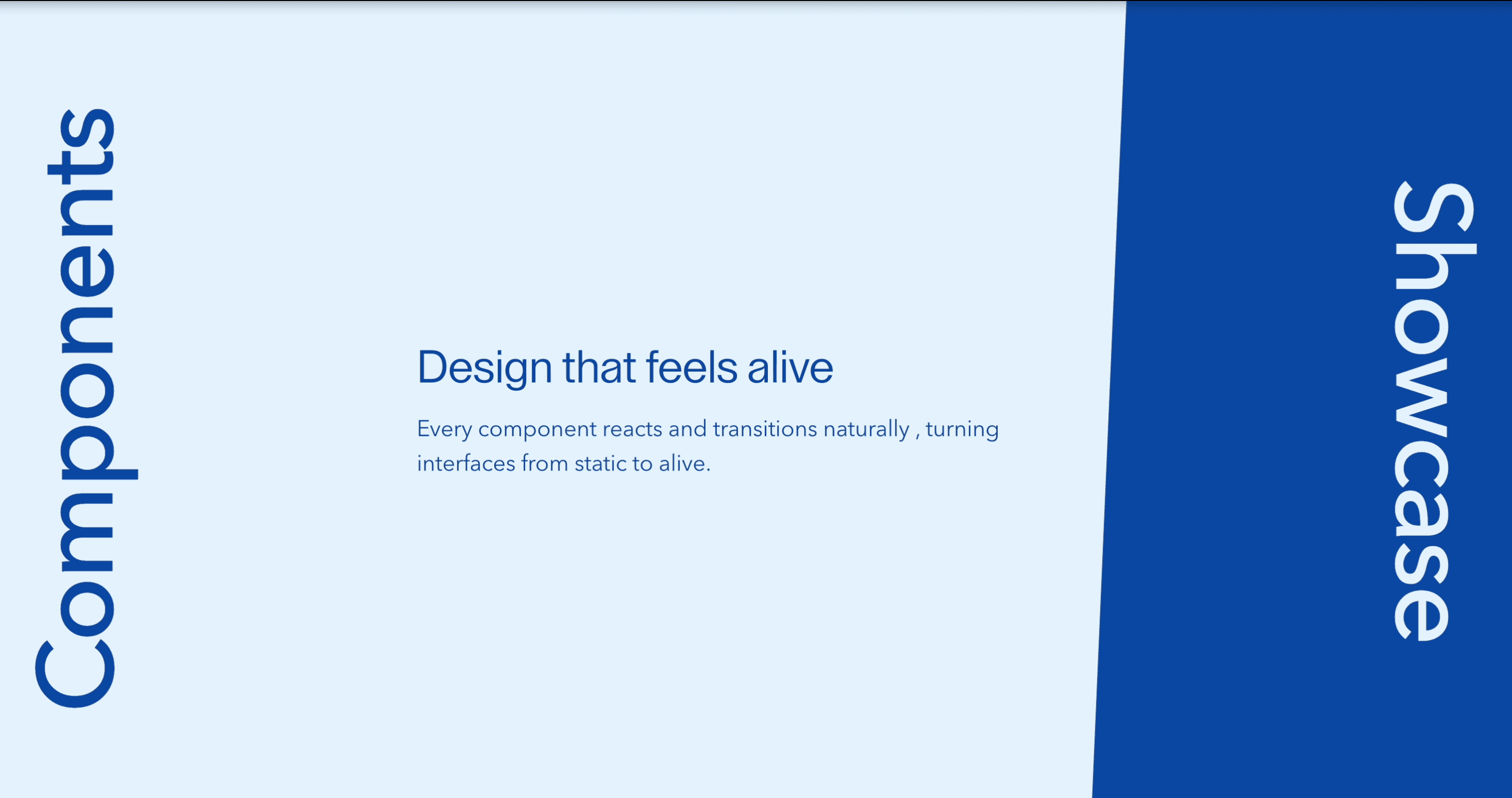
In the demo, the interaction is built around large vertical labels such as Components and Showcase. When the user clicks a label, the related content slides into view from the side through an angled, sheared panel. The result feels more graphic than a standard tabs component, but the job is still simple: show the right content when the user asks for it.
Use Shear Wipe when two or three related content views need to share the same space: components and showcases, features and proof, product story and results, design approach and implementation details. The page job is controlled switching: the visitor should understand which view is active, what changed, and where to click next.
The production risk is treating the visual wipe as the product. The component still needs real buttons, a visible active state, keyboard access, readable content, and a reduced-motion fallback. The angled wipe should make the content change feel designed; it should not make the user decode the interface.
Install Command
This is a Pro Effect.
You can preview it now. Upgrade to Pro for instant install access.
Usage Code
This is a Pro Effect.
You can preview it now. Upgrade to Pro for instant install access.
Component Code
This is a Pro Effect.
You can preview it now. Upgrade to Pro for instant install access.
This is a Pro Effect.
You can preview it now. Upgrade to Pro for instant install access.
Example Production Use Case
A product page can use Shear Wipe to switch between Components and Showcase. The Components view explains what the product includes, while the Showcase view presents examples, proof points, screenshots, or outcomes. The angled wipe makes the change feel intentional, but the user remains in control of what appears.
The outcome is focus: the page can show multiple sides of one story without stacking every detail vertically or forcing the visitor into a full carousel.
Best Used For
- Product sections where two or three related views need to share one visual space.
- Agency or portfolio pages that want to switch between capability copy and showcase proof.
- Feature sections where the selected content should slide into view with more personality than standard tabs.
- Landing pages where the content change should feel graphic, but still remain easy to understand.
Not For
Not for page transitions, route changes, checkout flows, dashboards, dense documentation, or large tab systems with many panels.
Not for critical information that users must see without clicking.
Not for content where hover is the only trigger. The selected view must be available through click, keyboard, and touch.
Performance Budget
Animate transform, clipping, and opacity rather than layout. Pre-size the content area where possible so the wipe does not create layout shift. Avoid loading heavy media for every inactive panel upfront, and clean up timers, observers, or animation instances when the component unmounts.
Accessibility and Mobile
Use real buttons or a proper tab pattern. Show a clear active state, preserve focus-visible styles, and make every content view reachable by keyboard and touch. The selected panel should have a readable heading or labelled region so users know what changed.
On mobile, collapse the layout into stacked panels, tap-controlled cards, or a simplified tab layout. Reduced-motion users should get an instant content switch or a short fade instead of the angled slide.
Common Mistakes
- Describing Shear Wipe as a page transition when it is a content-switching component.
- Making the vertical labels decorative instead of clickable controls.
- Hiding the active state, so users cannot tell whether Components or Showcase is selected.
- Putting essential copy only inside an animated layer that is hard to access.
- Shipping demo metrics or placeholder claims as real proof.
Changelog
v1.0.0
Aug 6, 2026Initial release
Props
| Prop | Type | Default | Description |
|---|---|---|---|
componentsTextColor | string | text-[#0D47A1] | Tailwind text color class for the Components panel copy. |
showcaseTextColor | string | text-white | Tailwind text color class for the Showcase panel copy. |
clipPathDuration | number | 0.9 | Duration of the shear clip-path wipe between panels. |
Frequently Asked Questions
What is Shear Wipe?
Shear Wipe is a React content-switching component that reveals different content views through an angled slide-in wipe.
Is Shear Wipe a page transition?
No. It does not change routes. It switches content inside the same component when a user clicks labels such as Components or Showcase.
When should I use Shear Wipe?
Use it when related content views need a shared space and a more graphic switch than normal tabs.
Should Shear Wipe use tabs?
If the views are mutually exclusive and function like tabs, use a proper tab pattern. If the labels behave more like mode switches, use real buttons with clear active state and a labelled content region.
How should Shear Wipe behave on mobile?
Use stacked panels, tap-safe controls, or a simplified tab layout. Avoid forcing large angled side panels onto small screens if they reduce readability.
What should reduced motion do for Shear Wipe?
Remove the angled slide and switch content instantly or with a short fade. The content should remain fully readable without motion.
Can Hyperiux adapt Shear Wipe for a real brand system?
Yes. A custom version should define content structure, trigger labels, active states, wipe direction, angle, timing, responsive behavior, accessibility states, reduced-motion fallback, source handoff, and implementation notes.
Request a Custom Creative Component Animation
Need a custom effect? Tell us what to create.


