Loading
Animated Form
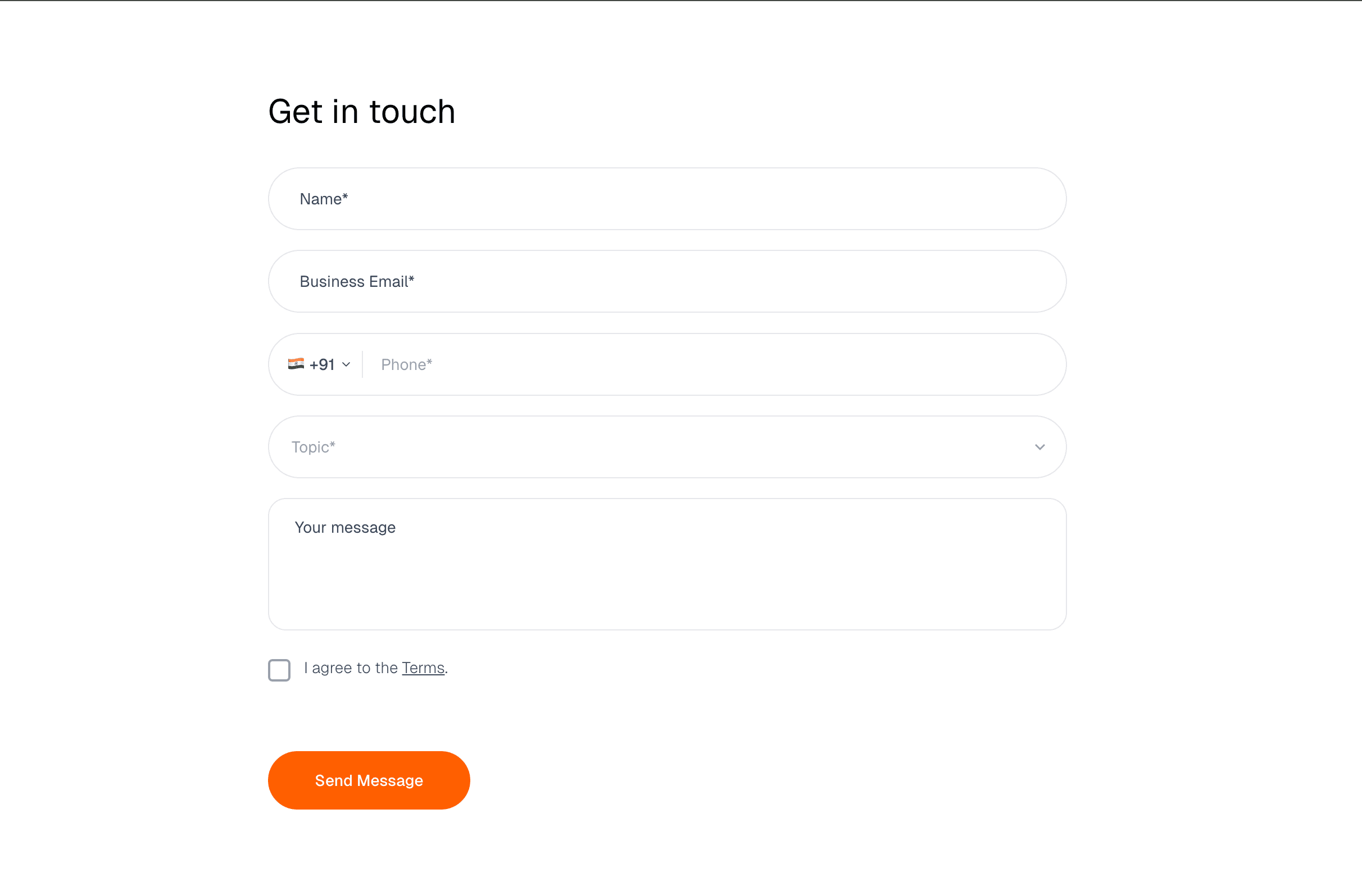
An interactive form component with clear animated states for labels, validation, errors, submit progress, and success feedback.
Published On: June 4, 2026
Last Updated: August 17, 2026
zod
Overview
Animated Form uses motion to clarify input, validation, submit, error, and success states without slowing the user down.
Use it for lead capture, demo requests, waitlists, onboarding, and contact flows where state clarity matters. The page job is completion: labels, validation, help text, error messages, submit state, and success confirmation should be obvious.
The risk in production is decoration during typing. Animation must never delay input, validation, error discovery, or submission feedback.
Install Command
This is a Pro Effect.
You can preview it now. Upgrade to Pro for instant install access.
Usage Code
This is a Pro Effect.
You can preview it now. Upgrade to Pro for instant install access.
Component Code
This is a Pro Effect.
You can preview it now. Upgrade to Pro for instant install access.
Example Production Use Case
A demo-request page can use Animated Form when the team needs clear labels, inline validation, submit progress, error recovery, and a visible success state without adding friction.
Best Used For
- Lead-capture forms that need validation clarity and visible submit state.
- Demo request and waitlist flows where errors must be easy to recover from.
- Product pages where the form is the conversion point, not a design flourish.
Not For
Not for flows where animation delays typing, validation, error discovery, payment, or submit feedback.
Performance Budget
Keep typing independent from decorative motion, debounce expensive validation, and avoid re-rendering the full form on every keystroke.
Accessibility and Mobile
Every field needs a label or accessible name, errors need field association, and submit state should be perceivable without relying on colour alone. On mobile, keep inputs large and keyboard-friendly.
Common Mistakes
- Animating labels until the accessible name becomes unclear.
- Showing errors visually without tying them to fields.
- Making users wait for decoration before the form accepts input.
Changelog
v1.0.1
Jul 30, 2026Added configurable color, border-radius, and duration controls.
v1.0.0
Jul 23, 2026Initial release
API Reference
| Prop | Type | Default | Description |
|---|---|---|---|
backgroundColor | color | #ffffff | Page background color around the form. |
textColor | color | #111111 | Text color for the form heading and field labels. |
inputBackgroundColor | color | #ffffff | Background color for inputs, textarea, and select controls. |
fieldBorderColor | color | #e5e7eb | Default border color for form controls. |
inputRoundedness | number | 28 | Border radius for inputs and the submit button in pixels. |
duration | number | 0.3 | Transition duration for control focus and button effects in seconds. |
Frequently Asked Questions
Which states must the Animated Form page document?
Label, focus, validation, submit/pending, error, and success states. A form page without state rules is not launch-ready.
How should errors be shown?
Inline, tied to the field, written plainly, and not hidden behind animation. Users should know what failed and how to fix it.
Can animated forms improve conversion?
Only when motion clarifies state. If it delays typing, hides validation, or makes errors feel playful, it hurts completion.
Can Hyperiux adapt Animated Form for a real brand system?
Yes. A custom version should define content structure, accessibility behavior, motion rules, reduced-motion behavior, source handoff, and implementation notes for the specific page job.
Request a Custom Creative Component Animation
Need a custom effect? Tell us what to create.


