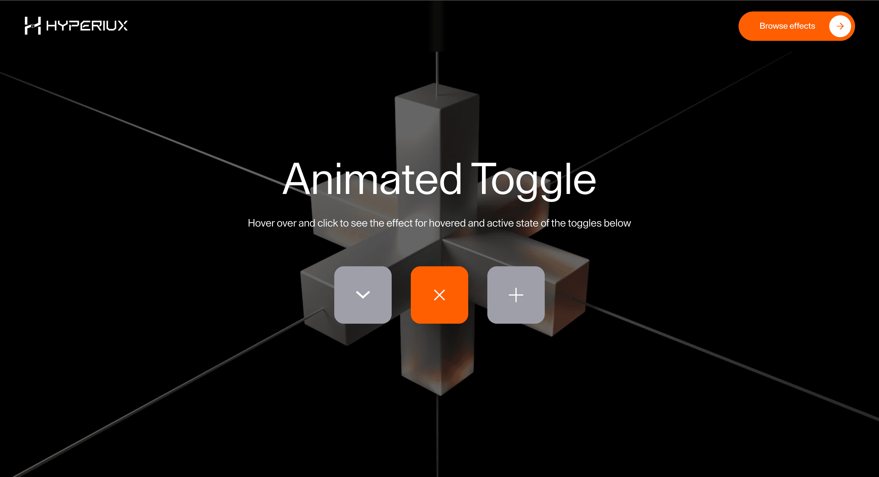
Animated Toggle gives a button or link a small, useful moment of feedback: a binary choice confirms state.
Use it where a CTA needs to feel responsive and intentional, not theatrical. A button should confirm action, state, or direction; it should not become a tiny stage play that delays the click.
The thing to watch is keeping the markup honest. Use genuine button and anchor elements, preserve focus, fire instantly, and make loading and disabled states obvious. The animation decorates the action; it is never the action.
Use this as button-interaction implementation guidance. Verify the shipped element semantics, anchor/button mode, disabled and loading states, focus-visible behavior, keyboard activation, and reduced-motion handling before relying on exact props, defaults, imports, or installation steps.
Best Used For
Pricing, settings, and plan-choice moments where a binary state needs visible confirmation.
Interfaces where the selected state matters more than hover decoration.
Animated Toggle adds feedback to an action without weakening semantics, focus, or activation speed.
Not For
Not for destructive actions, unclear states, or places where animation hides the label or delays activation.
Performance Budget
Keep feedback fast, avoid layout-triggering letter movement, and preserve instant activation.
Accessibility and Mobile
Use real buttons or anchors, visible focus-visible styles, and clear loading/disabled states. Touch targets should stay large enough on mobile.
Common Mistakes
Building Animated Toggle with divs instead of real buttons or links.
Hiding the label during hover.
Forgetting loading and disabled states.
Frequently Asked Questions
When should I use Animated Toggle?
Use it when a pricing or settings switch needs a binary choice that confirms state without delaying the action.
Should Animated Toggle use a real button or link?
Yes. Use `<button>` for actions and `<a>` for navigation.
How should Animated Toggle handle focus?
Use visible focus-visible styles and support keyboard activation.
How should loading states work with Animated Toggle?
Loading should be visually clear and programmatically communicated without hiding the label.
What should reduced motion do for Animated Toggle?
Remove long staggers, scrambles, and looping emphasis while keeping instant state feedback.


