Loading
Infinite Grid Gallery
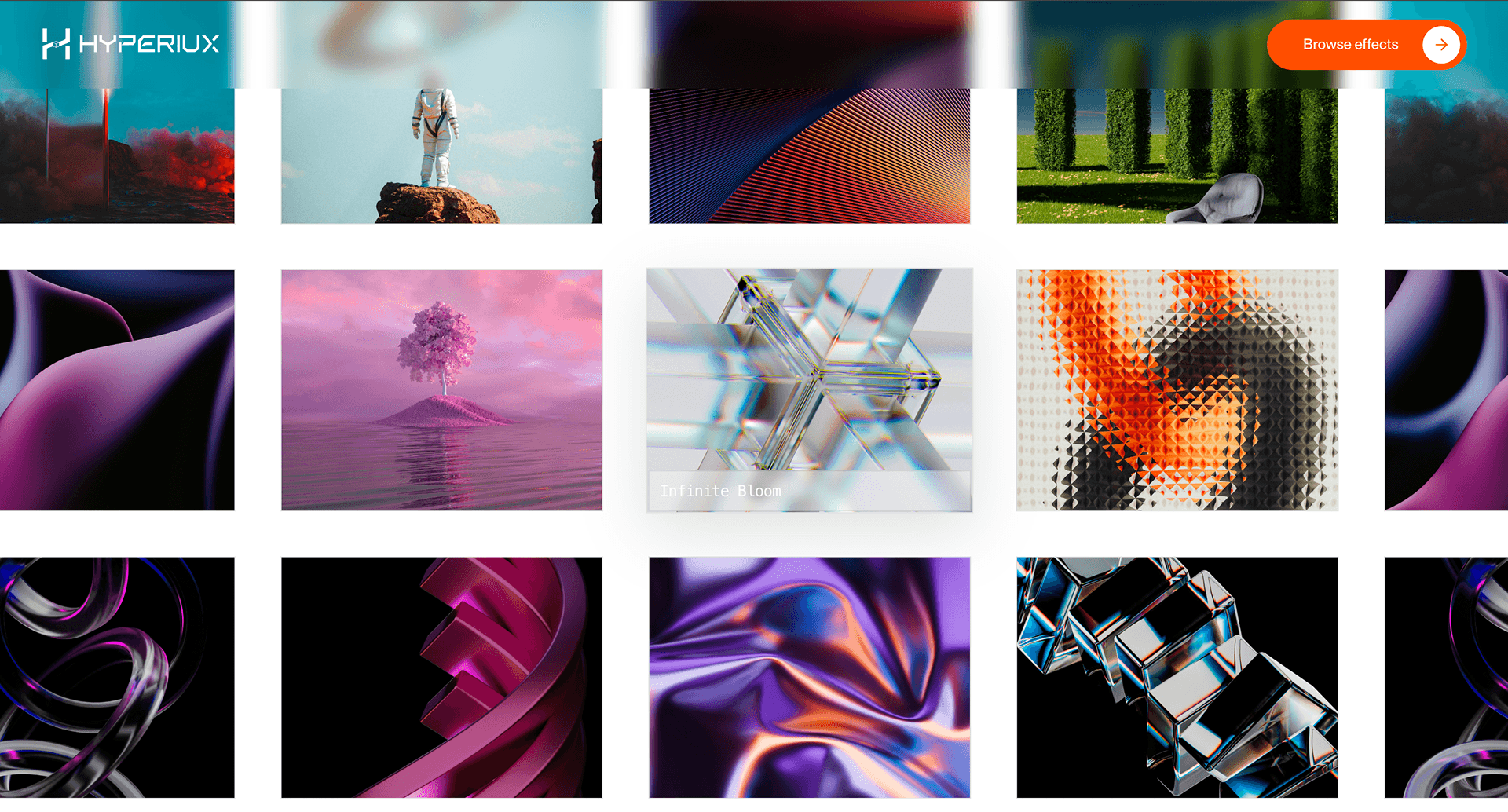
Transform image browsing into an endless spatial grid for portfolios, campaigns, and visual archives that need more depth than a flat gallery.
Published On: July 21, 2026
Last Updated: August 17, 2026
CSS
Overview
Infinite Grid Gallery turns a flat collection of visuals into a field you can move through. The gallery stops feeling like a page section and starts feeling like space.
Use Infinite Grid Gallery when a portfolio, campaign archive, or image-led product story needs more presence than a normal grid. It works best when the visitor is supposed to browse by movement, not compare every item in one glance. The page job is exploration: images should keep arriving without making the user feel trapped in a canvas.
The production risk is orientation. Infinite galleries can become impressive and useless very quickly if the user loses their position, cannot open a real item, or cannot access the same content without WebGL. The fallback should be a clean, crawlable gallery grid in DOM order.
Install Command
This is a Pro Effect.
You can preview it now. Upgrade to Pro for instant install access.
Usage Code
This is a Pro Effect.
You can preview it now. Upgrade to Pro for instant install access.
Component Code
This is a Pro Effect.
You can preview it now. Upgrade to Pro for instant install access.
Example Production Use Case
A creative studio can use Infinite Grid Gallery on a selected-work page where the goal is not fast comparison, but atmosphere and curiosity. The visitor moves through a field of project stills, selects a focused image, and enters the case study. The outcome is exploration: the work feels abundant without dumping every thumbnail into a static wall.
Best Used For
- Portfolio and campaign galleries where visual abundance is the point.
- Studio archives that need movement, depth, and a more memorable browsing surface.
- Image-led pages where each item can still resolve into a real link, caption, or case study.
Not For
Not for ecommerce catalogues, pricing pages, comparison grids, documentation, or routes where users need fast scanning.
Not for image sets where every item must be visible at once before the visitor can make a decision.
Performance Budget
Cap device pixel ratio, compress textures, lazy-load image assets carefully, pause rendering when offscreen, and dispose of geometries, materials, and textures on route change. Avoid turning one gallery into a GPU donation box.
Accessibility and Mobile
The gallery items need text equivalents, real links, and a fallback list or grid. On mobile, reduce camera movement, limit texture count, or switch to a static gallery. Reduced-motion users should get the same images without infinite movement.
Common Mistakes
- Rendering the only gallery content inside WebGL.
- Loading too many high-resolution textures before the section is used.
- Creating an endless field with no focused item, progress cue, or escape path.
Changelog
v1.0.1
Jul 21, 2026Add prefers-reduced-motion support
v1.0.0
Jul 20, 2026Initial release
API Reference
| Prop | Type | Default | Description |
|---|---|---|---|
columns | number | 4 | Desktop grid column count. |
gap | number | 44 | Spacing between grid images. |
speed | number | 1 | Grid movement speed. |
imageScale | number | 1 | Scale applied to gallery images. |
Frequently Asked Questions
When should I use Infinite Grid Gallery?
Use it when an image-led portfolio, campaign archive, or visual showcase needs spatial browsing instead of a standard grid.
Does Infinite Grid Gallery need a fallback?
Yes. The same items should render as a normal HTML gallery or list when WebGL is unavailable, reduced motion is enabled, or the device cannot support the scene smoothly.
How many images should it load at once?
Only the visible and near-visible set should be active. The cost is driven by texture size, draw calls, and how much of the scene stays alive, not just the number of items in your database.
How should users open a project from the gallery?
Every meaningful item should map to a real link, modal, or detail action. The WebGL surface can make the browsing feel dimensional, but the click path still needs standard navigation behavior.
What should happen on mobile?
Use a simplified grid, swipeable gallery, or reduced camera movement. A phone should not be forced through a desktop-scale infinite field.
Can Hyperiux adapt Infinite Grid Gallery for a real brand system?
Yes. A custom version should define image structure, texture treatment, camera rules, fallback layout, performance budget, source handoff, and implementation notes for the specific portfolio or launch context.
Request a Custom WebGL Animation
Need a custom effect? Tell us what to create.


