Loading
Animated Tabs
A keyboard-friendly animated tabs component for organizing dense product content, use cases, integrations, and equal-weight panels.
Published On: June 4, 2026
Last Updated: August 17, 2026
GSAP
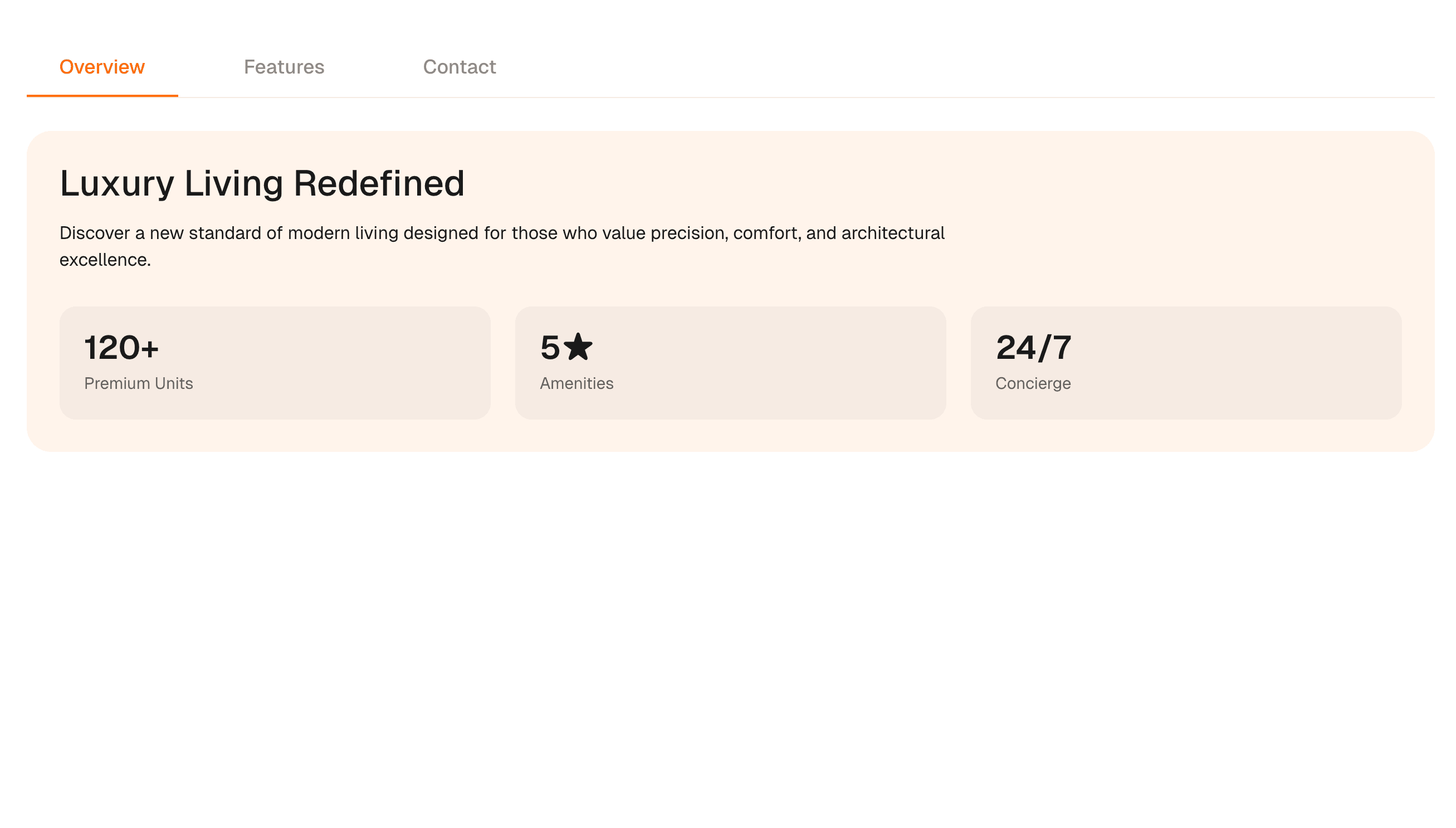
Overview
Animated Tabs organize dense product content into a tablist, tabs, and tab panels that stay readable before animation enters.
Use Animated Tabs when related content has equal standing and the first screen would become too heavy if every panel appeared at once. The page job is organized depth: users should understand the available panels and move between them with pointer or keyboard.
In production, the risk is hidden content that cannot be reached predictably. Implement tablist, tab, tabpanel, selected state, and arrow-key behavior before adding panel motion.
Install Command
This is a Pro Effect.
You can preview it now. Upgrade to Pro for instant install access.
Usage Code
This is a Pro Effect.
You can preview it now. Upgrade to Pro for instant install access.
Component Code
This is a Pro Effect.
You can preview it now. Upgrade to Pro for instant install access.
Example Production Use Case
A SaaS product page can use Animated Tabs to organize use cases, integrations, feature groups, or implementation options while keeping each panel crawlable or represented in server-rendered copy.
Best Used For
- Product sections where dense information needs clear grouping.
- Integration, pricing-detail, or use-case sections where each panel has equal weight.
- Pages where keyboard navigation and selected state are part of trust.
Not For
Not for content that must be compared side by side, discovered through search snippets, or read in one continuous flow.
Performance Budget
Avoid remounting heavy panels on every tab change unless necessary, pre-size panel space where possible, and keep transitions short.
Accessibility and Mobile
Expose tablist, tab, selected state, and tabpanel relationships where appropriate. On mobile, switch to stacked sections when horizontal tabs become cramped.
Common Mistakes
- Using tabs for unrelated content.
- Hiding important SEO copy in client-only inactive panels.
- Skipping keyboard movement between tabs.
Changelog
v1.0.1
Jul 31, 2026Added reduced-motion support, reworked the props API (defaultActiveIndex, animationType, slideDistance, accentColor, duration), and changed the tab-index control to a name-based dropdown.
v1.0.0
Jul 21, 2026Initial release
API Reference
| Prop | Type | Default | Description |
|---|---|---|---|
defaultActiveIndex | number | 0 | Index of the initially active tab. |
animationType | string | slide | Panel transition style. |
slideDistance | number | 40 | Horizontal travel distance for the slide transition, in pixels. |
accentColor | color | #ff6b00 | Color used for the active tab label and indicator. |
duration | number | 0.35 | Panel and indicator transition duration in seconds. |
Frequently Asked Questions
Which keyboard behavior do Animated Tabs need?
Arrow-key movement between tabs, clear selected state, and predictable activation. Pointer-only tabs are not production-ready.
When should animated tabs become stacked sections?
On mobile or when panel content is long enough that switching hides too much context.
Are animated tabs good for SEO?
They can be if content is present in crawlable HTML or represented clearly in the server-rendered page. Do not bury unique content in client-only panels.
Can Hyperiux adapt Animated Tabs for a real brand system?
Yes. A custom version should define content structure, accessibility behavior, motion rules, reduced-motion behavior, source handoff, and implementation notes for the specific page job.
Request a Custom Creative Component Animation
Need a custom effect? Tell us what to create.


