Loading
Animated FAQ
A button-controlled FAQ accordion for pricing pages, product objections, landing pages, and conversion-focused answer sections.
Published On: June 9, 2026
Last Updated: August 17, 2026
GSAP Lucide-react
Overview
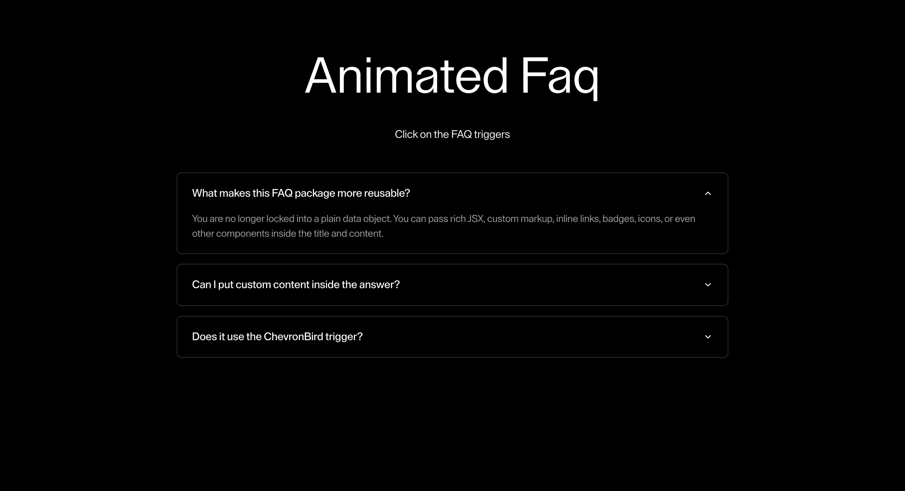
Animated FAQ is a button-controlled accordion for objections that appear at the decision point.
Use it on pricing, landing, product, and comparison pages where the visitor needs a specific answer before clicking the CTA. The page job is objection handling: questions open cleanly, answers remain crawlable, and the interaction clarifies state.
In production, the risk is turning answers into hidden decoration. Each question needs a real button, aria-expanded, a labelled answer region, and a reduced-motion state that opens instantly.
Install Command
npx hyperiux add animated-faqUsage Code
page.jsx
import {
  FAQContent,
  FAQGroup,
  FAQTitle,
  FAQWrapper,
} from "@/components/effects/animated-faq";

export default function FAQDemo() {
  const defaultOpenItems = faqItems
    .filter((item) => item.defaultOpen)
    .map((item) => item.id);

  return (
    <>
    <section className="bg-black h-screen px-8 py-20 text-white">
        <div className="max-w-5xl mx-auto text-center text-white mb-12">
                {/* Heading */}
                <h1 className="text-[5.5vw] max-sm:text-[11vw] max-md:text-[8vw]">
                Animated Faq
                </h1>

                {/* Subtext */}
                <p className="mt-8 text-[1.2vw] max-sm:text-[4.5vw] max-md:mt-4 max-md:text-[3vw]">
                  Click on the FAQ triggers
                </p>

              </div>
      <div className="mx-auto max-w-4xl space-y-4">
        <FAQGroup allowMultiple={false} defaultOpenItems={defaultOpenItems}>
          {faqItems.map((item) => (
            <FAQWrapper
              key={item.id}
              itemId={item.id}
              className="rounded-md border border-white/20 px-6 py-5"
              titleClassName="text-[1.1rem] font-medium text-white"
              iconSize={16}
              iconStrokeWidth={2}
              duration={0.5}
            >
              <FAQTitle className="pb-0">{item.title}</FAQTitle>

              <FAQContent className="pt-4 text-neutral-400">
                {item.content}
              </FAQContent>
            </FAQWrapper>
          ))}
        </FAQGroup>
      </div>
    </section>
    </>
  );
}
const faqItems = [
  {
    id: "faq-1",
    title: "What makes this FAQ package more reusable?",
    content: (
      <>
        You are no longer locked into a plain data object. You can pass rich
        JSX, custom markup, inline links, badges, icons, or even other
        components inside the title and content.
      </>
    ),
    defaultOpen: true,
  },
  {
    id: "faq-2",
    title: "Can I put custom content inside the answer?",
    content: (
      <div className="space-y-3">
        <p>Yes. This content area accepts full React nodes, not just text.</p>
        <ul className="list-disc pl-5 space-y-1">
          <li>Paragraphs</li>
          <li>Lists</li>
          <li>Buttons</li>
          <li>Inline links</li>
        </ul>
      </div>
    ),
    defaultOpen: false,
  },
  {
    id: "faq-3",
    title: "Does it use the ChevronBird trigger?",
    content: (
      <>
        Yes. The open and close state is visually driven by ChevronBird, so your
        motion language stays consistent across the whole system.
      </>
    ),
    defaultOpen: false,
  },
];
Component Code
index.jsx
import { FAQContent, FAQGroup, FAQTitle, FAQWrapper, } from "./AnimatedFaqComp";
import React from "react";
export { FAQContent, FAQGroup, FAQTitle, FAQWrapper };
const faqItems = [
    {
        id: "faq-1",
        title: "What makes this FAQ package more reusable?",
        content: (<>
        You are no longer locked into a plain data object. You can pass rich
        JSX, custom markup, inline links, badges, icons, or even other
        components inside the title and content.
      </>),
        defaultOpen: true,
    },
    {
        id: "faq-2",
        title: "Can I put custom content inside the answer?",
        content: (<div className="space-y-3">
        <p>Yes. This content area accepts full React nodes, not just text.</p>
        <ul className="list-disc pl-5 space-y-1">
          <li>Paragraphs</li>
          <li>Lists</li>
          <li>Buttons</li>
          <li>Inline links</li>
        </ul>
      </div>),
        defaultOpen: false,
    },
    {
        id: "faq-3",
        title: "Does it use the ChevronBird trigger?",
        content: (<>
        Yes. The open and close state is visually driven by ChevronBird, so your
        motion language stays consistent across the whole system.
      </>),
        defaultOpen: false,
    },
];
export default function AnimatedFaq() {
    const defaultOpenItems = faqItems
        .filter((item) => item.defaultOpen)
        .map((item) => item.id);
    return (<div className="mx-auto max-w-4xl space-y-4">
      <FAQGroup allowMultiple={false} defaultOpenItems={defaultOpenItems}>
        {faqItems.map((item) => (<FAQWrapper key={item.id} itemId={item.id} className="rounded-md border border-white/20 px-6 py-5" titleClassName="text-[1.1rem] font-medium text-white" iconSize={16} iconStrokeWidth={2} duration={0.5}>
            <FAQTitle className="pb-0">{item.title}</FAQTitle>

            <FAQContent className="pt-4 text-neutral-400">
              {item.content}
            </FAQContent>
          </FAQWrapper>))}
      </FAQGroup>
    </div>);
}
AnimatedFaqComp.jsx
"use client";
import React, { createContext, useCallback, useContext, useEffect, useId, useLayoutEffect, useMemo, useRef, useState, } from "react";
import gsap from "gsap";
import { ChevronDown, ChevronRight } from "lucide-react";
const useIsomorphicLayoutEffect = typeof window !== "undefined" ? useLayoutEffect : useEffect;
const FAQContext = createContext(null);
const FAQGroupContext = createContext(null);
const useFAQContext = () => {
    const context = useContext(FAQContext);
    if (!context) {
        throw new Error("FAQTitle and FAQContent must be used inside FAQWrapper.");
    }
    return context;
};
export function FAQGroup({ children, allowMultiple = false, defaultOpenItems = [], value, onChange, }) {
    const isControlled = Array.isArray(value);
    const [internalOpenItems, setInternalOpenItems] = useState(defaultOpenItems);
    const openItems = isControlled ? value : internalOpenItems;
    const toggleItem = useCallback((itemId) => {
        const next = (() => {
            const isOpen = openItems.includes(itemId);
            if (allowMultiple) {
                return isOpen
                    ? openItems.filter((id) => id !== itemId)
                    : [...openItems, itemId];
            }
            return isOpen ? [] : [itemId];
        })();
        if (!isControlled) {
            setInternalOpenItems(next);
        }
        onChange?.(next);
    }, [allowMultiple, isControlled, onChange, openItems]);
    const contextValue = useMemo(() => ({
        allowMultiple,
        openItems,
        toggleItem,
    }), [allowMultiple, openItems, toggleItem]);
    return (<FAQGroupContext.Provider value={contextValue}>
      {children}
    </FAQGroupContext.Provider>);
}
export function FAQWrapper({ children, className = "", titleClassName = "", contentClassName = "", iconClassName = "", iconSize = 18, iconStrokeWidth = 2, duration = 0.45, defaultOpen = false, controlledOpen, onToggle, itemId, }) {
    const group = useContext(FAQGroupContext);
    const generatedId = useId();
    const resolvedItemId = itemId ?? generatedId;
    const isStandaloneControlled = typeof controlledOpen === "boolean";
    const [internalOpen, setInternalOpen] = useState(defaultOpen);
    const isOpen = group
        ? group.openItems.includes(resolvedItemId)
        : isStandaloneControlled
            ? controlledOpen
            : internalOpen;
    const contentOuterRef = useRef(null);
    const contentInnerRef = useRef(null);
    const openHeightRef = useRef(0);
    const reduceMotionRef = useRef(typeof window !== "undefined" &&
        (window.matchMedia?.("(prefers-reduced-motion: reduce)")?.matches ?? false));
    const contentId = useId();
    const buttonId = useId();
    useEffect(() => {
        const mq = window.matchMedia?.("(prefers-reduced-motion: reduce)");
        if (!mq)
            return;
        const onChange = (event) => {
            reduceMotionRef.current = event.matches;
        };
        reduceMotionRef.current = mq.matches;
        mq.addEventListener?.("change", onChange);
        return () => mq.removeEventListener?.("change", onChange);
    }, []);
    const handleToggle = () => {
        if (group) {
            group.toggleItem(resolvedItemId);
            onToggle?.(!isOpen);
            return;
        }
        if (isStandaloneControlled) {
            onToggle?.(!controlledOpen);
            return;
        }
        setInternalOpen((prev) => {
            const next = !prev;
            onToggle?.(next);
            return next;
        });
    };
    const handleWrapperClick = (event) => {
        const isInteractive = event.target.closest("a, button, input, textarea, select");
        if (isInteractive)
            return;
        handleToggle();
    };
    const handleKeyDown = (event) => {
        if (event.key === "Enter" || event.key === " ") {
            event.preventDefault();
            handleToggle();
        }
    };
    useIsomorphicLayoutEffect(() => {
        if (!contentOuterRef.current || !contentInnerRef.current)
            return;
        const outer = contentOuterRef.current;
        const inner = contentInnerRef.current;
        gsap.killTweensOf([outer, inner]);
        const tweenDuration = reduceMotionRef.current ? 0 : duration;
        if (isOpen) {
            gsap.set(outer, {
                overflow: "hidden",
                height: "auto",
            });
            const targetHeight = outer.scrollHeight;
            openHeightRef.current = targetHeight;
            gsap.set(outer, { height: 0 });
            gsap.fromTo(outer, { height: 0 }, {
                height: targetHeight,
                duration: tweenDuration,
                ease: "power3.out",
                onComplete: () => {
                    gsap.set(outer, {
                        height: "auto",
                        overflow: "visible",
                    });
                },
            });
        }
        else {
            gsap.set(outer, { overflow: "hidden" });
            gsap.fromTo(outer, { height: openHeightRef.current }, {
                height: 0,
                duration: tweenDuration,
                ease: "power3.out",
            });
        }
    }, [isOpen, duration]);
    const value = {
        isOpen,
        contentOuterRef,
        contentInnerRef,
        contentId,
        buttonId,
        titleClassName,
        contentClassName,
        iconClassName,
        iconSize,
        iconStrokeWidth,
    };
    return (<FAQContext.Provider value={value}>
      <div className={`cursor-pointer ${className}`} role="button" tabIndex={0} aria-expanded={isOpen} aria-controls={contentId} id={buttonId} onClick={handleWrapperClick} onKeyDown={handleKeyDown}>
        {children}
      </div>
    </FAQContext.Provider>);
}
export function FAQTitle({ children, className = "", showIcon = true, iconPosition = "right", iconMode = "rotate", }) {
    const { isOpen, titleClassName, iconClassName, iconSize, iconStrokeWidth, } = useFAQContext();
    const icon = showIcon ? (<div className={`shrink-0 ${iconClassName}`}>
      {iconMode === "rotate-left-down" ? (<ChevronRight size={iconSize} strokeWidth={iconStrokeWidth} className={`transition-transform duration-300 ease-out motion-reduce:transition-none ${isOpen ? "rotate-90" : "rotate-0"}`} aria-hidden="true"/>) : (<ChevronDown size={iconSize} strokeWidth={iconStrokeWidth} className={`transition-transform duration-300 ease-out motion-reduce:transition-none ${isOpen ? "rotate-180" : "rotate-0"}`} aria-hidden="true"/>)}
    </div>) : null;
    return (<div className={`flex w-full items-center justify-between gap-6 ${titleClassName} ${className}`}>
      {iconPosition === "left" ? (<>
          {icon}
          <div className="flex-1">{children}</div>
        </>) : (<>
          <div className="flex-1">{children}</div>
          {icon}
        </>)}
    </div>);
}
export function FAQContent({ children, className = "", innerClassName = "", }) {
    const { isOpen, contentOuterRef, contentInnerRef, contentId, buttonId, contentClassName, } = useFAQContext();
    return (<div id={contentId} ref={contentOuterRef} role="region" aria-labelledby={buttonId} style={{
            height: isOpen ? "auto" : 0,
            overflow: isOpen ? "visible" : "hidden",
        }} className={contentClassName}>
      <div ref={contentInnerRef} className={className}>
        <div className={innerClassName}>{children}</div>
      </div>
    </div>);
}
export const AnimatedFAQ = {
    Group: FAQGroup,
    Wrapper: FAQWrapper,
    Title: FAQTitle,
    Content: FAQContent,
};
export default AnimatedFAQ;
Example Production Use Case
A pricing page can place Animated FAQ below plan cards so questions about contracts, refunds, implementation, and support open exactly where hesitation appears.
Best Used For
- Pricing pages where objections need to open beside the CTA.
- Product landing pages where answers should stay crawlable but not dominate the first screen.
- Sales pages where accordion state should be clear for keyboard and screen-reader users.
Not For
Not for hiding essential policy, pricing, support, or legal details that users must see without opening an accordion.
Performance Budget
Keep answer panels light, avoid layout-heavy height animation across many open items, and render answer copy as normal HTML so search and no-JS paths still see it.
Accessibility and Mobile
Each question needs a real button with aria-expanded and a connected answer panel. On mobile, keep tap targets generous and make open/closed state visually obvious.
Common Mistakes
- Animating an accordion before the button and aria-expanded state are correct.
- Hiding the only useful answer inside client-only state.
- Letting reduced-motion users wait for height animation.
Changelog
v1.0.1
Jul 28, 2026Updated accordion behavior and documented reduced-motion support.
v1.0.0
Jul 22, 2026Initial release
Props
| Prop | Type | Default | Description |
|---|---|---|---|
allowMultiple | boolean | false | Lets more than one FAQ answer stay open at once. |
duration | number | 0.5 | Open and close animation duration. |
showIcon | boolean | true | Shows or hides the FAQ trigger icon. |
iconPosition | string | right | Side where the trigger icon is rendered. |
iconMode | string | rotate | Chevron rotation style used by the trigger icon. |
Frequently Asked Questions
What ARIA pattern does Animated FAQ need?
Use a button-controlled accordion: each question is a button, aria-expanded reflects state, and the answer is associated with the control. Do not use generic div toggles.
Where does Animated FAQ help conversion?
Place it near pricing, lead-capture, or product proof where visitors hesitate. It is strongest for objections, not generic educational content.
Should FAQ answers be crawlable?
Yes. The answer text should exist as HTML so search engines, screen readers, and no-JS users can still access the information.
Can Hyperiux adapt Animated FAQ for a real brand system?
Yes. A custom version should define content structure, accessibility behavior, motion rules, reduced-motion behavior, source handoff, and implementation notes for the specific page job.
Request a Custom Component Animation
Need a custom effect? Tell us what to create.


