Loading
Animated Modal
A focus-managed dialog component for confirmations, demo previews, compact forms, media lightboxes, and contextual help.
Published On: June 4, 2026
Last Updated: August 17, 2026
Lucide-react
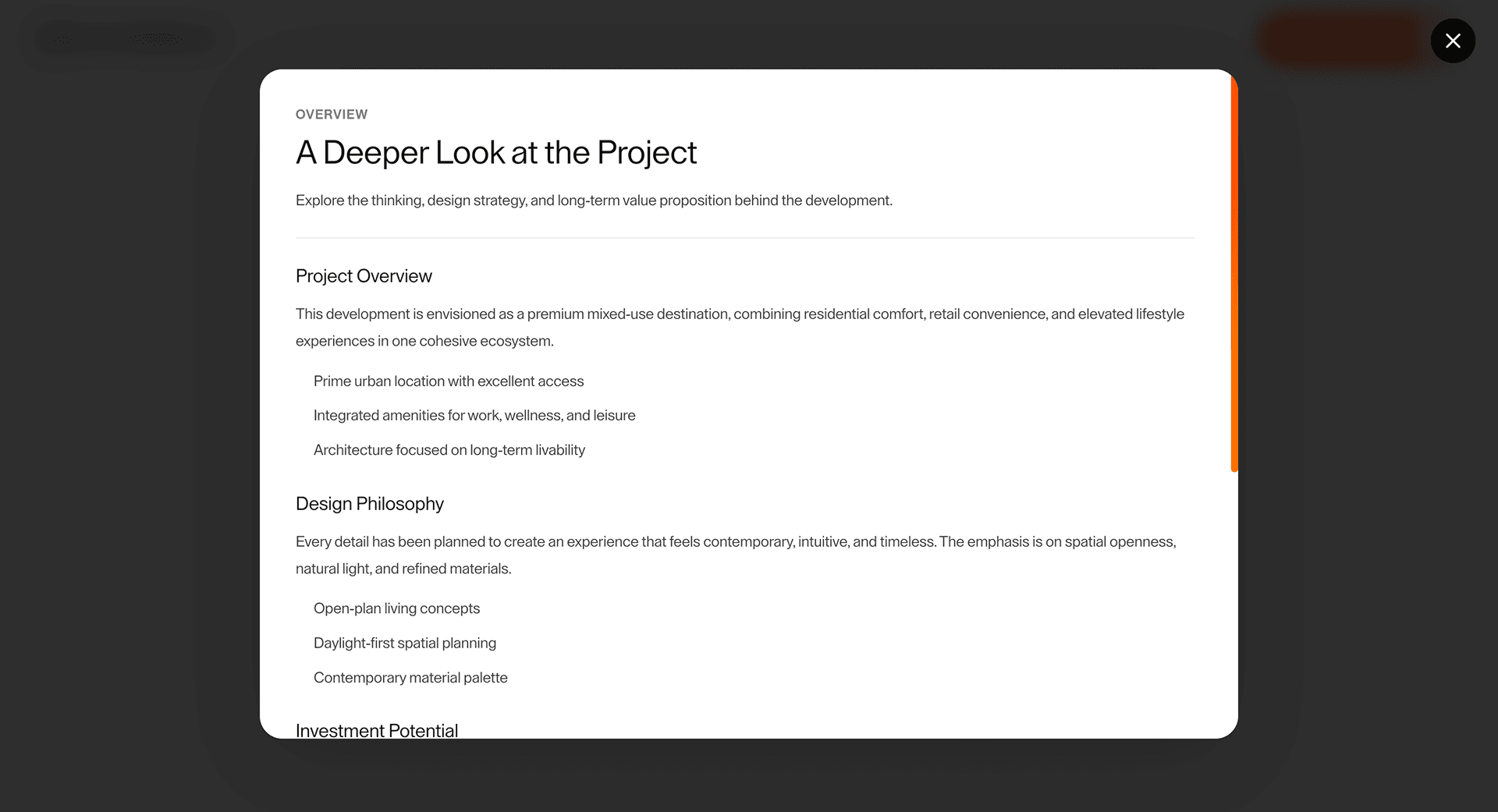
Overview
Animated Modal is a labelled dialog pattern with motion added after focus, Escape, scroll lock, and restore behavior are solved.
Use it for short, interruptive tasks where a dialog is genuinely better than an inline section: confirmation, demo preview, compact form, media lightbox, or contextual help. The page job is temporary focus, not hiding depth.
The risk in production is broken focus. The dialog must be labelled, focus-trapped while open, closable with Escape, and return focus to the trigger.
Install Command
This is a Pro Effect.
You can preview it now. Upgrade to Pro for instant install access.
Usage Code
This is a Pro Effect.
You can preview it now. Upgrade to Pro for instant install access.
Component Code
This is a Pro Effect.
You can preview it now. Upgrade to Pro for instant install access.
Example Production Use Case
A product page can use Animated Modal for a short demo preview or confirmation flow when the trigger remains obvious and closing returns the visitor to the exact point of action.
Best Used For
- Short dialogs where temporary focus helps the task.
- Demo previews, confirmation steps, compact forms, and media lightboxes with clear close behavior.
- Desktop interactions that can become drawers or inline sections on mobile.
Not For
Not for long pages, dense forms, core pricing details, or content that would work better as an inline section or drawer.
Performance Budget
Mount heavy modal content only when needed, keep open/close transitions short, and avoid blocking route or scroll restoration after close.
Accessibility and Mobile
Label the dialog, trap focus only while open, close with Escape when safe, and restore focus to the trigger. On mobile, use a drawer or inline section when the content is long.
Common Mistakes
- Opening a modal without a clear title or accessible label.
- Failing to return focus to the trigger.
- Putting long task flows inside a cramped dialog.
Changelog
v1.0.1
Jul 30, 2026Added reduced motion support.
v1.0.0
Jun 4, 2026Initial release
API Reference
| Prop | Type | Default | Description |
|---|---|---|---|
showCloseButton | boolean | true | Shows the close (X) button. |
closeOnBackdrop | boolean | true | Closes the modal when the backdrop is clicked. |
closeOnEsc | boolean | true | Closes the modal when Escape is pressed. |
size | number | 72 | Modal content width as a percentage of the viewport, capped at 960px. |
overlayOpacity | number | 0.82 | Opacity of the page overlay. |
duration | number | 0.5 | Open and close fade duration in seconds. |
backgroundColor | color | #ffffff | Modal content background color. |
textColor | color | #111111 | Modal content text color. |
roundedness | number | 24 | Modal content border radius in pixels. |
Frequently Asked Questions
Which accessibility details are non-negotiable for Animated Modal?
A labelled dialog, focus trap, Escape close, focus restore, visible close control, and scroll lock where supported.
When should Animated Modal become inline on mobile?
When the content is long, form-heavy, or central to the task. A cramped mobile modal is usually worse than a drawer or inline section.
What should reduced motion do?
Remove scale, blur, and dramatic movement. The dialog can appear instantly or with a short opacity change.
Can Hyperiux adapt Animated Modal for a real brand system?
Yes. A custom version should define content structure, accessibility behavior, motion rules, reduced-motion behavior, source handoff, and implementation notes for the specific page job.
Request a Custom Creative Component Animation
Need a custom effect? Tell us what to create.


