Loading
Parallax Image
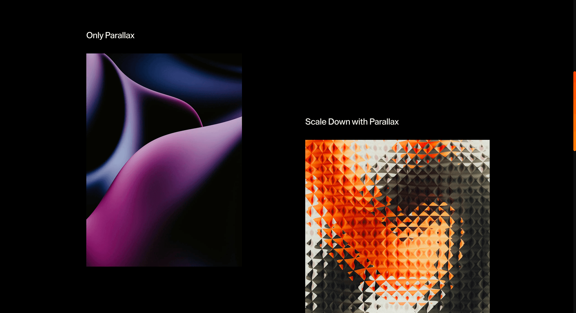
A lightweight single-image parallax effect that adds subtle scroll depth to hero visuals, product photography, and section breaks.
Published On: June 4, 2026
Last Updated: August 17, 2026
GSAP
Overview
Parallax Image gives one visual a slower pulse than the page around it. The effect is small; the pacing signal is not.
Use Parallax Image when a single visual needs depth without becoming a gallery or scene. Editorial, brand, and product photography pages can use it to make one image feel tied to the scroll pace. The page job is focus: one visual earns attention without asking for a full interaction system.
The thing to watch is image cropping and offset. If the parallax distance exceeds the safe crop area, the image exposes empty edges or shifts against the surrounding copy.
Install Command
This is a Pro Effect.
You can preview it now. Upgrade to Pro for instant install access.
Usage Code
This is a Pro Effect.
You can preview it now. Upgrade to Pro for instant install access.
Component Code
This is a Pro Effect.
You can preview it now. Upgrade to Pro for instant install access.
Example Production Use Case
A brand page introducing a hero product photograph: Parallax Image gives the image a slight scroll depth while the copy remains still. The outcome is focus: the product visual feels intentional without turning the section into a showpiece.
Best Used For
- Hero visuals and section breaks where a single image needs quiet depth without stealing the copy.
- Hero and section-break visuals that need a quiet sense of weight.
- Parallax Image creates a concrete scroll outcome that a static section would not deliver.
Not For
Not for image-critical shopping, documentation, or pages where the picture must stay perfectly stable for evaluation.
Not for pages where motion makes product detail harder to inspect than a still image.
Performance Budget
Animate transform and opacity, avoid layout reads in scroll handlers, pre-size media, and clean up timelines/listeners when the route changes.
Accessibility and Mobile
The animated sequence must match DOM order. On mobile, replace pinned or horizontal mechanics with stacked sections, native swipe, or static cards.
Common Mistakes
- Setting offsets larger than the safe crop area.
- Adding parallax where precise image inspection matters.
- Forgetting to reserve image dimensions before motion starts.
Changelog
v1.0.1
Jul 21, 2026Added prefers-reduced-motion support: translateY parallax shift and scale range are reduced to 25% strength instead of full motion
v1.0.0
Jul 20, 2026Initial release
Props
| Prop | Type | Default | Description |
|---|---|---|---|
translateY | string | 30% | Vertical parallax travel. |
scrub | boolean | number | true | Links animation progress to scroll. Accepts true or a numeric scrub delay. |
enableScale | boolean | false | Enables scale animation while scrolling. |
scaleFrom | number | 1.6 | Initial image scale. |
scaleTo | number | 1.2 | Final image scale. |
Frequently Asked Questions
What makes Parallax Image different from a standard scroll reveal?
It's not an entrance animation at all, one image simply moves at a slower rate than the page around it, creating a quiet depth cue rather than a reveal. The effect is small by design; it signals pacing, not spectacle. Use it to give a single hero or section image a sense of weight.
How should Parallax Image simplify on mobile devices?
The depth differential is barely perceptible on a short viewport and can cause cropping or gaps, so reduce the offset heavily or pin the image in place. Often the cleanest mobile behavior is a static image. Reduced-motion users should always see it static.
What should developers test before shipping Parallax Image?
Reserve the image's dimensions to avoid layout shift, confirm the transform touches only compositor properties, and check there's no clipping at the top or bottom of its range. Verify it stays smooth during fast scroll. Confirm the static fallback looks intentional, not accidental.
Which content structure works best with Parallax Image?
A single strong visual anchoring a hero, section break, or quote — one image with room above and below to move. It adds nothing to a gallery or a tight grid. Pair it with restrained surrounding copy so the subtle motion isn't lost.
When should I avoid Parallax Image even if the preview looks good?
Avoid it where the image must stay precisely aligned with adjacent text or where any cropping would hide detail. On content-dense pages the effect is too quiet to justify the risk. Skip it if the only reason to add it is that the preview looked nice.
Request a Custom Scroll Effect
Need a custom effect? Tell us what to create.


