Loading
Parallax Footer
A footer reveal effect that turns the end of a page into a polished final scroll moment.
Published On: July 9, 2026
Last Updated: August 17, 2026
Lucide-react
Overview
Parallax Footer turns the end of the page into a final handoff. It makes the exit feel placed rather than dropped.
Use Parallax Footer when the end of the page should feel like a final scene rather than a hard stop. Agency, brand, and editorial pages benefit when the footer carries a little depth without delaying contact or navigation. The page job is finish: the exit should feel designed and still remain useful.
The production risk is footer utility. If the parallax layer hides links, contact details, or legal navigation, the flourish is working against the page.
Install Command
This is a Pro Effect.
You can preview it now. Upgrade to Pro for instant install access.
Usage Code
This is a Pro Effect.
You can preview it now. Upgrade to Pro for instant install access.
Component Code
This is a Pro Effect.
You can preview it now. Upgrade to Pro for instant install access.
This is a Pro Effect.
You can preview it now. Upgrade to Pro for instant install access.
Example Production Use Case
An agency site closing a long case-study page: Parallax Footer lets the final contact section arrive with depth instead of dropping in as a utility block. The outcome is finish: the page lands with polish while the contact path stays obvious.
Best Used For
- Long pages where the final CTA or footer should feel arrived at, not bolted on.
- Long pages where the final CTA or sitemap should feel arrived at, not dropped.
- Parallax Footer creates a concrete scroll outcome that a static section would not deliver.
Not For
Not for utility footers where visitors need immediate links, legal pages, or task flows that should end quickly.
Not for footers that primarily serve as a fast sitemap or legal navigation block.
Performance Budget
Animate transform and opacity, avoid layout reads in scroll handlers, pre-size media, and clean up timelines/listeners when the route changes.
Accessibility and Mobile
The animated sequence must match DOM order. On mobile, replace pinned or horizontal mechanics with stacked sections, native swipe, or static cards.
Common Mistakes
- Letting the reveal delay access to legal, contact, or sitemap links.
- Creating gaps or overlap at the bottom of the scroll range.
- Using footer motion on short pages where the footer is already visible.
Changelog
v1.0.0
Jul 9, 2026Initial release
Props
| Prop | Type | Default | Description |
|---|---|---|---|
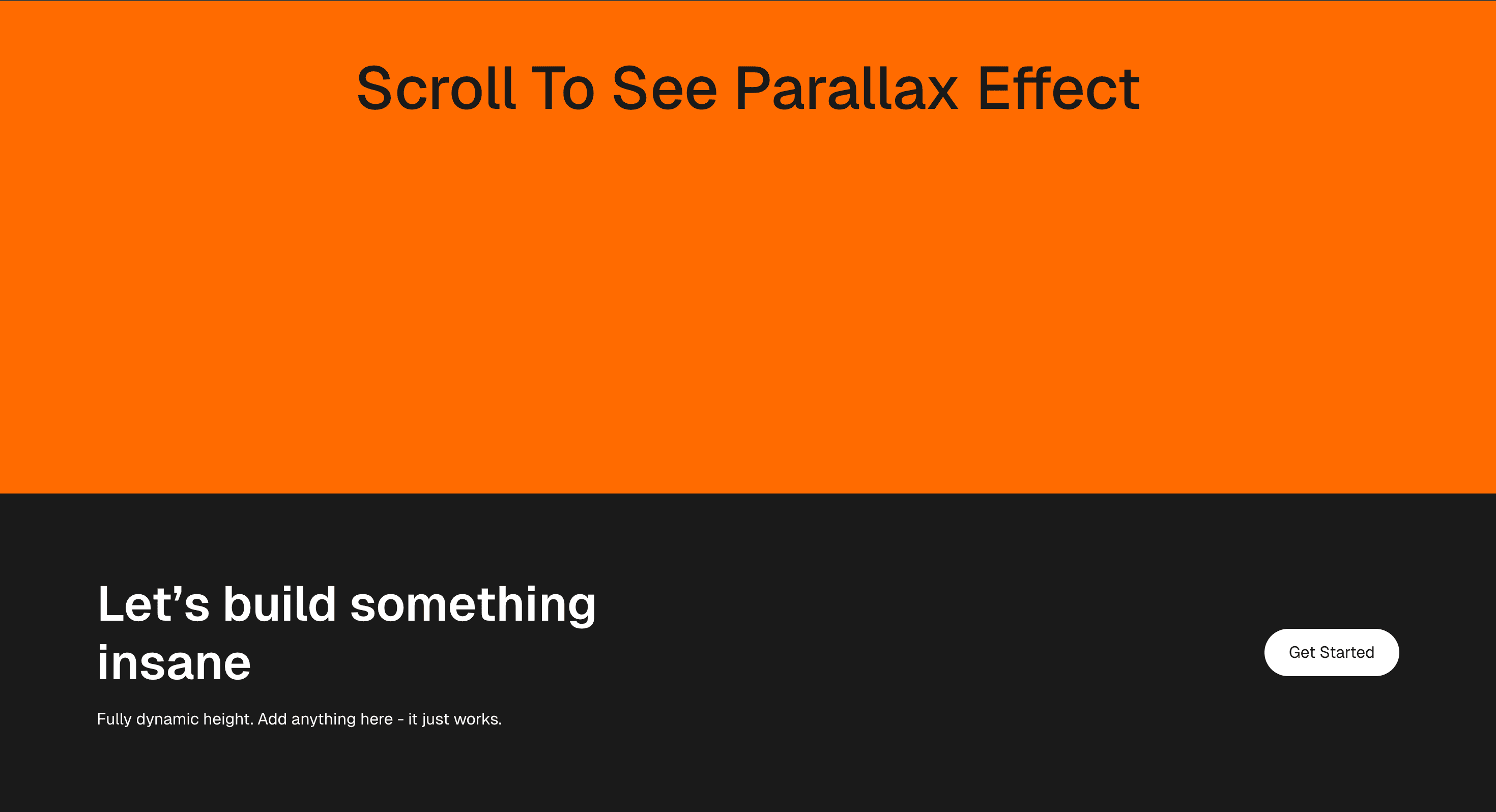
containerBgColor | string | #ff6b00 | Background color of the intro container above the footer reveal. |
footerBgColor | string | #1a1a1a | Background color of the fixed footer panel. |
Frequently Asked Questions
What makes Parallax Footer different from a standard scroll reveal?
It treats the end of the page as a deliberate handoff: the footer slides into place beneath the content rather than simply appearing, so the exit feels placed instead of dropped. The motion is about closure, not entrance. Use it to give the final screen a sense of arrival.
How should Parallax Footer simplify on mobile devices?
Reduce or remove the offset so the footer settles cleanly without a gap, since there's little room for layered movement on a phone. The footer's links and information must remain fully usable. Reduced-motion users should see a normal, static footer.
What should developers test before shipping Parallax Footer?
Confirm the footer never leaves a gap or overlaps the last section at the bottom of the scroll range, that it re-measures on resize, and that all footer links and controls stay reachable. Test with both short and long page bodies. Verify the static fallback is clean.
Which content structure works best with Parallax Footer?
A substantial footer worth arriving at a final CTA, sitemap, or brand sign-off on a page long enough to build momentum toward the end. It does little on a short page where the footer is already in view. Keep the footer content genuinely useful.
When should I avoid Parallax Footer even if the preview looks good?
Avoid it on short pages, on utility routes, or anywhere the motion could delay access to footer links. If the reveal risks a layout gap on some viewports, prefer a static footer. Skip it when it's decoration with no functional payoff.
Request a Custom Scroll Effect Animation
Need a custom effect? Tell us what to create.


