Loading
Chess Grid Transition
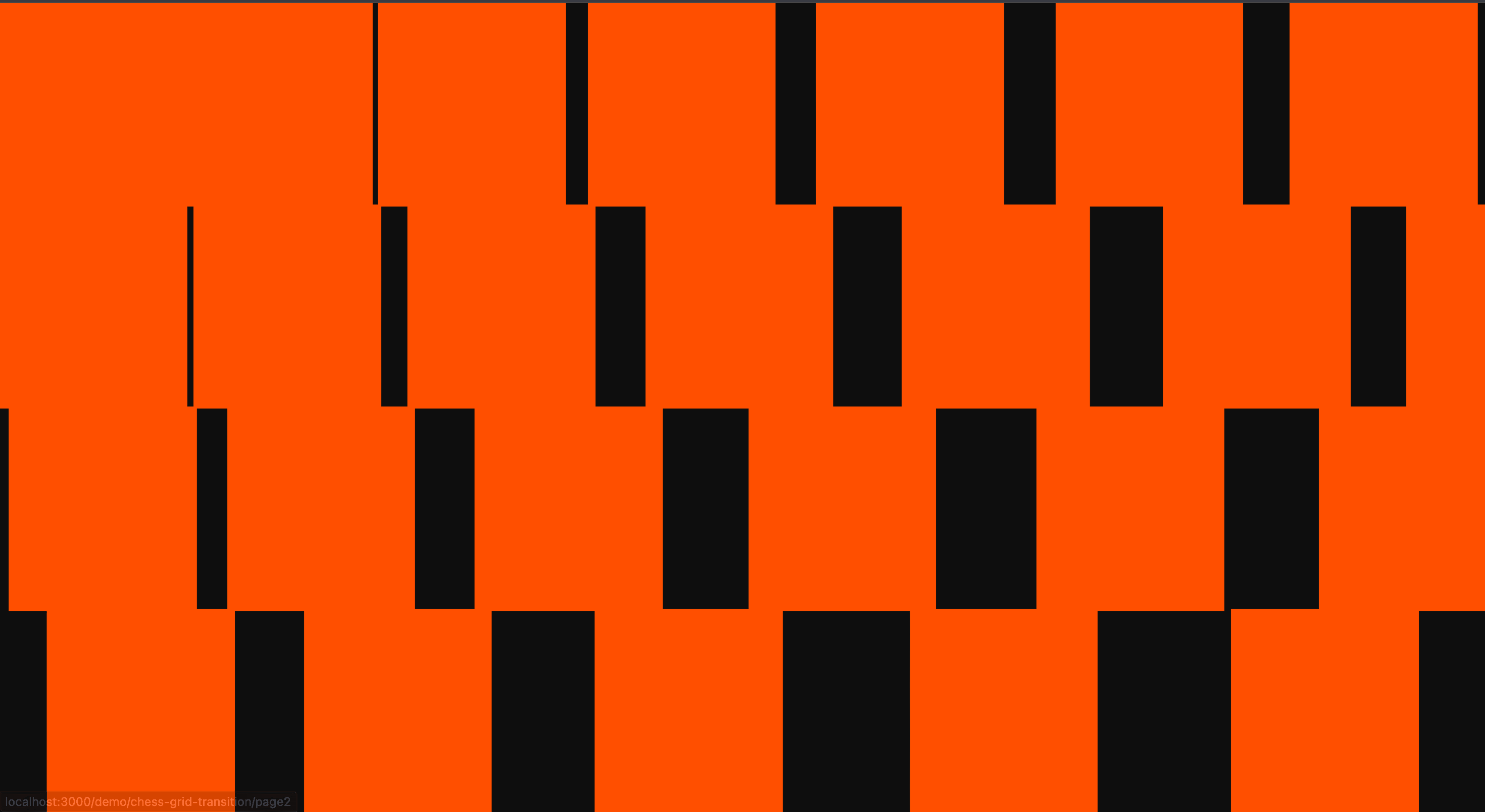
A grid-based page transition that closes and opens routes through a patterned checker-style reveal.
Published On: February 10, 2026
Last Updated: August 17, 2026
GSAPnext-transition-router
Overview
Chess Grid Transition turns the cut between routes into a designed moment: a grid closes and opens between pages.
Use it on brand sites, campaign pages, portfolios, and editorial journeys where route changes benefit from continuity. Avoid it in apps, docs, checkout, and search paths where navigation speed is the feature.
The thing to watch is delay. Mount the transition where route state actually changes, keep the duration short, restore focus after navigation, and give reduced-motion users an instant or nearly instant path.
Install Command
(Next.js App Router only. Requires next-transition-router for route-transition lifecycle hooks and must be wrapped in its provider. This effect will not function in plain React or in the Next.js Pages Router.)
npx hyperiux add chess-grid-transitionUsage Code
layout.jsx
import ChessGridTransition from "@/components/effects/chess-grid-transition/ChessGridTransition";

export default function layout({ children }) {
  return (
    <ChessGridTransition>
      {children}
    </ChessGridTransition>
  );
}
Component Code
ChessGridTransition.jsx
// Built using Hyperiux Vault: https://vault.hyperiux.com
'use client';
import { TransitionRouter } from 'next-transition-router';
import React, { useEffect, useRef, useState } from 'react';
import gsap from 'gsap';
function prefersReducedMotion() {
    if (typeof window === 'undefined')
        return false;
    return window.matchMedia?.('(prefers-reduced-motion: reduce)')?.matches ?? false;
}
const DEFAULT_GRID_SIZE = 8;
const DEFAULT_COLOR = '#ff5f00';
function clampNumber(value, min, max, fallback) {
    const next = Number(value);
    if (!Number.isFinite(next))
        return fallback;
    return Math.min(max, Math.max(min, next));
}
export default function ChessGridTransition({ children, duration = 1, gridSize = DEFAULT_GRID_SIZE, color = DEFAULT_COLOR, }) {
    const wrapperRef = useRef(null);
    const gridRef = useRef(null);
    const [mounted, setMounted] = useState(false);
    const [isMobile, setIsMobile] = useState(false);
    const [isTablet, setIsTablet] = useState(false);
    const safeDuration = clampNumber(duration, 0.25, 3, 1);
    const cols = Math.round(clampNumber(gridSize, 4, 16, DEFAULT_GRID_SIZE));
    const desktopRows = Math.max(2, Math.round(cols * 0.5));
    const mobileRows = Math.max(4, Math.round(cols * 1.125));
    const tabletRows = Math.max(4, Math.round(cols * 1.25));
    const overlap = 2;
    useEffect(() => {
        const updateViewport = () => {
            const width = window.innerWidth;
            setIsMobile(width <= 639);
            setIsTablet(width > 639 && width <= 1025);
        };
        updateViewport();
        window.addEventListener('resize', updateViewport);
        return () => window.removeEventListener('resize', updateViewport);
    }, []);
    const rows = isMobile ? mobileRows : isTablet ? tabletRows : desktopRows;
    const getRowCells = (cells, rowIndex) => {
        const rowCells = [];
        for (let col = 0; col < cols; col++) {
            rowCells.push(cells[rowIndex * cols + col]);
        }
        return rowCells;
    };
    const buildAnimation = (tl, cells, direction = 1) => {
        const rowsArr = Array.from({ length: rows }, (_, i) => i);
        rowsArr.forEach((rowIndex, rowOrderIndex) => {
            const rowCells = getRowCells(cells, rowIndex);
            rowCells.forEach((cell, colIndex) => {
                const delay = rowOrderIndex * 0.1 + colIndex * 0.1;
                if (direction === 1) {
                    const translateAmount = (cols - colIndex + 1) * 100;
                    tl.fromTo(cell, { xPercent: translateAmount }, {
                        xPercent: 0,
                        duration: 0.8 * safeDuration,
                        ease: 'power2.out',
                    }, delay);
                }
                else {
                    tl.to(cell, {
                        xPercent: -(colIndex + 2) * 100,
                        duration: 0.8 * safeDuration,
                        ease: 'power2.in',
                    }, delay);
                }
            });
        });
    };
    useEffect(() => {
        const cells = gridRef.current.children;
        Array.from(cells).forEach((cell, i) => {
            const colIndex = i % cols;
            gsap.set(cell, { xPercent: -(colIndex + 2) * 100 });
        });
        setMounted(true);
    }, [cols, rows]);
    const totalCells = cols * rows;
    return (<TransitionRouter auto leave={(next) => {
            const tl = gsap.timeline({ onComplete: next });
            if (prefersReducedMotion()) {
                tl.to(wrapperRef.current, { opacity: 0, duration: 0.2, ease: 'power1.out' }, 0);
                return () => tl.kill();
            }
            const cells = gridRef.current.children;
            tl.to(wrapperRef.current, { opacity: 0, duration: 0.8 * safeDuration }, 0);
            buildAnimation(tl, cells, 1);
            return () => tl.kill();
        }} enter={(next) => {
            const tl = gsap.timeline({ onComplete: next });
            if (prefersReducedMotion()) {
                tl.to(wrapperRef.current, { opacity: 1, duration: 0.2, ease: 'power1.out', clearProps: 'all' }, 0);
                return () => tl.kill();
            }
            const cells = gridRef.current.children;
            tl.fromTo(wrapperRef.current, { opacity: 0 }, { opacity: 1, duration: 0.8 * safeDuration, delay: safeDuration, clearProps: 'all' }, 0);
            buildAnimation(tl, cells, -1);
            return () => tl.kill();
        }}>
      <div ref={gridRef} className={`h-screen w-screen fixed top-0 left-0 z-999 pointer-events-none flex flex-wrap overflow-hidden ${mounted ? 'opacity-100' : 'opacity-0'}`}>
        {Array.from({ length: totalCells }).map((_, i) => {
            const colIndex = i % cols;
            const rowIndex = Math.floor(i / cols);
            return (<span key={i} className='absolute shrink-0' style={{
                    backgroundColor: color,
                    width: `calc((100vw / ${cols}) * ${isMobile ? 1.6 : 1} + ${overlap}px)`,
                    height: `calc(100vh / ${rows} + ${overlap}px)`,
                    left: `calc(${colIndex} * (100vw / ${cols}) * ${isMobile ? 1.6 : 1} - ${overlap / 2}px)`,
                    top: `calc(${rowIndex} * (100vh / ${rows}) - ${overlap / 2}px)`,
                }}></span>);
        })}
      </div>

      <div className='h-full w-full relative z-2'>
        <div ref={wrapperRef} className='h-full w-full will-change-transform'>
          {children}
        </div>
      </div>

    </TransitionRouter>);
}
Example Production Use Case
Use this as route-transition implementation guidance. Verify the shipped integration point, route-state behavior, focus restoration, cleanup, timing controls, and reduced-motion fallback before relying on exact props, defaults, imports, or installation steps.
Best Used For
- Campaign or portfolio sites where grid geometry already belongs to the visual language.
- Simple navigation flows that can use a patterned route cut without confusing orientation.
- Chess Grid Transition turns route change into a brief brand moment without delaying orientation.
Not For
Not for apps, docs, checkout, search, or frequently navigated product flows where delay harms completion.
Performance Budget
Keep duration short, avoid artificial route delays, and do not block interactivity after the destination route is ready.
Accessibility and Mobile
Move focus to the destination main region after navigation. On mobile and reduced motion, use instant transitions or short fades.
Common Mistakes
- Using Chess Grid Transition as fake loading delay.
- Forgetting focus restoration after navigation.
- Running full-screen motion for reduced-motion users.
Changelog
v1.1.0
Jul 21, 2026Added reduced-motion route fallback with short opacity fades.
v1.0.0
Feb 10, 2026Initial release
Props
| Prop | Type | Default | Description |
|---|---|---|---|
duration | number | 1 | Duration multiplier for the chess grid sweep. |
gridSize | number | 8 | Grid density used to derive transition columns and responsive rows. |
color | string | #ff5f00 | Chess grid block color. |
Frequently Asked Questions
When should I use Chess Grid Transition?
Use it when a simple route tree needs a patterned grid that closes and opens between pages without delaying navigation.
Where should Chess Grid Transition mount in the App Router?
Mount it where the route wrapper remounts on navigation, often a template or route-transition component rather than a persistent layout.
How long should Chess Grid Transition last?
Keep it short, usually 300–600ms. Longer transitions need a real loading reason.
How should focus work after Chess Grid Transition?
Move focus to the destination main region or heading after navigation completes.
What is the reduced-motion fallback for Chess Grid Transition?
Use instant navigation or a brief fade, not full-screen movement or masks.
Request a Custom Page Transition
Need a custom effect? Tell us what to create.


