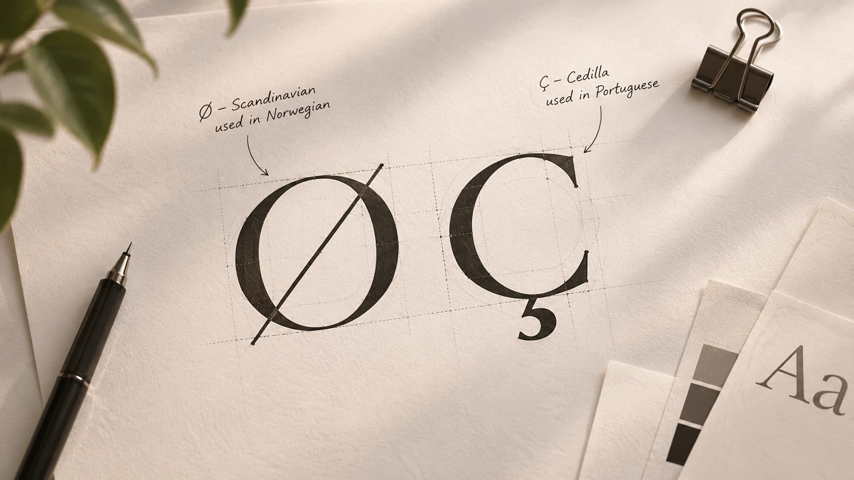
Most type specimens show you the alphabet in English. Our clients write in Norwegian and Portuguese, so the first thing we look at is never the A. It’s the Ø, the Å, the Ç and the Ã.
The Letters Drawn Last
Accented letters are often the last thing a foundry finishes, and you can tell. The marks sit too high, crash into the line above or look borrowed from another font.
- Ø and ø. The slash should belong to the letter, not look like a crossing-out.
- Ã and õ. The tilde needs room above it at tight line spacing, or headlines collide.
- Ç and ç. The cedilla should hang cleanly, even in the boldest weight.
How We Test
We set the same three words in every candidate: “fjøsdør”, “ação” and “Bærum”. Then we set them in capitals, at caption size and at poster size. It rules out about half the shortlist in an afternoon.
A typeface that can’t spell your customer’s street name isn’t on the shortlist, however good its ampersand.
Mind the Long Words
Norwegian joins words together, and Portuguese runs longer than English. A display face that looks generous in a pitch can break onto three lines in a real headline. We test with real copy, never with lorem ipsum.
Before you fall for a typeface, ask the foundry for its full character list and set your own name, your address and your longest product name in it.
- Typography
- Languages
- Identity
Beatriz Matos
Beatriz designs identities and type systems in Lisbon. She keeps a sheet of every Portuguese word a font has ever failed to set properly.