


Cards Runway
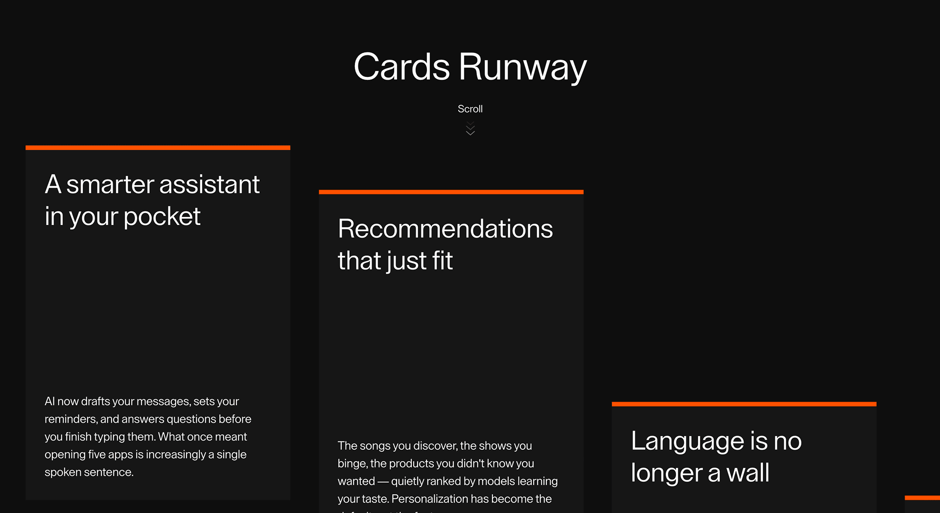
Turn a group of feature or story cards into a staged runway sequence where each idea gets a clean moment before the next one arrives.
Overview
Card Drift gives a set of cards a slow, low-amplitude drift so a proof grid or feature row feels alive without asking for attention.
Use Card Drift on testimonial walls, logo or feature grids, and portfolio tiles where a hint of independent motion adds life to otherwise static cards. The drift should earn its place through state clarity, semantics, and task usefulness, not decoration.
In production, the risk is distraction. The drift has to stay subtle, pause when the section is offscreen or motion is reduced, and never pull focus from the card content or its links, and every state change should remain clear under keyboard, mobile, and reduced-motion conditions.
Install
This is a Pro effect.
You can preview it now. Pro install access opens next week for Founding Access users.
Usage
This is a Pro effect.
You can preview it now. Pro install access opens next week for Founding Access users.
Component Code
This is a Pro effect.
You can preview it now. Pro install access opens next week for Founding Access users.
Example Production Use Case
An AI product landing page can use Cards Runway to explain five everyday AI shifts: assistant behavior, recommendations, translation, creativity, and coding help. The outcome is pacing: each idea gets a clean beat instead of collapsing into a flat feature grid.
Best Used For
- AI, SaaS, and product sections where multiple related benefits need staged attention.
- Editorial explainers where each card is one chapter in a short argument.
- Service or feature groups where a flat grid feels too passive but a full carousel feels too heavy.
Not For
Not for comparison tables, pricing cards, legal content, dense documentation, or long card copy that users need to scan quickly.
Not for sections where every card needs to be visible at once before a decision can be made.
Performance Budget
Keep card count controlled, animate transform and opacity instead of layout, pre-size the card container, and avoid expensive blur or shadow effects on every card during movement. Clean up scroll or pointer listeners when the component unmounts.
Accessibility and Mobile
Cards should be real HTML in the intended reading order. On mobile, switch to a clean vertical stack, simple swipe, or static cards. Reduced-motion users should see the same content without runway movement, stagger, or large transforms.
Common Mistakes
- Writing cards like paragraphs instead of sharp content beats.
- Using too many cards until the sequence loses its rhythm.
- Letting z-index or overlap hide focus states, links, or card text.
- Keeping desktop card movement on small touch screens without a fallback.
Frequently Asked Questions
When should I use Cards Runway?
How many cards work best?
Should each card have a CTA?
How should Cards Runway behave on mobile?
Does Cards Runway affect SEO?
What should reduced motion do?
Can Hyperiux adapt Cards Runway for a real product section?
Request a Custom Creative Component Animation
Need a custom effect? Tell us what to create.


