Fieldnote
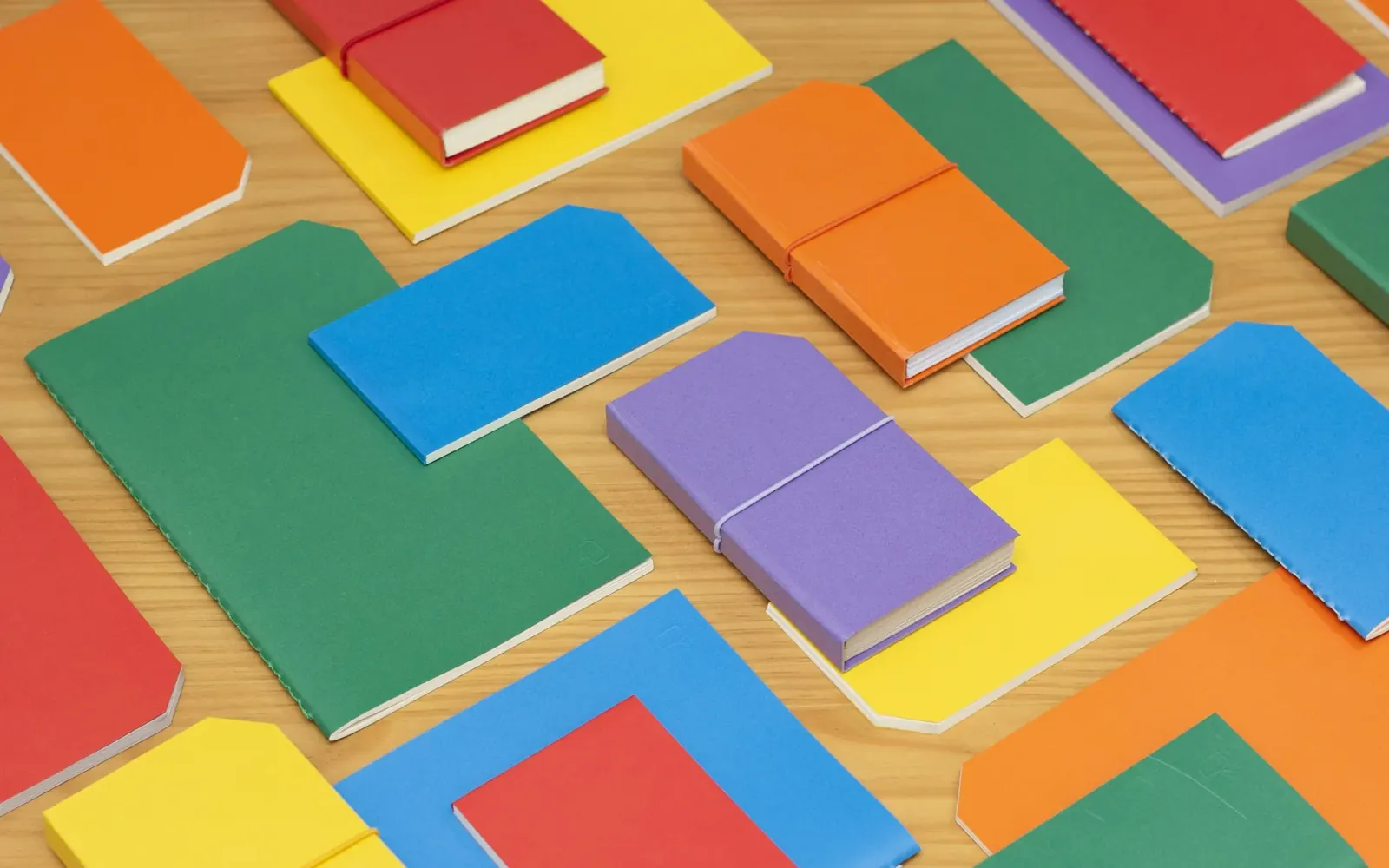
Editorial design and a website for people who write things down. A notebook brand that wanted its pages to feel as good on screen as they do in the hand.
- Client
- Fieldnote
- Year
- 2024
- What we did
- Editorial design, website
- Timeline
- 14 weeks, Dubai and London
The problem
Cloudline had a formula salons loved and no brand at all. The shelf they wanted was a wall of lab coats and percentages.
The brief: sit next to prestige labels in a department store, still feel warm on Instagram, and fit on a pack small enough for a travel kit. No pressure.
The missing pixel
Nobody in the category was selling the feeling. So we did. One pink, one image, one rounded wordmark that looks like it’s exhaling.
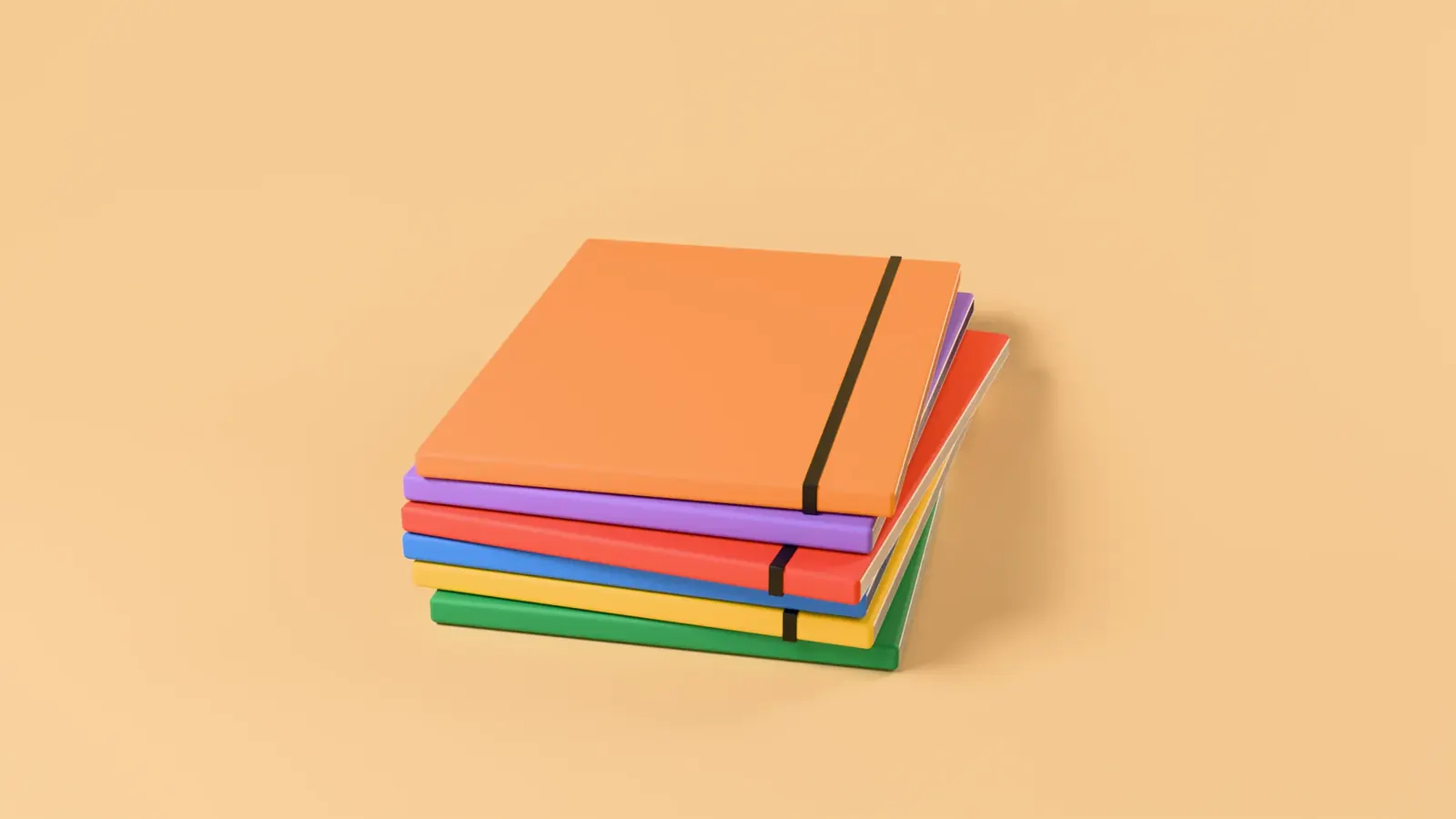
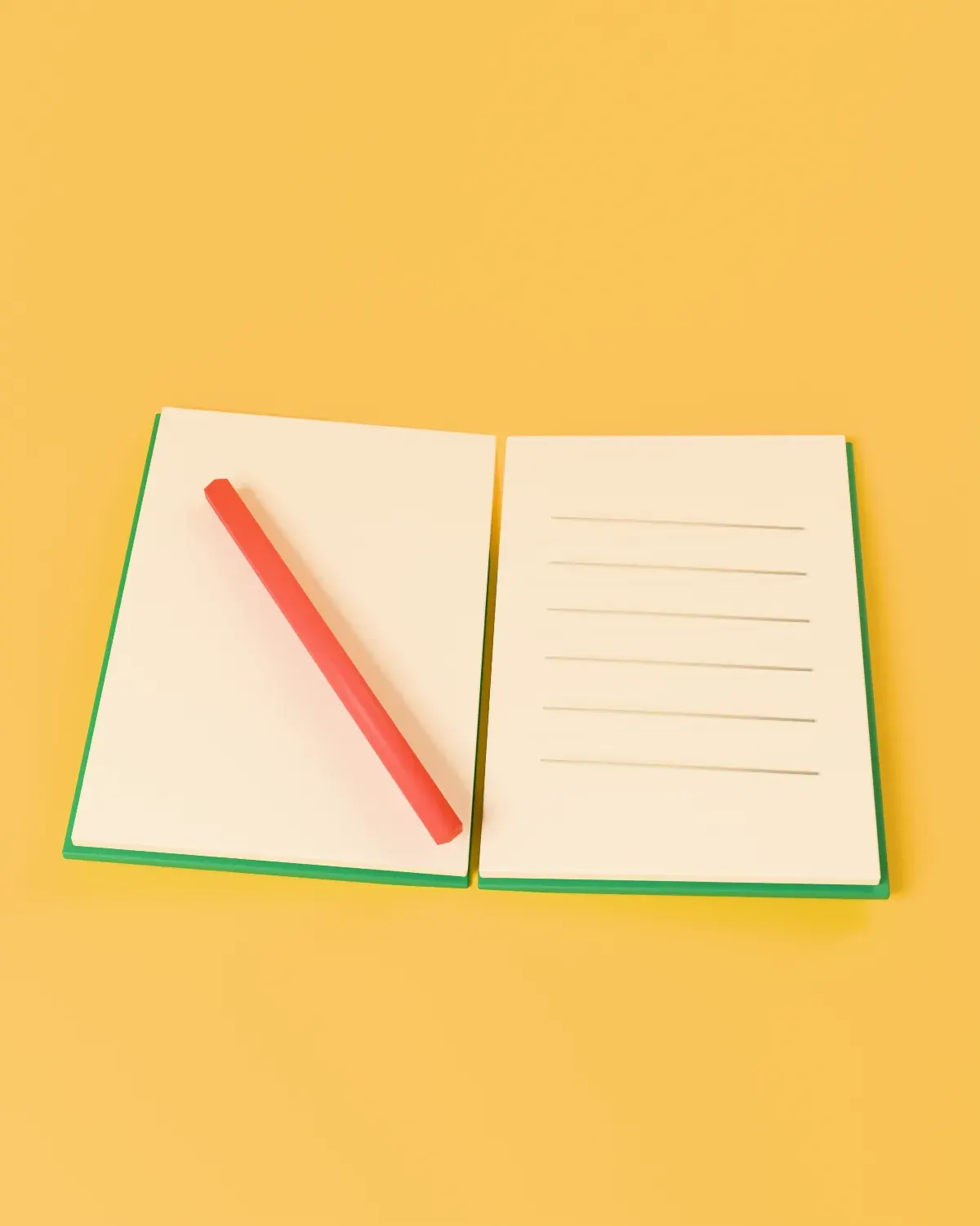
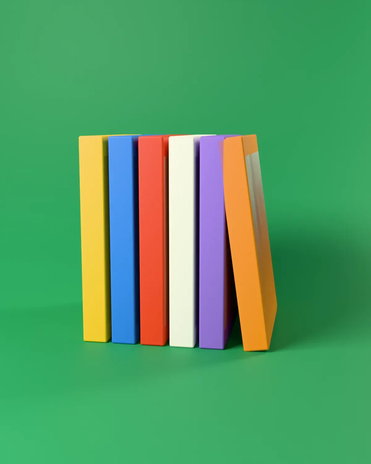
Texture, not colour, separates the range, so the shelf reads as one calm block. We shot the campaign in a single day on a soft-sculpture set and cut it into a 20-second film for launch.
What happened next
Measured six months after launch.
- sell-through against the category average
- salons and stores in year one
- views of a 20-second film about clouds
We came in with a formula and a feeling. They turned the feeling into a brand. People pick the bottle up just to find out what it feels like.

Credits
- Creative directionNaina Sethi
- StrategyMarcus Bell
- DesignLeila Haddad, Ana Sofía Reyes
- WordsClara Whitfield
- MotionKenji Park
- ProductionMei Lin

Got a missing pixel? Let’s find it.
Somewhere in here, one pixel is missing.
Move around. Click when you find the gap.