Loading
Hover Slider
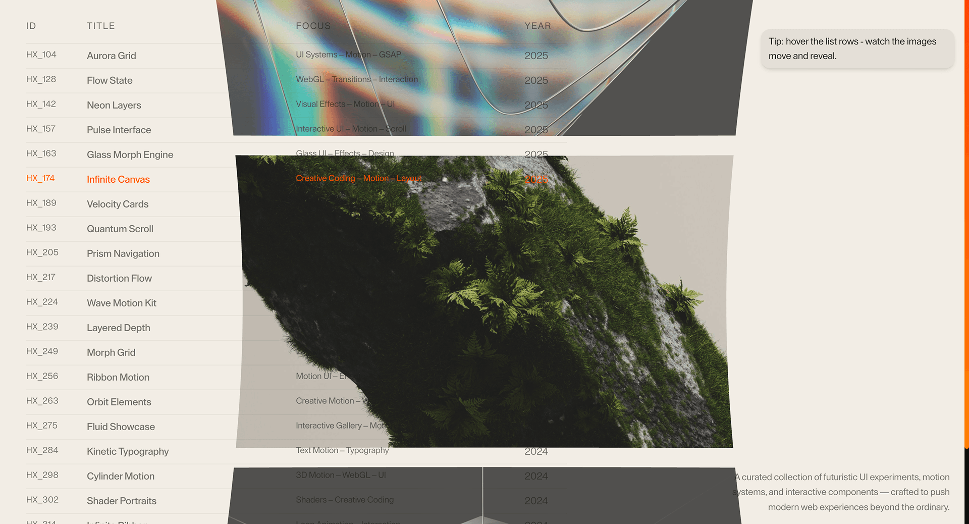
A hover-preview slider that pairs feature lists, work grids, or product items with contextual visual previews.
Published On: June 4, 2026
Last Updated: August 17, 2026
Three.jsGSAP
Overview
Interactive Hover Slider adds motion to a component that already has a job: hover previews guide exploration.
Use Interactive Hover Slider when a compact feature or capability list should reveal visual context through preview panels. The preview should help exploration without making hover the only access path.
The thing to watch is generic behavior. Interactive Hover Slider must use the right semantic pattern for its task before animation is added, and every state change should remain clear under keyboard, mobile, and reduced-motion conditions.
Install Command
This is a Pro Effect.
You can preview it now. Upgrade to Pro for instant install access.
Usage Code
This is a Pro Effect.
You can preview it now. Upgrade to Pro for instant install access.
Component Code
This is a Pro Effect.
You can preview it now. Upgrade to Pro for instant install access.
This is a Pro Effect.
You can preview it now. Upgrade to Pro for instant install access.
This is a Pro Effect.
You can preview it now. Upgrade to Pro for instant install access.
Example Production Use Case
A product page can use Interactive Hover Slider to preview related capabilities from a compact list. Hover enriches exploration on desktop, while mobile needs the same previews available through tap or stacked cards.
Best Used For
- Feature and capability previews where hover can reveal context on desktop.
- Product pages that also provide tap or stacked access for touch users.
- Feature previews where hover speeds exploration but touch and keyboard access stay equal.
Not For
Not for essential information that mobile, keyboard, or no-hover users cannot reach.
Performance Budget
Pre-size preview media, avoid swapping large images on every pointer movement, and lazy-load only previews that are likely to appear.
Accessibility and Mobile
Support focus and tap paths for every preview. On mobile, switch to stacked cards, accordions, or tap-controlled panels instead of hover-only reveal.
Common Mistakes
- Making hover the only way to see the preview.
- Loading every large preview image upfront.
- Letting preview motion move the list or CTA targets.
Changelog
v1.0.1
Jul 21, 2026Add prefers-reduced-motion support
v1.0.0
Jul 20, 2026Initial release
Props
| Prop | Type | Default | Description |
|---|---|---|---|
transitionDuration | number | 0.45 | Hover reveal and curve transition duration. |
imageScale | number | 0.95 | WebGL image plane scale. |
curveFactor | number | 1 | Multiplier for the circular arc image curvature. |
Frequently Asked Questions
When should I use Interactive Hover Slider?
Use it when a feature or product section needs hover previews to guide exploration.
How should Interactive Hover Slider avoid pointer-only access?
Every hover reveal needs an equivalent focus, click, tap, or stacked-content path. The preview must be reachable without a mouse.
How should Interactive Hover Slider work on touch devices?
Use tap-to-preview, stacked preview cards, or an accordion-like reveal. Do not rely on hover as the only way to see the content.
Can Interactive Hover Slider improve product exploration?
Yes, when short feature labels need supporting screenshots or proof snippets. It hurts conversion when previews hide the primary CTA or require desktop-only behavior.
What should reduced motion do for Interactive Hover Slider?
Keep previews available while removing sliding, parallax, or image-travel motion between states.
Request a custom WebGL Effect
Need a custom effect? Tell us what to create.


