Loading
Stack Spread
A stack-to-spread hero component for portfolios, creative studios, product launches, campaign pages, and brand-led landing sections where imagery should move from compression into expression.
Published On: September 7, 2026
Last Updated: September 7, 2026
Motion
Overview
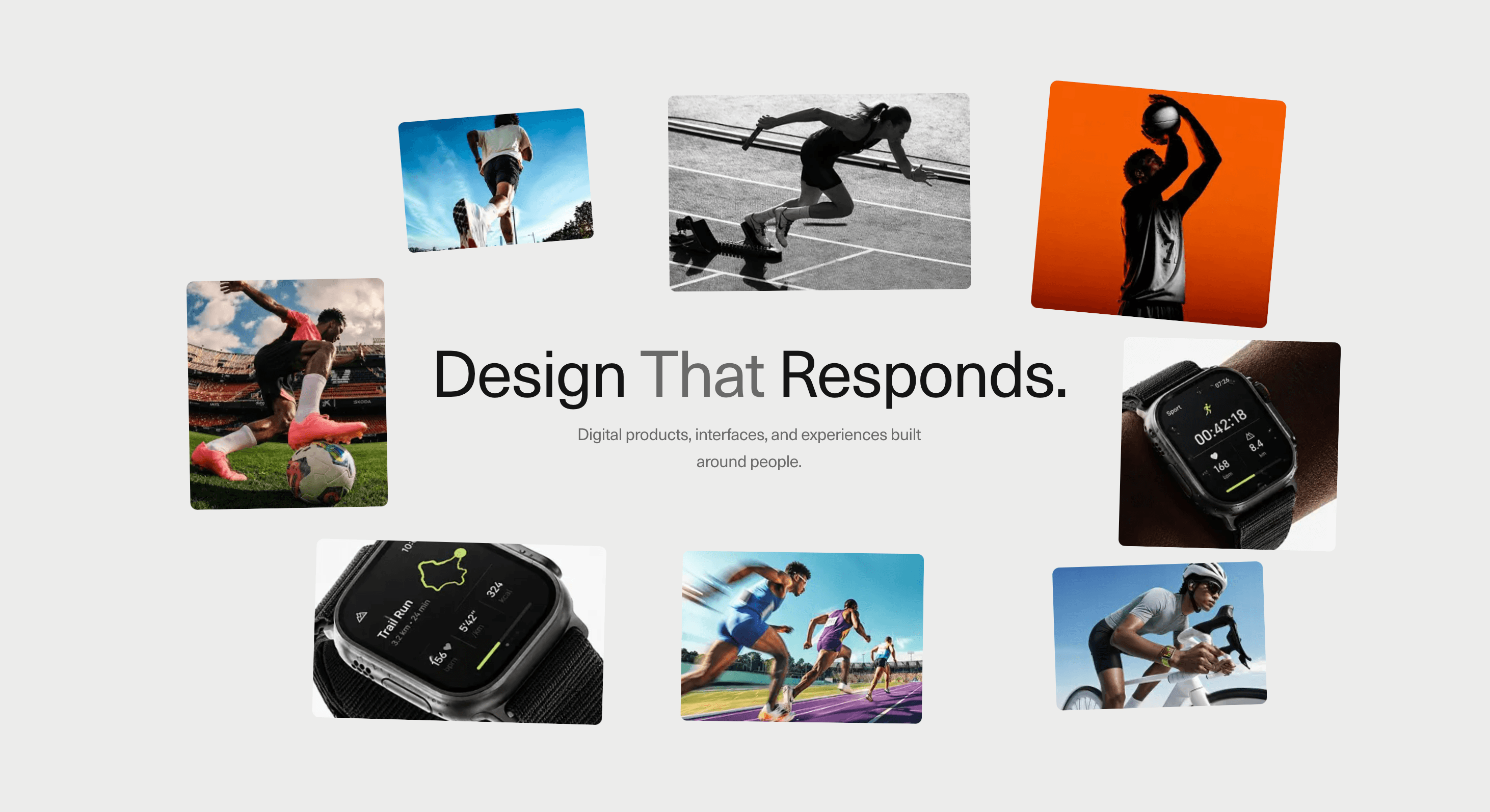
Stack Spread turns a small visual pile into a spatial composition.
A group of cards begins close together, then separates into a wider arrangement around the page’s core message. The spread gives each image room without turning the section into a standard grid. The centre can hold a headline, brand line, product statement, or campaign idea while the surrounding cards create atmosphere, proof, and visual range.
Use Stack Spread when a page needs to introduce a visual world quickly. It works for agency homepages, portfolio intros, campaign launches, editorial landing pages, fashion and lifestyle brands, product-world presentations, creative archives, and image-led SaaS sections where the surrounding visuals support one central claim.
The page job is reveal and composition. The visitor should feel the collection opening up around the message, then immediately understand what the section is saying. The spread should make the headline feel surrounded by proof, not buried under decorative cards.
Install Command
npx hyperiux add stack-spreadUsage Code
page.jsx
import StackSpread from "@/components/effects/stack-spread";

export default function page() {
  return (
    <>
        <StackSpread />
    </>
  );
}
Component Code
index.jsx
// Built using Hyperiux Vault: https://vault.hyperiux.com
"use client";
import Image from "next/image";
import { motion, useScroll, useTransform, useReducedMotion, } from "motion/react";
import { useEffect, useRef, useState } from "react";

const IMG_BASE = "https://pub-8abee449136941f5b0a1cd2c014534e9.r2.dev/vault-listing-images/assets-images/scroll-scatter";
const IMG = {
    plane: `${IMG_BASE}/img01.png`,
    painting: `${IMG_BASE}/img02.png`,
    breaker: `${IMG_BASE}/img03.png`,
    dog: `${IMG_BASE}/img04.png`,
    footballer: `${IMG_BASE}/img05.png`,
    jacket: `${IMG_BASE}/img06.jpg`,
    meadow: `${IMG_BASE}/img07.jpg`,
    stripes: `${IMG_BASE}/img08.png`,
};
// per-image rest scale, keyed by img index (1-8). default 1, drop below to shrink.
const SCALE = {
    1: 0.9,
    2: 0.8,
    3: 0.9,
    4: 0.8,
    5: 0.8,
    6: 0.9,
    7: 0.9,
    8: 0.7,
};
const s = (i) => SCALE[i] ?? 1;
// array order = stack order, back (z 2) -> front (z 9)
const CARDS = [
    // top-left stripes (img08) — sm row 1 left
    {
        item: { src: IMG.stripes, alt: "Colour stripes" },
        stackOffset: { x: -8, y: -10 },
        stackRotate: -18,
        target: { x: -20, y: -34, rotate: 0, scale: s(8), w: 17, h: 22 },
        targetSm: { x: -22, y: -40 },
        z: 2,
    },
    // top-right meadow (img07) — sm row 1 right
    {
        item: { src: IMG.meadow, alt: "Wildflower meadow" },
        stackOffset: { x: 14, y: -10 },
        stackRotate: 20,
        target: { x: 32, y: -30, rotate: 0, scale: s(7), w: 18, h: 32 },
        targetSm: { x: 22, y: -40 },
        z: 3,
    },
    // mid-left jacket (img06) — sm row 2 left
    {
        item: { src: IMG.jacket, alt: "Figure in a leather jacket" },
        stackOffset: { x: -16, y: 0 },
        stackRotate: -4,
        target: { x: -36, y: -2, rotate: 0, scale: s(6), w: 15, h: 32 },
        targetSm: { x: -22, y: -19 },
        z: 4,
    },
    // top-centre footballer (img05) — sm row 2 right
    {
        item: { src: IMG.footballer, alt: "Footballer mid-kick" },
        stackOffset: { x: 1, y: -10 },
        stackRotate: -2,
        target: { x: 6, y: -32, rotate: 0, scale: s(5), w: 25, h: 30 },
        targetSm: { x: 22, y: -19 },
        z: 5,
    },
    // mid-right dog (img04) — sm row 3 left
    {
        item: { src: IMG.dog, alt: "Terrier in profile" },
        stackOffset: { x: 18, y: 1 },
        stackRotate: 6,
        target: { x: 37, y: 6, rotate: 0, scale: s(4), w: 18, h: 32 },
        targetSm: { x: -22, y: 20 },
        z: 6,
    },
    // bottom-left breaker (img03) — sm row 3 right
    {
        item: { src: IMG.breaker, alt: "Breakdancer holding a pose" },
        stackOffset: { x: -6, y: 10 },
        stackRotate: 6,
        target: { x: -24, y: 34, rotate: 0, scale: s(3), w: 22, h: 25 },
        targetSm: { x: 22, y: 20 },
        z: 7,
    },
    // bottom-centre painting (img02) — sm row 4 left
    {
        item: { src: IMG.painting, alt: "Renaissance fresco detail" },
        stackOffset: { x: 8, y: 7 },
        stackRotate: 3,
        target: { x: 2, y: 36, rotate: 0, scale: s(2), w: 20, h: 26 },
        targetSm: { x: -22, y: 40 },
        z: 8,
    },
    // bottom-right plane (img01) — sm row 4 right
    {
        item: { src: IMG.plane, alt: "Vintage fighter plane" },
        stackOffset: { x: 20, y: 12 },
        stackRotate: -7,
        target: { x: 30, y: 34, rotate: 0, scale: s(1), w: 16, h: 20 },
        targetSm: { x: 22, y: 40 },
        z: 9,
    },
];

const SCATTER_START = 0.12;
const SCATTER_END = 0.9;
const SUB = "Digital products, interfaces, and experiences built around people.";
const RESPONSIVE = {
    desktop: {
        scale: null,
        small: false,
        colX: null,
        card: null,
    },
    small: {
        scale: 0.72,
        small: true,
        colX: 22,
        card: { w: 40, h: 20 },
    },
};
function useResponsive() {
    const [r, setR] = useState(RESPONSIVE.desktop);
    useEffect(() => {
        const read = () => {
            setR(window.innerWidth <= 1025 ? RESPONSIVE.small : RESPONSIVE.desktop);
        };
        read();
        window.addEventListener("resize", read);
        return () => window.removeEventListener("resize", read);
    }, []);
    return r;
}
function Card({ card, progress, reduce, clusterRotation, scaleMul, isSmall, colX, fixedCard, stackScale, cardRadius, }) {
    const { item, target } = card;
    const flat = reduce === true;
    const stackRotate = flat ? 0 : clusterRotation ? card.stackRotate ?? 0 : 0;
    const stackOffset = card.stackOffset ?? { x: 0, y: 0 };
    const restScale = scaleMul ?? target.scale ?? 1;
    // final resting spot: column grid on small screens, scatter on desktop
    const sm = isSmall && card.targetSm ? card.targetSm : null;
    const endX = sm
        ? colX != null
            ? Math.sign(sm.x) * colX
            : sm.x
        : target.x;
    const endY = sm ? sm.y : target.y;
    const endRotate = flat || isSmall ? 0 : target.rotate;
    // -50% keeps card centred on its anchor
    const translate = useTransform(progress, (p) => {
        const tx = stackOffset.x + (endX - stackOffset.x) * p;
        const ty = stackOffset.y + (endY - stackOffset.y) * p;
        return `calc(-50% + ${tx}vw) calc(-50% + ${ty}vh)`;
    });
    const rotate = useTransform(progress, [0, 1], [stackRotate, endRotate]);
    const scale = useTransform(progress, [0, 1], [stackScale, restScale]);
    return (<motion.div className="absolute left-1/2 top-1/2 will-change-transform" style={{
            width: `${fixedCard ? fixedCard.w : target.w}vw`,
            height: `${fixedCard ? fixedCard.h : target.h}vh`,
            zIndex: card.z ?? 1,
            translate,
            rotate,
            scale,
        }}>
      <CardFace item={item} cardRadius={cardRadius}/>
    </motion.div>);
}
function CardFace({ item, cardRadius, }) {
    return (<div className="relative h-full w-full overflow-hidden max-md:rounded-[4vw]" style={{ borderRadius: `${cardRadius}px` }}>
      <Image src={item.src} alt={item.alt ?? ""} fill sizes="(max-width: 1025px) 40vw, 25vw" className="object-cover" draggable={false}/>
    </div>);
}
function StackSpreadStage({ cards, scrollLength = 350, bgColor = "#ececeb", clusterRotation = true, stackScale = 0.82, cardRadius = 8, textColor = "#141414", textFadeStart = 0.3, }) {
    const wrapRef = useRef(null);
    const reduce = useReducedMotion();
    const { scale: scaleMul, small: isSmall, colX, card: fixedCard } = useResponsive();
    const { scrollYProgress } = useScroll({
        target: wrapRef,
        offset: ["start start", "end end"],
    });
    // hold, scatter, then settle
    const progress = useTransform(scrollYProgress, [0, SCATTER_START, SCATTER_END, 1], [0, 0, 1, 1]);
    const noScale = reduce === true;
    const copyOpacity = useTransform(progress, [textFadeStart, textFadeStart + 0.35], [0, 1]);
    const copyScale = useTransform(progress, [textFadeStart, 0.9], [0.85, 1]);
    return (<section ref={wrapRef} className="relative w-full" style={{ height: `${scrollLength}vh`, backgroundColor: bgColor }}>
      <div className="sticky top-0 h-screen w-full overflow-hidden">
        {/* centre text */}
        <motion.div className="pointer-events-none absolute inset-0 z-5 flex flex-col items-center justify-center px-6 text-center max-md:px-8" style={{
            opacity: copyOpacity,
            scale: noScale ? 1 : copyScale,
        }}>
          <h2 className="w-full whitespace-pre-line font-display text-[4.5vw] font-normal leading-none! tracking-tight max-md:text-[10vw]" style={{ color: textColor }}>
            Design

           <span className="opacity-60"> {" "}
              That
               {" "}
              </span>
              Responds.
          </h2>
          <p className="mt-[1.2vw] w-full max-w-[42ch] text-[1.15vw] leading-relaxed tracking-tight max-md:mt-3 max-md:text-[3.6vw]" style={{ color: textColor, opacity: 0.6 }}>
            {SUB}
          </p>
        </motion.div>

        {/* scattering cards */}
        <div className="absolute inset-0 z-10">
          {cards.map((card, i) => (<Card key={i} card={card} progress={progress} reduce={reduce} clusterRotation={clusterRotation} scaleMul={scaleMul} isSmall={isSmall} colX={colX} fixedCard={fixedCard} stackScale={stackScale} cardRadius={cardRadius}/>))}
        </div>
      </div>
    </section>);
}
export default function StackSpread({ scrollLength = 350, bgColor = "#ececeb", clusterRotation = true, stackScale = 0.82, cardRadius = 8, textColor = "#141414", textFadeStart = 0.3, }) {
    return (<StackSpreadStage cards={CARDS} scrollLength={scrollLength} bgColor={bgColor} clusterRotation={clusterRotation} stackScale={stackScale} cardRadius={cardRadius} textColor={textColor} textFadeStart={textFadeStart}/>);
}
Example Production Use Case
A creative studio can use Stack Spread in the hero to introduce its visual range. The cards begin as a compact stack, then spread around a central brand line. The result gives the page a sense of energy, taste, and motion before the visitor reaches the service details.
The outcome is immediate visual positioning. The page does not need to explain that the studio has range; the composition makes that range visible.
A product company can use the same component for launch assets, template previews, customer use cases, dashboard states, or product-world imagery. The stack creates anticipation, while the spread turns the hero into a structured showcase.
Best Used For
• Portfolio and studio hero sections where visual range matters.
• Campaign pages that need a strong opening composition.
• Product launch pages with multiple supporting visuals.
• SaaS or AI landing pages that want image-led proof around a central claim.
• Fashion, lifestyle, photography, editorial, and creative brand pages.
• Visual archives, moodboards, and selected work sections where composition matters more than grid scanning.
Not For
Not for dense galleries, ecommerce catalogues, pricing sections, documentation, comparison tables, forms, or content users need to scan quickly.
Not for weak image sets. Stack Spread can arrange strong visuals beautifully, but it cannot create taste from random assets.
Not for sections where the central message is long. The headline needs space, not a swarm of cards fighting for attention.
Performance Budget
Keep the number of cards controlled, optimise images, reserve the final section dimensions, and animate transform and opacity rather than layout-heavy properties. Avoid excessive blur, large shadows, and constant recalculation during scroll or pointer movement.
Do not render oversized images if the displayed cards are small. The component should feel light even when the composition feels rich.
Accessibility and Mobile
Keep the central headline and supporting text as real DOM content. Give meaningful alt text to image cards when they communicate content. If the images are decorative atmosphere, mark them appropriately.
On mobile, simplify the spread. Use fewer visible cards, reduce rotation, stack some visuals vertically, or switch to a calmer composition that preserves the central message. For reduced motion, show the final spread, a static stack, or a minimal fade without outward card travel.
Common Mistakes
• Letting cards cover the headline or CTA.
• Using too many images.
• Relying on random placement instead of composed spread positions.
• Mixing image ratios without a cropping rule.
• Making the initial stack so dense that the visuals are unreadable.
• Forcing the full desktop spread onto mobile.
• Using the effect as decoration when the image set has no relationship to the message.
Changelog
v1.0.0
Sep 4, 2026Initial release
Props
| Prop | Type | Default | Description |
|---|---|---|---|
clusterRotation | boolean | true | Fan the clustered stack with each card's own angle, or start every card flat. |
stackScale | number | 0.82 | Scale of the cards while clustered, before they spread out to full size. |
cardRadius | number | 8 | Corner radius on each card, in px (desktop only - tablet/mobile keep their responsive radius). |
bgColor | color | #ececeb | Background color of the section behind the cards. |
textColor | color | #141414 | Color of the centre headline and subtitle. |
textFadeStart | number | 0.3 | Scroll progress (0-1) where the centre text starts fading in. |
Frequently Asked Questions
What is Stack Spread?
Stack Spread is a React component that animates a group of image cards from a compact stack into a wider composed layout around a central message.
When should I use Stack Spread?
Use it for hero sections, portfolio intros, campaign launches, product-world presentations, visual archives, and brand pages where imagery should support one central claim.
Is Stack Spread a carousel?
No. Stack Spread is not primarily for browsing slide by slide. It is a visual composition pattern that opens a card group into a spatial arrangement.
How many cards work best?
A controlled set works best. Six to ten cards is usually enough to create visual range without overwhelming the headline or hurting performance.
Can Stack Spread include text cards?
Yes, but use them carefully. The component works best with image-led cards around a clear central headline. Text-heavy cards can make the layout feel crowded.
How do I keep Stack Spread accessible?
Keep the main headline and supporting copy as real text. Use meaningful alt text for content images, hide decorative images where appropriate, and preserve a logical reading order.
What should reduced motion do?
Reduced motion should remove outward spread travel, rotation, and repeated motion. Show a static final composition, a simplified stack, or a minimal fade.
Does Stack Spread work on mobile?
Yes, with adaptation. Reduce card count, simplify spread positions, avoid tiny cards near screen edges, and keep the central message readable.
Can Hyperiux adapt Stack Spread for a real brand system?
Yes. A custom version should define card count, image ratios, spread geometry, trigger behavior, central content rules, mobile fallback, accessibility states, reduced-motion handling, source handoff, and implementation notes.
Request a Custom Scroll Animation
Need a custom effect? Tell us what to create.


