Loading
Circular Slider
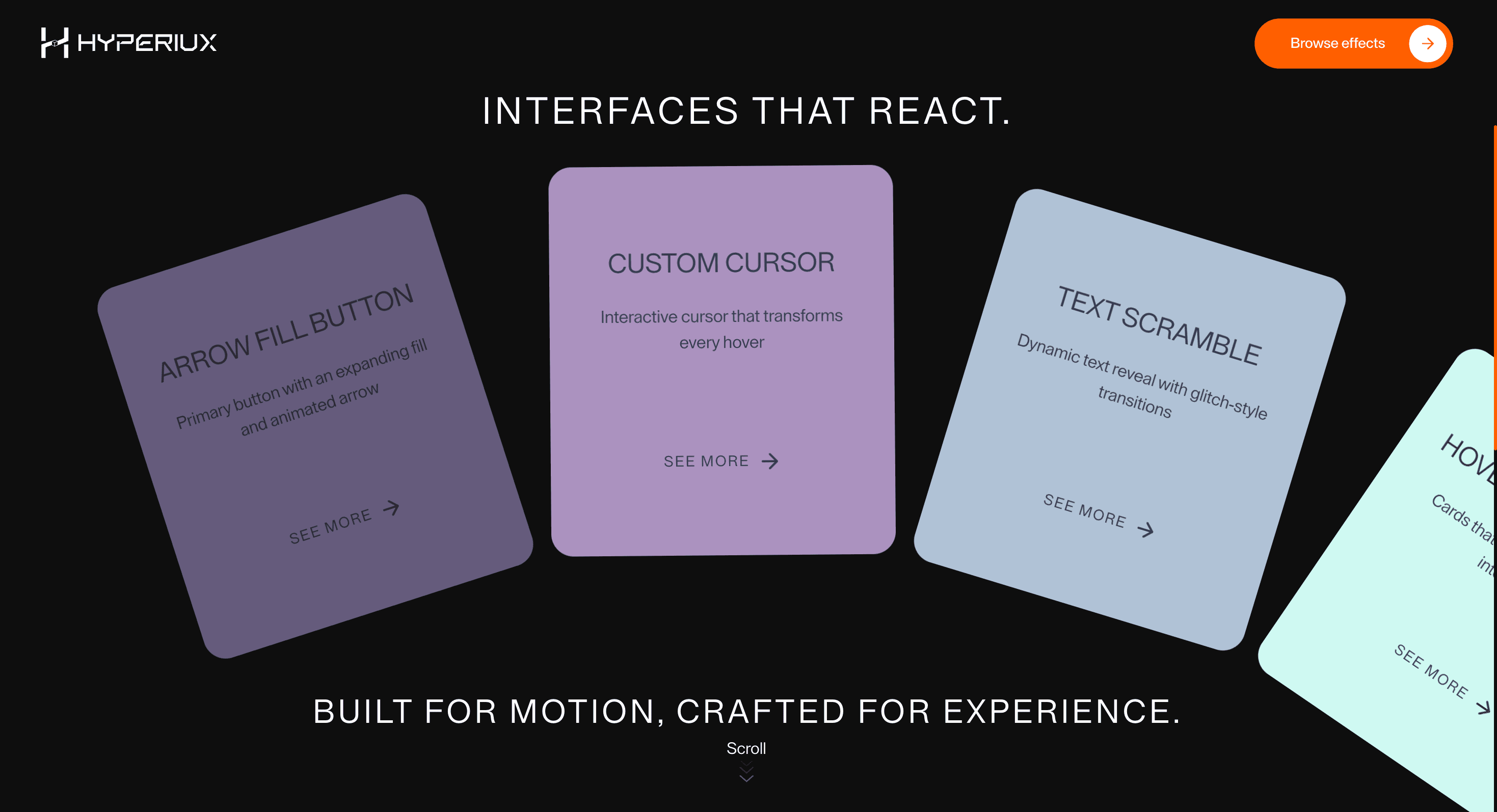
A circular carousel effect that rotates visual items into focus for campaigns, portfolios, testimonials, and feature highlights.
Published On: June 22, 2026
Last Updated: August 17, 2026
GSAPLucide-react
Overview
Circular Slider gives scroll a circular rhythm. Each item rotates into attention before making room for the next.
Use Circular Slider when visual browsing needs a stronger mechanic than a plain slider. Portfolio pages, product visuals, and campaign galleries can use it when rotation reinforces the art direction. The page job is motion identity: the way items move becomes part of the brand surface.
In production, the risk is control clarity. Rotation must not hide the active slide, disorient keyboard users, or autoplay important content past the visitor.
Install Command
This is a Pro Effect.
You can preview it now. Upgrade to Pro for instant install access.
Usage Code
This is a Pro Effect.
You can preview it now. Upgrade to Pro for instant install access.
Component Code
This is a Pro Effect.
You can preview it now. Upgrade to Pro for instant install access.
This is a Pro Effect.
You can preview it now. Upgrade to Pro for instant install access.
Example Production Use Case
A portfolio page using a circular visual system: Circular Slider makes the browsing mechanic match the brand geometry. The outcome is motion identity: the interaction feels designed into the system, not attached later.
Best Used For
- Equal-weight testimonials or features where taking turns suits the content better than comparison.
- Testimonial or feature sets where items take turns holding focus.
- Circular Slider creates a concrete scroll outcome that a static section would not deliver.
Not For
- Not for important proof, pricing, or long text where rotation makes content feel optional.
- Not for testimonials or features that should remain visible as proof at all times.
Performance Budget
Animate transform and opacity, avoid layout reads in scroll handlers, pre-size media, and clean up timelines/listeners when the route changes.
Accessibility and Mobile
The animated sequence must match DOM order. On mobile, replace pinned or horizontal mechanics with stacked sections, native swipe, or static cards.
Common Mistakes
- Rotating important proof out of view too quickly.
- Shipping continuous motion without pause or static fallback.Letting the turning cadence overpower the item content.
Changelog
v1.0.1
Jul 24, 2026Added reduced-motion support.
v1.0.0
Jul 23, 2026Initial release
Props
| Prop | Type | Default | Description |
|---|---|---|---|
backgroundColor | string | #111111 | Background color for the full component section. |
showBottomText | boolean | true | Shows or hides the bottom supporting text. |
gap | number | 24 | Additional spacing between cards along the wheel arc. |
cardWidth | number | 320 | Desktop width of each orbiting card in pixels. |
cardHeight | number | 360 | Desktop height of each orbiting card in pixels. |
Frequently Asked Questions
What makes Circular Slider different from a standard scroll reveal?
Each item rotates into attention and then makes room for the next, giving scroll a circular rhythm instead of a single entrance. The turning cadence paces the section. Use it when items should take turns holding focus.
How should Circular Slider simplify on mobile devices?
Replace scroll-driven rotation with native swipe and clear controls, since rotation transforms are hard to follow on a phone. Keep one item dominant at a time. Reduced-motion users should get a static, swipeable list.
What should developers test before shipping a Circular Slider?
Confirm keyboard access to every item, an accessible name and controls, and that rotation doesn't break focus order or trap the user. Add pause/rotation behavior where motion is continuous. Verify the static fallback includes all items.
Which content structure works best with Circular Slider?
A modest set of equal-weight items like testimonials, features, or shots where taking turns suits the content. It's wrong for long lists or for anything users must compare at once. Keep each item self-contained.
When should I avoid Circular Slider even if the preview looks good?
Avoid it when users need to see items side by side, when the set is large, or when continuous rotation would distract. If order matters and rotation obscures it, use a list. Skip it where a static grid is clearer.
Request a Custom Scroll Animation
Need a custom effect? Tell us what to create.


