Loading
Unfold Navbar
An animated navigation component for portfolios, agency websites, SaaS landing pages, product microsites, and brand-led interfaces where the menu should feel like part of the experience, not a default browser afterthought.
Published On: September 14, 2026
Last Updated: September 14, 2026
GSAPuseGSAP
Overview
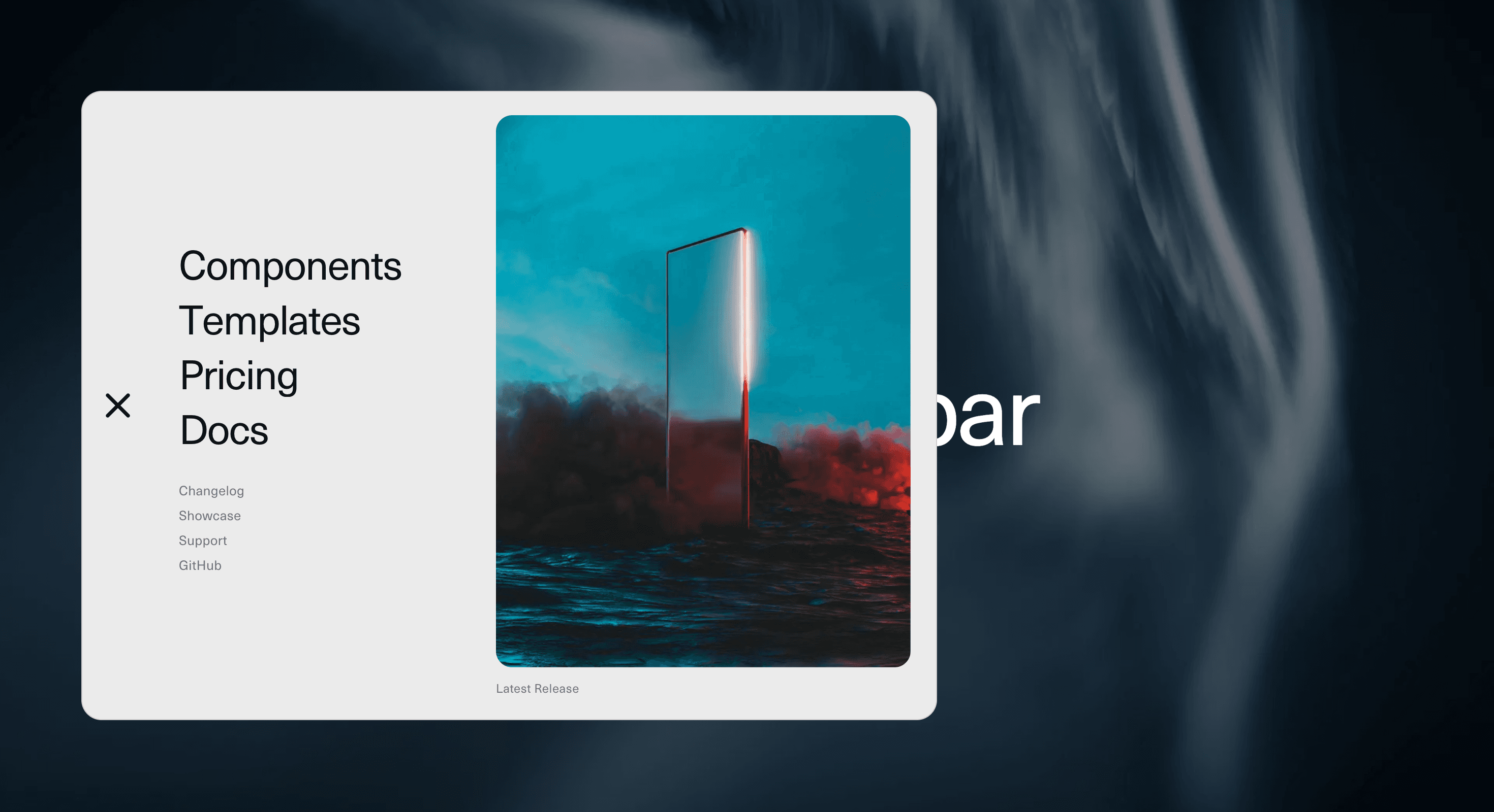
Unfold Navbar turns navigation into a deliberate reveal.
A compact trigger opens into a larger menu surface where links, supporting actions, and secondary details unfold in sequence. The movement can feel like panels opening, sections expanding, or a navigation layer being assembled on demand. The user gets a clear browsing structure without the page needing a permanently heavy header.
Use Unfold Navbar when the navigation needs more character than a basic horizontal menu but less interruption than a full experimental route transition. It works for portfolio sites, creative studios, product launches, SaaS pages, editorial projects, campaign microsites, and compact brand websites where the menu carries identity as well as utility.
The page job is controlled access. The user should know where the menu is, what opened, how to choose a route, and how to close it. The unfold animation should add ceremony to navigation, not make the user negotiate with a folding chair before finding the Work page.
Install Command
This is a Pro Effect.
You can preview it now. Upgrade to Pro for instant install access.
Usage Code
This is a Pro Effect.
You can preview it now. Upgrade to Pro for instant install access.
Component Code
This is a Pro Effect.
You can preview it now. Upgrade to Pro for instant install access.
Example Production Use Case
A creative studio can use Unfold Navbar to keep the header minimal while still giving the menu a strong branded presence. The user taps the trigger, the navigation opens in layers, and primary routes appear with enough space to feel intentional rather than squeezed into a thin top bar.
The outcome is identity with utility. The site keeps a clean first impression, but the navigation still feels designed, structured, and memorable.
A SaaS or product launch page can use the same component for a compact header that opens into product sections, documentation links, pricing, templates, changelog, and a focused conversion CTA.
Best Used For
• Portfolio and agency sites where navigation should carry brand presence.
• SaaS and product pages that need a compact header with a richer open state.
• Campaign microsites where the menu should feel authored, not generic.
• Editorial and creative pages where links need more visual rhythm.
• Product ecosystems with primary routes, secondary resources, and one clear CTA.
• Mobile-first layouts where an expandable menu is more practical than a wide nav bar.
Not For
Not for dense enterprise navigation with many nested levels, complex permissions, admin dashboards, documentation sidebars, ecommerce mega menus, or workflows where speed matters more than ceremony.
Not for hiding routes behind unclear icons or experimental triggers. A menu can unfold beautifully and still fail if users do not know it is a menu.
Not for pages where the animation delays basic navigation. Getting to another page should not feel like waiting for a stage curtain to remember its cue.
Performance Budget
Keep the menu animation lightweight. Animate transform, opacity, clip-path, or scale with restraint. Avoid layout-heavy transitions across many nested elements, and do not recalculate menu positions on every frame.
Stagger links subtly. Long stagger chains can make navigation feel slow, especially when users already know where they want to go. Clean up listeners, scroll locks, timers, and animation instances when the component unmounts.
Accessibility and Mobile
Use a semantic navigation landmark and real links. The trigger should be a button with a clear accessible label and expanded state. Support keyboard operation, visible focus states, Escape-to-close, and focus return to the trigger.
If the open menu behaves like an overlay, keep focus inside the menu while it is active or make the focus order predictable and safe. On mobile, make links large enough to tap, keep close controls obvious, and avoid tiny secondary actions near screen edges.
For reduced motion, remove unfolding travel, long stagger, panel rotation, and spring overshoot. Open the menu instantly or with a minimal fade while keeping the same routes available.
Common Mistakes
• Using a div instead of a button for the menu trigger.
• Making the menu icon unclear.
• Forgetting Escape-to-close and focus return.
• Letting the menu cover the page without a visible close action.
• Animating every link so slowly that navigation becomes friction.
• Hiding important routes inside decorative panels.
• Building a beautiful menu with no active route state.
• Forcing the same unfold layout onto mobile without checking tap comfort.
Changelog
v1.0.0
Sep 14, 2026Initial release
Props
| Prop | Type | Default | Description |
|---|---|---|---|
backgroundColor | string | #ebebeb | Navbar surface color. |
textColor | string | #111111 | Main links and menu icon color. |
mutedColor | string | rgba(0,0,0,0.5) | Numbers, secondary links, captions, and dimmed links color. |
animationSpeed | number | 1 | Opening and closing speed multiplier. Higher values animate faster. |
charStagger | number | 0.015 | Delay between characters on link hover, in seconds. |
showLinkUnderline | boolean | false | Show the animated underline on link hover. |
showNumbers | boolean | false | Show numbers beside primary links. |
dimInactiveLinks | boolean | true | Dim other primary links while hovering a row. |
showFeature | boolean | true | Show the feature image and caption. |
Frequently Asked Questions
What is Unfold Navbar?
Unfold Navbar is a React navigation component that expands from a compact trigger into a staged animated menu surface.
When should I use Unfold Navbar?
Use it for portfolios, agency websites, SaaS pages, product launches, editorial projects, and brand-led interfaces where the menu should feel designed without overwhelming the header.
Is Unfold Navbar the same as a dropdown menu?
No. A dropdown usually opens a small list below a trigger. Unfold Navbar creates a larger navigation surface where links and supporting content can reveal in a more composed sequence.
What should reduced motion do?
Reduced motion should remove long unfolding movement, staggered link travel, rotation, and spring overshoot. Open the menu instantly or with a minimal fade.
Is Unfold Navbar good for complex enterprise navigation?
Usually no. It is better for curated navigation systems. Large enterprise menus with many nested levels may need a structured mega menu, sidebar, search, or documentation navigation.
Request a Custom Navigation Animation
Need a custom effect? Tell us what to create.

