Loading
Side Navbar
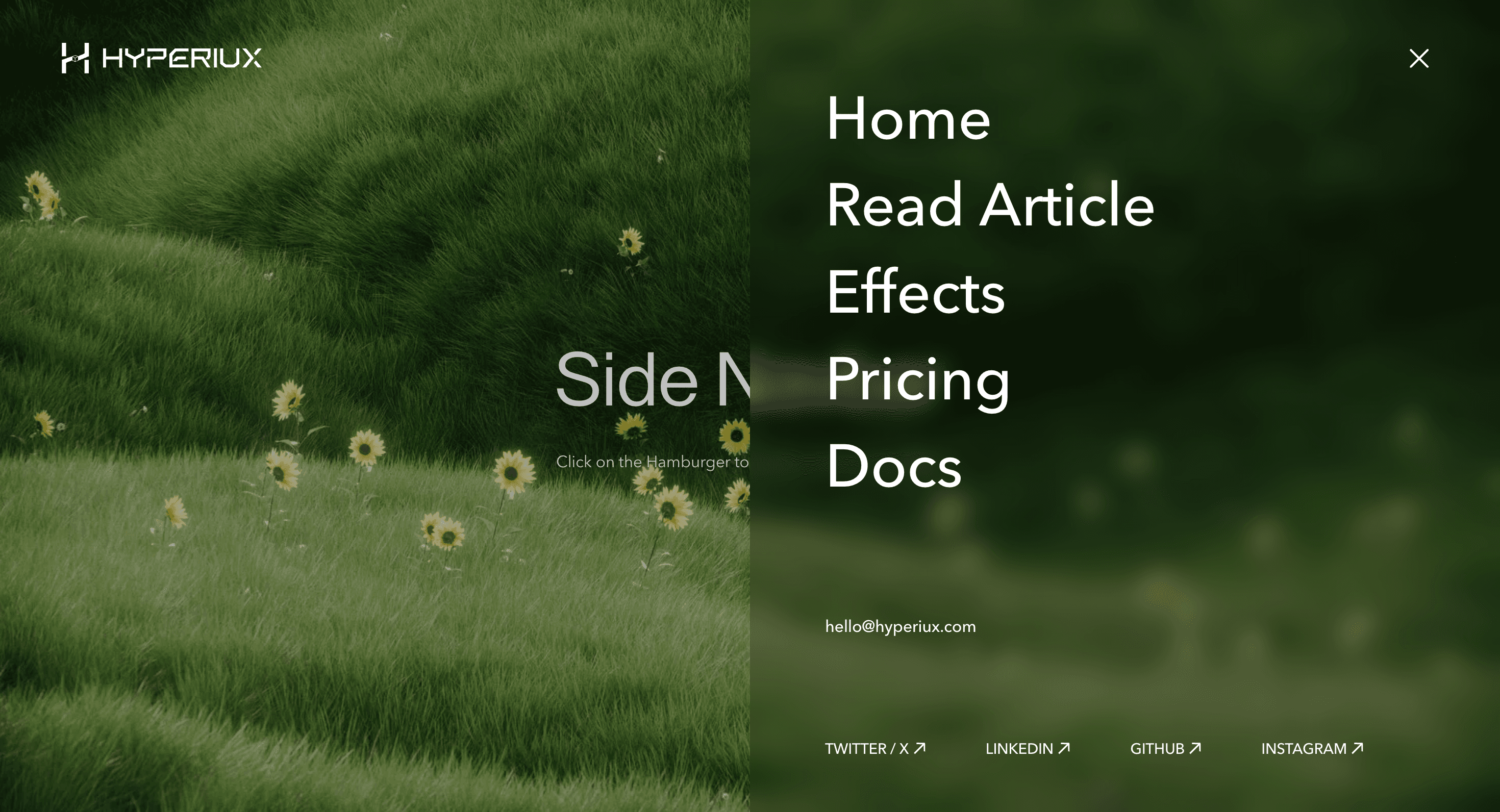
A hamburger-triggered side navigation panel with primary links, contact details, and social routes for compact brand and portfolio navigation.
Published On: August 12, 2026
Last Updated: August 17, 2026
CSS
Overview
Side Navbar opens a full-height navigation panel from a compact hamburger trigger.
It is built for websites where the navigation should feel deliberate without occupying the header all the time. The menu opens as a side panel, reveals primary links, keeps supporting information close, and gives the visitor a clear route back through a visible close control.
Use Side Navbar for portfolios, agency websites, campaign pages, product microsites, and editorial experiences where the navigation can behave like a designed moment. The page job is orientation: visitors should know what opened, where the important routes are, and how to close it without guessing.
The production risk is treating the menu like decoration. A side navbar is still navigation. Links need to be real links, the close control needs to be obvious, focus must move into the panel, Escape should close it, and focus should return to the hamburger trigger after closing.
Install Command
This is a Pro Effect.
You can preview it now. Upgrade to Pro for instant install access.
Usage Code
This is a Pro Effect.
You can preview it now. Upgrade to Pro for instant install access.
Component Code
This is a Pro Effect.
You can preview it now. Upgrade to Pro for instant install access.
This is a Pro Effect.
You can preview it now. Upgrade to Pro for instant install access.
Example Production Use Case
An agency portfolio can use Side Navbar to keep the hero visually clean while still giving visitors direct access to Work, Services, Pricing, Docs, and Contact. The hamburger opens a full-height panel with primary routes, contact details, and social links. The outcome is clarity: navigation feels designed without hiding where the visitor can go next.
Best Used For
- Portfolio, agency, and campaign sites where the header should stay minimal.
- Compact navigation systems that need primary links, contact details, and social links in one panel.
- Brand-led sites where opening navigation can be a polished interaction without slowing route access.
Not For
Not for complex apps, dashboards, dense product navigation, large documentation sites, or menus with many nested levels.
Not for sites where all primary actions need to remain visible at all times.
Performance Budget
Animate transform and opacity rather than layout, avoid re-rendering the whole page when the menu opens, lock background scroll cleanly, and remove listeners after close or route change.
Accessibility and Mobile
Use a real button for the hamburger trigger with an accessible label. Move focus into the menu when it opens, trap focus while open if the panel behaves modally, support Escape close, and restore focus to the trigger when it closes. On mobile, keep tap targets large and make the close control easy to reach.
Common Mistakes
- Building the hamburger trigger with a generic div instead of a real button.
- Opening a menu without moving keyboard focus into it.
- Forgetting Escape close and focus restoration.
- Letting the side panel cover content while background scroll remains active.
- Hiding important navigation links behind hover-only states.
Changelog
v1.0.0
Aug 10, 2026Initial release
Props
| Prop | Type | Default | Description |
|---|---|---|---|
panelWidth | string | 50% | Width of the sliding menu panel. |
openDuration | number | 0.5 | Duration of the sidebar opening and closing slide. |
linksStagger | number | 0.05 | Stagger between the main navigation links as they animate in. |
socialsStagger | number | 0.05 | Stagger between the social links as they animate in. |
Frequently Asked Questions
When should I use Side Navbar?
Use Side Navbar when a site needs compact header navigation that opens into a clear full-height menu panel.
Should Side Navbar trap focus?
If the side panel behaves like an overlay and blocks interaction with the page behind it, yes. Focus should remain inside the menu until the visitor closes it.
What should happen when a menu link is clicked?
The menu should close on navigation, route focus should move to the destination content, and background scroll should be restored.
How should Side Navbar work on mobile?
Keep the trigger and close button tap-safe, make links large enough to press comfortably, and avoid tiny social links near screen edges.
What should reduced motion do for Side Navbar?
Use an instant open/close state or a short fade. Remove long slides, staggered link entrances, and background movement.
Can Hyperiux adapt Side Navbar for a real brand system?
Yes. A custom version should define menu structure, animation direction, active states, focus behavior, scroll lock, mobile layout, reduced-motion fallback, source handoff, and implementation notes.
Request a Custom Navigation Animation
Need a custom effect? Tell us what to create.


