Loading
Perspective Shift Menu
A cinematic navigation component for portfolios, studio websites, product launches, campaign pages, and brand-led interfaces where opening the menu should feel like entering a separate navigation layer.
Published On: September 16, 2026
Last Updated: September 16, 2026
GSAP
Overview
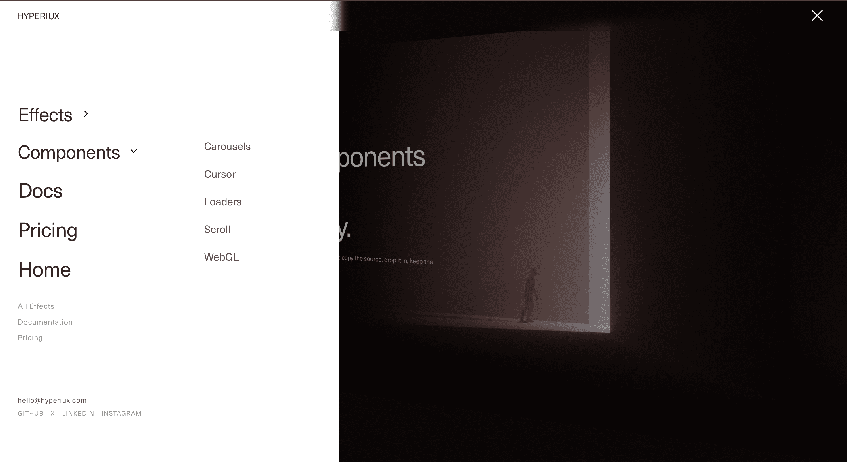
Perspective Shift Menu turns navigation into a spatial state change.
When the menu opens, the main page shifts into the background through scale, rotation, perspective, or depth. The navigation panel moves into focus with primary links, secondary routes, category groups, and supporting information. The page does not simply receive a menu overlay. It becomes part of the transition.
Use Perspective Shift Menu when navigation is a meaningful brand moment, not just a utility drawer. It works for creative studios, portfolios, digital products, SaaS launches, editorial microsites, agencies, and high-craft landing pages where the menu should feel designed without making the user hunt for basic links.
The page job is orientation with drama. The visitor should understand that the menu is open, see the available routes clearly, and close or navigate without confusion. Perspective is the entrance. Usability is still the job.
Install Command
This is a Pro Effect.
You can preview it now. Upgrade to Pro for instant install access.
Usage Code
This is a Pro Effect.
You can preview it now. Upgrade to Pro for instant install access.
Component Code
This is a Pro Effect.
You can preview it now. Upgrade to Pro for instant install access.
Example Production Use Case
A creative studio can use Perspective Shift Menu to turn global navigation into a brand moment. The homepage shifts into depth while the menu opens with project categories, service routes, contact links, and social channels.
The outcome is atmosphere with structure. The menu feels authored, but the visitor still finds the route they came for.
A SaaS or developer-tool landing page can use the same component for a compact navigation system where product categories, docs, pricing, and effect libraries need room without overcrowding the header.
Best Used For
• Portfolio and agency websites where navigation contributes to brand feel.
• Product launches and campaign pages with a cinematic visual system.
• SaaS, AI, and developer-tool sites where categories need a structured menu surface.
• Editorial microsites where the menu can behave like a chapter layer.
• Navigation systems with primary routes plus secondary categories or supporting links.
Not For
Not for dense enterprise dashboards, admin tools, checkout flows, documentation-heavy products, or pages where users need fast utility navigation above all else.
Not for menus with weak structure. A perspective transition can make navigation feel premium, but it cannot fix unclear information architecture.
Not for mobile unless the menu simplifies cleanly. A desktop 3D shift forced onto a small screen can quickly become a tiny tilted website pretending to be useful.
Performance Budget
Keep transforms GPU-friendly. Animate transform, opacity, and overlay states rather than layout-heavy properties. Avoid large blur filters, excessive shadows, and continuous animation while the menu is open.
Clean up keyboard listeners, scroll locks, and route-change side effects when the menu closes or the component unmounts. The menu should feel dramatic for the user, not for the browser’s memory profile.
Accessibility and Mobile
Use a semantic button for the menu trigger, clear labels, visible focus states, keyboard navigation, Escape close behavior, and focus return to the trigger when the menu closes.
If the menu behaves like a modal layer, keep focus inside the menu while it is open and prevent background content from being reached accidentally. If it behaves like a non-modal navigation panel, make background interaction predictable.
On mobile, simplify the perspective shift, reduce rotation, and prioritize readable navigation links. For reduced motion, remove the 3D page movement and open the menu with a simple fade, slide, or instant state change.
Common Mistakes
• Making the animation stronger than the navigation.
• Forgetting Escape close and focus return.
• Leaving background page elements focusable when the menu should be modal.
• Using unclear nested categories.
• Letting the transformed page become unreadable or distracting.
• Forcing desktop perspective behavior onto mobile.
• Using a hamburger menu because it looks clean while hiding routes users actually need.
Changelog
v1.0.0
Sep 16, 2026Initial release
Props
| Prop | Type | Default | Description |
|---|---|---|---|
animationSpeed | number | 1 | Opening and closing speed multiplier. Higher values animate faster. |
tiltAngle | number | 20 | How far the page rotates away, in degrees. 0 slides without tilting. |
linkStagger | number | 0 | Delay between nav links as they enter, in seconds. |
charStagger | number | 0.007 | Delay between characters on link hover, in seconds. |
panelWidth | number | 22 | Nav column width, in vw. |
drawerWidth | number | 18 | Sub-drawer width, in vw. |
panelColor | string | #ffffff | Nav column and sub-drawer surface color. |
textColor | string | #111111 | Links, headings, and menu icon color. |
voidColor | string | #0e0e0e | The void behind the page as it tilts away. |
dimOpacity | number | 0.4 | How strongly the receded page is dimmed, 0 to 1. |
Frequently Asked Questions
What is Perspective Shift Menu?
Perspective Shift Menu is a React navigation component where opening the menu shifts the main page into a 3D perspective state while the navigation panel moves into focus.
When should I use Perspective Shift Menu?
Use it for portfolios, studio sites, product launches, campaign pages, and brand-led interfaces where navigation should feel more cinematic than a simple dropdown.
Is Perspective Shift Menu good for documentation sites?
Usually no. Documentation users need fast scanning, search, and predictable navigation. A simpler sidebar or header navigation is usually better.
Does Perspective Shift Menu need an animation library?
Not always. A strong version can be built with React state and CSS perspective transforms. More complex versions may use Framer Motion, Motion, or GSAP depending on the shipped implementation.
What should reduced motion do?
Reduced motion should remove the 3D page tilt, scale travel, and perspective movement. Open the menu with a simple fade, slide, or instant state change.
Request a Custom Navigation Animation
Need a custom effect? Tell us what to create.


