Loading
Morphing Dock
A floating dock navigation component for portfolios, agency websites, SaaS pages, product microsites, and brand-led interfaces where navigation should stay compact until the user asks for more.
Published On: September 14, 2026
Last Updated: September 14, 2026
GSAP
Overview
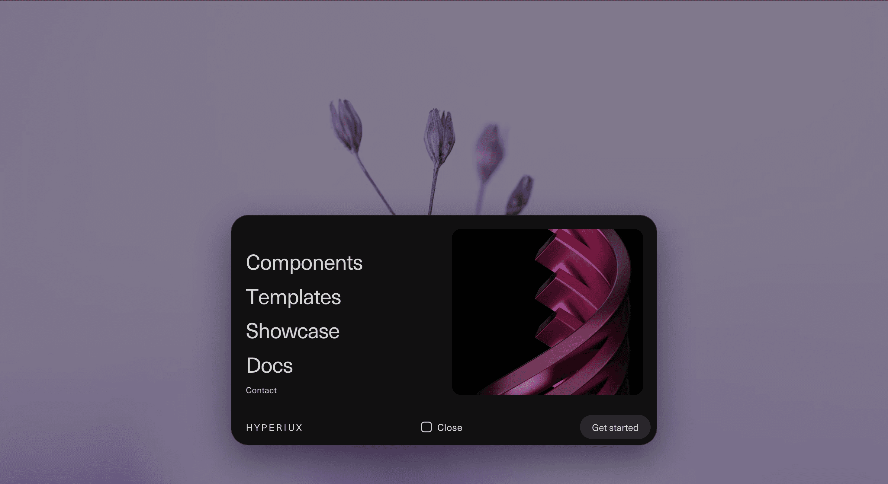
Morphing Dock keeps navigation light until it needs to open.
The component starts as a compact dock with the essential brand, menu, and action controls. When activated, it expands into a larger navigation surface where links, supporting actions, and optional preview content can appear. The interaction gives the menu a strong sense of continuity because the expanded panel feels like it grows from the dock rather than appearing as a disconnected overlay.
Use Morphing Dock when the page needs a clean first impression without hiding navigation completely. It works for creative portfolios, agency sites, product launches, SaaS landing pages, template directories, editorial projects, and campaign microsites where the navigation should feel designed but still practical.
The page job is compact control. The user should know where the menu lives, what opened, what each route does, and how to close it. The morph should make navigation feel fluid, not make the visitor wonder whether the footer has developed ambitions.
Install Command
This is a Pro Effect.
You can preview it now. Upgrade to Pro for instant install access.
Usage Code
This is a Pro Effect.
You can preview it now. Upgrade to Pro for instant install access.
Component Code
This is a Pro Effect.
You can preview it now. Upgrade to Pro for instant install access.
Example Production Use Case
A product microsite can use Morphing Dock as a floating navigation system near the bottom of the viewport. The compact state keeps the page visually clean, while the expanded state gives visitors access to components, templates, documentation, pricing, and the main conversion action.
The outcome is presence without header weight. The navigation feels integrated into the experience without occupying the whole top of the page.
A creative studio can use the same component for a portfolio site where the menu needs to feel premium, compact, and memorable. The dock becomes a small persistent control, then opens into a branded route surface when the visitor needs direction.
Best Used For
• Portfolio and agency websites where the navigation should feel designed.
• SaaS and product launch pages that need a compact persistent menu.
• Template, component, and product directories with a small set of primary routes.
• Campaign microsites where standard headers feel too heavy.
• Editorial and creative projects where navigation should support the visual system.
• Mobile-adapted menus where compact controls matter.
Not For
Not for complex enterprise navigation, large ecommerce menus, admin dashboards, documentation systems with many nested sections, or product areas that need persistent sidebar navigation.
Not for hiding essential routes behind unclear controls. A dock can be compact, but it cannot be cryptic.
Not for pages where navigation speed matters more than ceremony. If the user knows exactly where they want to go, the menu should not make them sit through a tiny architectural transformation first.
Performance Budget
Keep the morph lightweight. Animate transform, opacity, clip-path, width, height, and border radius with restraint, and avoid layout-heavy recalculation across many nested elements. Stagger links subtly rather than turning every route into a separate entrance ceremony.
Clean up event listeners, outside-click handlers, scroll locks, and animation instances when the component unmounts. If preview media appears inside the expanded menu, optimise it and avoid loading heavy assets before the menu is opened.
Accessibility and Mobile
Use a semantic navigation landmark and real links. The dock trigger should be a button with an accessible label and expanded state. Support keyboard operation, visible focus states, Escape-to-close, and focus return.
On mobile, keep dock controls large enough to tap and avoid placing critical actions too close to screen edges. The expanded state may need to behave like a bottom sheet, centred panel, or full-screen menu depending on available space.
For reduced motion, remove shape travel, long scaling, spring overshoot, and staggered link movement. Open the expanded menu instantly or with a minimal fade while keeping the same routes available.
Common Mistakes
• Making the compact trigger unclear.
• Using clickable divs instead of buttons and links.
• Forgetting Escape-to-close and focus return.
• Animating the dock so slowly that navigation becomes friction.
• Hiding important routes inside decorative preview panels.
• Loading heavy preview media before the menu is opened.
• Forcing the same desktop dock geometry onto mobile.
• Treating the morph as more important than route clarity.
Changelog
v1.0.0
Sep 14, 2026Initial release
Props
| Prop | Type | Default | Description |
|---|---|---|---|
duration | number | 1 | Duration multiplier for dock animations; 1 preserves the original timing proportions. |
staggerStep | number | 0.01 | Delay in seconds between animated letters. |
showLine | boolean | true | Draw navigation link underlines on hover and focus. The CTA never shows an underline. |
backgroundColor | color | #111111 | Dock and expanded panel background. |
textColor | color | #d2d2d2 | Resting navigation and CTA link color. |
hoverColor | color | #ffffff | Navigation and CTA link hover and focus color. |
brand | string | HYPERIUX | Dock brand label. |
contactLabel | string | Contact | Contact link label. |
email | string | hello@hyperiux.com | Contact email address. |
emailNote | string | Partnerships, press and support. | Supporting contact text. |
ctaLabel | string | Get started | CTA label. |
ctaHref | string | # | CTA destination. |
teaserImage | string | https://pub-8abee449136941f5b0a1cd2c014534e9.r2.dev/vault-listing-images/assets-images/v-10.jpg | Preview image URL. |
teaserHref | string | # | Preview destination. |
expandedWidth | number | 48 | Expanded nav panel width in viewport units. |
expandedHeight | number | 26 | Expanded nav panel height in viewport units. |
items | array | [{"label":"Components","href":"#","blurb":"Drop-in motion primitives"},{"label":"Templates","href":"#","blurb":"Full pages, wired and ready"},{"label":"Showcase","href":"#","blurb":"Built with Hyperiux in the wild"},{"label":"Docs","href":"#","blurb":"Guides, props and recipes"}] | Navigation items with label, href, and blurb strings. |
Frequently Asked Questions
What is Morphing Dock?
Morphing Dock is a React navigation component that transforms a compact floating dock into an expanded menu surface.
When should I use Morphing Dock?
Use it for portfolios, agency sites, product microsites, SaaS landing pages, launch pages, and brand-led interfaces where navigation should stay compact but still feel polished.
Is Morphing Dock the same as a navbar?
Not exactly. A navbar is usually fixed as a full horizontal navigation area. Morphing Dock starts as a compact control and expands into a larger route surface when activated.
Is Morphing Dock the same as a dropdown?
No. A dropdown usually opens a simple list from one trigger. Morphing Dock changes the shape and scale of the navigation container itself, creating a more continuous menu interaction.
Can Morphing Dock work in Next.js?
Yes. Use it as a client component in Next.js App Router because menu state, keyboard behavior, focus management, and animation logic run on the client.
What should reduced motion do?
Reduced motion should remove shape morphing, scale travel, staggered link motion, and spring overshoot. The menu should open instantly or with a minimal fade.
Request a Custom Navigation Animation
Need a custom effect? Tell us what to create.


