Loading
Video Player
A branded video player component with usable playback controls for demos, case-study videos, captions, and product proof.
Published On: June 4, 2026
Last Updated: August 17, 2026
Lucide-react
Overview
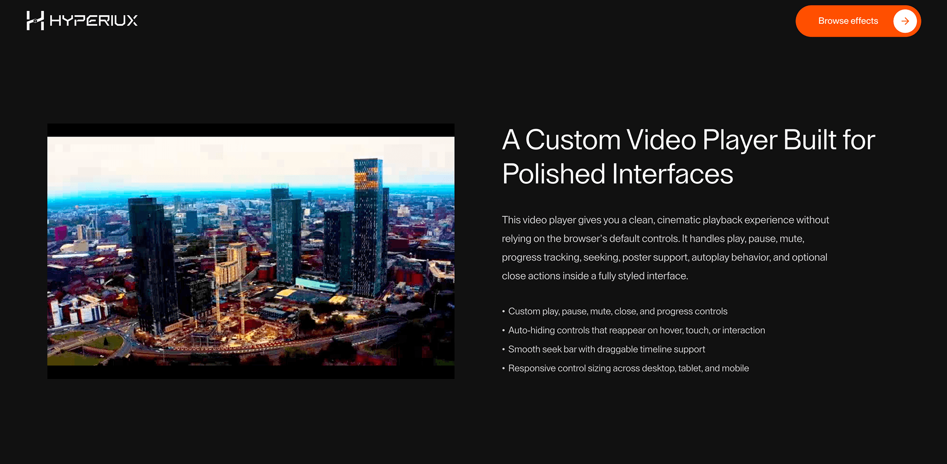
Custom Video Player gives product demos and case-study videos branded controls without making playback harder.
Use it when a video section needs source, poster, captions, visible controls, keyboard operation, and loading states that match the brand system. The page job is watched proof: the player should make the demo easier to trust and operate.
The thing to watch is inaccessible media chrome. Custom controls must preserve play/pause, mute, seek, captions, focus order, keyboard shortcuts where supported, and a plain fallback if custom UI fails.
Install Command
This is a Pro Effect.
You can preview it now. Upgrade to Pro for instant install access.
Usage Code
This is a Pro Effect.
You can preview it now. Upgrade to Pro for instant install access.
Component Code
This is a Pro Effect.
You can preview it now. Upgrade to Pro for instant install access.
This is a Pro Effect.
You can preview it now. Upgrade to Pro for instant install access.
Example Production Use Case
A product demo page can use Custom Video Player when the video is a proof asset: poster loads fast, captions are available, controls are visible, and keyboard users can operate playback without guessing.
Best Used For
- Product demo sections where branded controls must stay keyboard-usable.
- Case-study pages where poster, captions, and playback states affect trust.
- Landing pages where media loading should not block the rest of the page.
Not For
Not for videos that need native reliability more than branded chrome, or for pages where captions, controls, or fallback playback cannot be verified.
Performance Budget
Load the poster first, avoid blocking surrounding content on video metadata, and lazy-load heavy media only when the section is likely to be used.
Accessibility and Mobile
Expose every control to keyboard users, keep captions available where provided, preserve focus order, and avoid hover-only playback controls on touch screens.
Common Mistakes
- Styling controls so heavily that play, pause, mute, seek, or captions become unclear.
- Autoplaying proof video without user control.
- Letting media loading block the rest of the page.
Changelog
v1.0.1
Jul 30, 2026Replaced the rAF progress loop with native timeupdate events.
v1.0.0
Jul 23, 2026Initial release
Props
| Prop | Type | Default | Description |
|---|---|---|---|
autoPlay | boolean | true | Starts playback automatically when allowed. |
startMuted | boolean | true | Initial muted state. |
showCloseButton | boolean | true | Shows the close button on the player. |
rounded | boolean | false | Rounds the player frame when not fullscreen. |
preserveAspectRatio | boolean | true | Uses object-contain instead of object-cover for the video. |
hideControlsDelay | number | 1800 | Delay before controls auto-hide, in milliseconds. |
Frequently Asked Questions
What makes Custom Video Player different from a decorative component?
It controls actual media. Playback, captions, focus, and loading behavior matter more than the animation around the controls.
Which accessibility details are required?
Controls need accessible names, keyboard focus, visible focus states, caption access where captions exist, and predictable play/pause state.
Should the video autoplay?
Avoid autoplay unless the video is muted, non-essential, and does not interfere with reduced-motion or user control expectations.
Can Hyperiux adapt Custom Video Player for a real brand system?
Yes. A custom version should define content structure, accessibility behavior, motion rules, reduced-motion behavior, source handoff, and implementation notes for the specific page job.
Request a Custom Creative Component Animation
Need a custom effect? Tell us what to create.


