Loading
GSAP Flip Card
A thumbnail-to-preview card component for portfolios, product galleries, case-study visuals, travel stories, editorial pages, and image-led interfaces where the selected card should feel physically connected to its new position.
Published On: September 10, 2026
Last Updated: September 10, 2026
GSAP
Overview
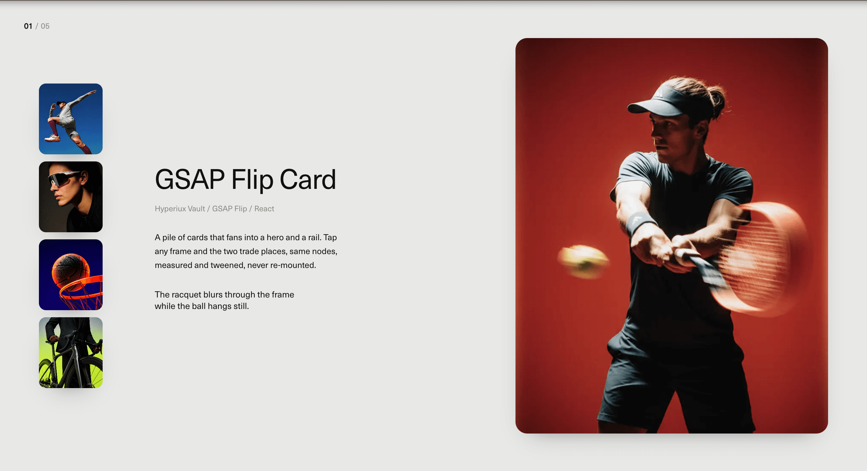
GSAP Flip Card turns image selection into a spatial handoff.
A user selects a thumbnail, and the chosen card animates into a larger preview area without feeling like a disconnected replacement. The movement preserves visual continuity: the selected image feels like the same object travelling from one place in the layout to another.
Use GSAP Flip Card when a gallery needs more craft than a static preview and more continuity than a normal image swap. It works for portfolios, product images, visual archives, travel galleries, editorial image sets, creative case studies, and landing-page sections where selection should feel tactile.
The page job is continuity. The visitor should understand exactly which item they selected, where it moved, and why the preview changed. The animation should make the layout feel intelligent, not make the card perform gymnastics before showing a mountain photo.
Install Command
npx hyperiux add gsap-flip-cardUsage Code
page.jsx
import GsapFlipCard from '@/components/effects/gsap-flip-card'

const page = () => {
  return (
    <>
    <GsapFlipCard/>
    </>
  )
}
Component Code
index.jsx
// Built using Hyperiux Vault: https://vault.hyperiux.com
'use client';
import React, { useCallback, useEffect, useLayoutEffect, useRef, useState, useSyncExternalStore, } from "react";
import { gsap } from "gsap";
import { Flip } from "gsap/dist/Flip";
import { SplitText } from "gsap/dist/SplitText";
import Image from "next/image";
gsap.registerPlugin(Flip, SplitText);
const REDUCED_MOTION_QUERY = "(prefers-reduced-motion: reduce)";
function prefersReducedMotion() {
    if (typeof window === "undefined")
        return false;
    return window.matchMedia?.(REDUCED_MOTION_QUERY)?.matches ?? false;
}
function subscribeToReducedMotion(callback) {
    if (typeof window === "undefined")
        return () => { };
    const mediaQueryList = window.matchMedia(REDUCED_MOTION_QUERY);
    mediaQueryList.addEventListener("change", callback);
    return () => mediaQueryList.removeEventListener("change", callback);
}
function getServerReducedMotionSnapshot() {
    return false;
}
function usePrefersReducedMotion() {
    return useSyncExternalStore(subscribeToReducedMotion, prefersReducedMotion, getServerReducedMotionSnapshot);
}
const CAPTION_FONT_VW = 1;
const CAPTION_LINE_RATIO = 1.3;
const CAPTION_LINE_VW = CAPTION_FONT_VW * CAPTION_LINE_RATIO;
const CAPTION_MOBILE_LINE_RATIO = 1.5;
const CAPTION_MOBILE_LINE = `${3 * CAPTION_MOBILE_LINE_RATIO}vw`;
const CAPTION_MOBILE_LINE_SM = `${3.5 * CAPTION_MOBILE_LINE_RATIO}vw`;
const UNSPLASH = (id) => `https://images.unsplash.com/photo-${id}?w=800&h=1000&fit=crop`;
const defaultItems = [
    {
        id: 0,
        image: UNSPLASH('1500534623283-312aade485b7'),
        alt: 'Coastal cliffs meeting open water',
        caption: 'Late light on the headland, shot from the cliff path.',
    },
    {
        id: 1,
        image: UNSPLASH('1519681393784-d120267933ba'),
        alt: 'Mountain range under night sky',
        caption: 'The ridge holds its last colour long after the sun goes.',
    },
    {
        id: 2,
        image: UNSPLASH('1470252649378-9c29740c9fa8'),
        alt: 'Star field over a dark ridge',
        caption: 'Clear enough that night to read the whole sky at once.',
    },
    {
        id: 3,
        image: UNSPLASH('1506905925346-21bda4d32df4'),
        alt: 'Mist settling across a valley',
        caption: 'Mist gathers in the valley before the morning burns it off.',
    },
    {
        id: 4,
        image: UNSPLASH('1439066615861-d1af74d74000'),
        alt: 'Forest ridge in low cloud',
        caption: 'Cloud sits low on the treeline and refuses to lift.',
    },
    {
        id: 5,
        image: UNSPLASH('1444927714506-8492d94b4e3d'),
        alt: 'Waves breaking along a shoreline',
        caption: 'The tide works the same stretch of shore all afternoon.',
    },
];
const GsapFlipCard = ({ items = defaultItems, title = "GSAP Flip Card", meta = "Hyperiux Vault / GSAP Flip / React", description = "A pile of cards that fans into a hero and a rail. Tap any frame and the two trade places, same nodes, measured and tweened, never re-mounted.", backgroundColor = "#e9e9e7", textColor = "#111111", mutedColor = "#8a8a86", rounded = 20, thumbWidth = 108, thumbHeight = 120, thumbGap = 12, heroWidth = 530, heroHeight = 670, duration = 0.7, ease = "power3.inOut", stackOffsetX = 3, stackOffsetY = 9, stackRotation = 0, showCounter = true, captionLines = 2, captionFadeDuration = 0.25, captionRevealDuration = 0.55, captionLineStagger = 0.07, onClose, className = "", }) => {
    const reducedMotion = usePrefersReducedMotion();
    const [order, setOrder] = useState(() => items.map((_, i) => i));
    const [opened, setOpened] = useState(false);
    const [stageWidth, setStageWidth] = useState(0);
    const stageRef = useRef(null);
    const rootRef = useRef(null);
    const cardRefs = useRef(new Map());
    const flipStateRef = useRef(null);
    const isAnimatingRef = useRef(false);
    const [shownCaption, setShownCaption] = useState(() => items[0]?.caption);
    const captionRef = useRef(null);
    const captionTweenRef = useRef(null);
    const captionSplitRef = useRef(null);
    const revertCaptionSplit = useCallback(() => {
        captionSplitRef.current?.revert();
        captionSplitRef.current = null;
    }, []);
    useEffect(() => {
        setOrder(items.map((_, i) => i));
    }, [items]);
    useLayoutEffect(() => {
        const el = rootRef.current;
        if (!el)
            return;
        const measure = () => setStageWidth(el.clientWidth);
        measure();
        const ro = new ResizeObserver(measure);
        ro.observe(el);
        return () => ro.disconnect();
    }, []);
    const registerCard = useCallback((index, node) => {
        if (node)
            cardRefs.current.set(index, node);
        else
            cardRefs.current.delete(index);
    }, []);
    const orderedCards = useCallback(() => order.map((i) => cardRefs.current.get(i)).filter(Boolean), [order]);
    const isMobile = stageWidth > 0 && stageWidth <= 1025;
    const isNarrow = stageWidth > 0 && stageWidth < 900;
    const railCount = Math.max(items.length - 1, 0);
    const scale = isNarrow ? Math.min(1, stageWidth / 900) : 1;
    const tW = thumbWidth * scale;
    const tH = thumbHeight * scale;
    const gap = thumbGap * scale;
    const hW = Math.min(heroWidth * scale, stageWidth * 0.46);
    const hH = heroHeight * (hW / heroWidth || 1);
    const railX = Math.max(24, stageWidth * 0.045);
    const heroX = stageWidth - hW - railX;
    const stackWidth = Math.min(215 * scale, stageWidth * 0.42);
    const stackHeight = stackWidth * 1.5;
    const slotBox = useCallback((slot) => {
        if (slot === 0) {
            return { x: heroX, y: 0, w: hW, h: hH, r: rounded * scale, z: items.length + 1 };
        }
        const railHeight = railCount * tH + (railCount - 1) * gap;
        const top = -railHeight / 2 + (slot - 1) * (tH + gap);
        return {
            x: railX,
            y: top + tH / 2,
            w: tW,
            h: tH,
            r: rounded * 0.6 * scale,
            z: items.length - slot,
        };
    }, [heroX, hW, hH, railX, tW, tH, gap, railCount, rounded, scale, items.length]);
    const select = useCallback((itemIndex) => {
        if (itemIndex === order[0] || isAnimatingRef.current)
            return;
        if (!isMobile) {
            flipStateRef.current = Flip.getState(orderedCards(), { props: "borderRadius" });
        }
        setOrder((prev) => {
            const next = [...prev];
            const from = next.indexOf(itemIndex);
            next[from] = next[0];
            next[0] = itemIndex;
            return next;
        });
    }, [order, orderedCards, isMobile]);
    useLayoutEffect(() => {
        const state = flipStateRef.current;
        if (!state)
            return;
        flipStateRef.current = null;
        if (reducedMotion || isMobile)
            return;
        isAnimatingRef.current = true;
        Flip.from(state, {
            duration,
            ease,
            absolute: true,
            props: "borderRadius",
            onEnter: (els) => gsap.fromTo(els, { opacity: 0 }, { opacity: 1, duration }),
            onComplete: () => {
                isAnimatingRef.current = false;
            },
        });
    }, [order, duration, ease, reducedMotion, isMobile]);
    const open = useCallback(() => {
        if (opened || isAnimatingRef.current || stageWidth === 0)
            return;
        if (reducedMotion) {
            setOpened(true);
            return;
        }
        const state = Flip.getState(orderedCards(), { props: "borderRadius" });
        setOpened(true);
        requestAnimationFrame(() => {
            isAnimatingRef.current = true;
            Flip.from(state, {
                duration: duration * 1.0,
                ease,
                absolute: true,
                props: "borderRadius",
                stagger: 0.04,
                onComplete: () => {
                    isAnimatingRef.current = false;
                },
            });
        });
    }, [opened, stageWidth, reducedMotion, orderedCards, duration, ease]);
    const close = useCallback(() => {
        if (!opened || isAnimatingRef.current)
            return;
        if (reducedMotion) {
            setOpened(false);
            onClose?.();
            return;
        }
        const state = Flip.getState(orderedCards(), { props: "borderRadius" });
        setOpened(false);
        requestAnimationFrame(() => {
            isAnimatingRef.current = true;
            Flip.from(state, {
                duration: duration * 0.9,
                ease,
                absolute: true,
                props: "borderRadius",
                stagger: { each: 0.035, from: "end" },
                onComplete: () => {
                    isAnimatingRef.current = false;
                },
            });
        });
        onClose?.();
    }, [opened, reducedMotion, orderedCards, duration, ease, onClose]);
    const nextCaption = items[order[0]]?.caption;
    const activeCaption = reducedMotion ? nextCaption : shownCaption;
    useEffect(() => {
        if (reducedMotion || nextCaption === shownCaption)
            return;
        const el = captionRef.current;
        if (!el) {
            revertCaptionSplit();
            setShownCaption(nextCaption);
            return;
        }
        captionTweenRef.current?.kill();
        captionTweenRef.current = gsap.to(el, {
            opacity: 0,
            y: -8,
            duration: captionFadeDuration,
            ease: "power2.in",
            onComplete: () => {
                revertCaptionSplit();
                setShownCaption(nextCaption);
            },
        });
    }, [nextCaption, shownCaption, reducedMotion, captionFadeDuration, revertCaptionSplit]);
    useLayoutEffect(() => {
        const el = captionRef.current;
        if (!el || !activeCaption)
            return;
        if (reducedMotion) {
            revertCaptionSplit();
            gsap.set(el, { opacity: 1, y: 0 });
            return;
        }
        captionTweenRef.current?.kill();
        revertCaptionSplit();
        gsap.set(el, { opacity: 1, y: 0 });
        const split = SplitText.create(el, {
            type: "lines",
            linesClass: "hxs-caption-line",
            mask: "lines",
        });
        captionSplitRef.current = split;
        const lines = split.lines;
        if (!lines?.length) {
            revertCaptionSplit();
            return;
        }
        gsap.set(lines, { yPercent: 100 });
        captionTweenRef.current = gsap.to(lines, {
            yPercent: 0,
            duration: captionRevealDuration,
            stagger: captionLineStagger,
            ease: "power3.out",
        });
        return () => {
            captionTweenRef.current?.kill();
            revertCaptionSplit();
        };
    }, [activeCaption, reducedMotion, captionRevealDuration, captionLineStagger, revertCaptionSplit]);
    useEffect(() => {
        const onKey = (e) => {
            if (e.key === "Escape") {
                close();
                return;
            }
            if (!opened || items.length < 2)
                return;
            if (e.key === "ArrowDown" || e.key === "ArrowRight")
                select(order[1]);
            else if (e.key === "ArrowUp" || e.key === "ArrowLeft")
                select(order[order.length - 1]);
        };
        window.addEventListener("keydown", onKey);
        return () => window.removeEventListener("keydown", onKey);
    }, [order, select, close, opened, items.length]);
    if (items.length === 0)
        return null;
    const heroItemIndex = order[0];
    const heroItem = items[heroItemIndex];
    const heroSlotLabel = heroItemIndex + 1;
    const cardStyle = (itemIndex) => {
        const slot = order.indexOf(itemIndex);
        if (!opened) {
            const w = stackWidth;
            const h = stackHeight;
            return {
                position: "absolute",
                left: stageWidth / 2 - w / 2,
                top: "50%",
                width: w,
                height: h,
                borderRadius: rounded * 0.75 * scale,
                transform: `translateY(-50%) translate(${slot * stackOffsetX}px, ${slot * stackOffsetY}px) rotate(${slot * stackRotation}deg)`,
                zIndex: items.length - slot,
            };
        }
        const box = slotBox(slot);
        return {
            position: "absolute",
            left: box.x,
            top: "50%",
            width: box.w,
            height: box.h,
            borderRadius: box.r,
            transform: `translateY(calc(-50% + ${box.y}px))`,
            zIndex: box.z,
        };
    };
    const chromeStyle = {
        opacity: opened ? 1 : 0,
        transition: "opacity 0.5s ease 0.25s",
        pointerEvents: opened ? undefined : "none",
    };
    if (isMobile) {
        return (<div ref={rootRef} className={`hxs-gsap-flip-card relative w-full min-h-svh overflow-hidden ${className}`} style={{ background: backgroundColor, color: textColor }}>
        <div className="min-h-svh px-[5vw] py-[8vw] flex flex-col gap-[6vw]">
          {showCounter && (<div className="text-[3vw] tracking-[0.02em]">
              <span className="font-semibold">
                {String(heroSlotLabel).padStart(2, "0")}
              </span>
              <span style={{ color: mutedColor }}>
                {" "}
                / {String(items.length).padStart(2, "0")}
              </span>
            </div>)}

          {heroItem && (<div className="relative w-full flex-1 min-h-[45svh] overflow-hidden bg-[#d8d8d4] shadow-[0_18px_40px_-24px_rgba(0,0,0,0.45)]" style={{ borderRadius: rounded }}>
              <Image src={heroItem.image} alt={heroItem.alt ?? ""} draggable={false} fill sizes="90vw" priority className="object-cover"/>
            </div>)}

          <div className="max-[1025px]:pb-[3vh]">
            <h2 className="text-[7vw]  max-md:text-[8.5vw] leading-[1.05] m-0 font-normal tracking-[-0.02em]">
              {title}
            </h2>
            <p className="text-[3vw] max-md:text-[3.5vw] mt-[3vw] mb-[4vw]" style={{ color: mutedColor }}>
              {meta}
            </p>
            <p className="text-[3.2vw] max-md:text-[3.8vw] leading-[1.65] m-0">
              {description}
            </p>
            <div className="mt-[5vw] h-[calc(var(--hxs-cap-line)*var(--hxs-cap-lines))] max-md:[--hxs-cap-line:var(--hxs-cap-line-sm)]" style={{
                "--hxs-cap-line": CAPTION_MOBILE_LINE,
                "--hxs-cap-line-sm": CAPTION_MOBILE_LINE_SM,
                "--hxs-cap-lines": captionLines,
            }}>
              <p ref={captionRef} className="text-[3vw] text-left max-md:text-left max-md:w-[80%] max-md:text-[4vw] w-[80%]  m-0  leading-normal">
                {activeCaption}
              </p>
            </div>
          </div>

          <div className="grid grid-cols-3 gap-[3vw]">
            {order.slice(1).map((itemIndex) => {
                const item = items[itemIndex];
                if (!item)
                    return null;
                return (<button key={item.id ?? itemIndex} type="button" onClick={() => select(itemIndex)} aria-label={item.alt ?? item.caption ?? `Image ${itemIndex + 1}`} className="relative p-0 border-none overflow-hidden aspect-4/5 w-full bg-[#d8d8d4] [-webkit-tap-highlight-color:transparent]" style={{ borderRadius: rounded * 0.6 }}>
                  <Image src={item.image} alt={item.alt ?? ""} draggable={false} fill sizes="30vw" className="object-cover"/>
                </button>);
            })}
          </div>
        </div>
      </div>);
    }
    return (<div ref={rootRef} className={`hxs-gsap-flip-card relative w-full min-h-svh overflow-hidden ${className}`} style={{ background: backgroundColor, color: textColor }}>
      {showCounter && (<div className="absolute top-[2.22vw] left-[2.78vw] text-[0.9vw] tracking-[0.02em] z-60" style={chromeStyle}>
          <span className="font-semibold">
            {String(heroSlotLabel).padStart(2, "0")}
          </span>
          <span style={{ color: mutedColor }}> / {String(items.length).padStart(2, "0")}</span>
        </div>)}

      <div ref={stageRef} onClick={(e) => {
            if (e.target === e.currentTarget)
                close();
        }} className={`relative w-full min-h-svh ${opened ? "cursor-pointer" : "cursor-default"}`}>
        <div className={`absolute top-1/2 -translate-y-1/2 max-w-[22.22vw] z-30 pointer-events-none ${isNarrow ? "hidden" : "block"}`} style={{ ...chromeStyle, left: railX + tW + Math.max(48, stageWidth * 0.06) }}>
          <h2 className="text-[3.2vw] leading-[1.05] font-normal tracking-[-0.02em] m-0">
            {title}
          </h2>
          <p className="text-[0.9vw] mt-[0.97vw] mb-[1.81vw] mx-0" style={{ color: mutedColor }}>
            {meta}
          </p>
          <p className="text-[0.97vw] leading-[1.65] m-0">{description}</p>
          <div className="mt-[1.94vw]" style={{ height: `${CAPTION_LINE_VW * captionLines}vw` }}>

            <p ref={captionRef} className="text-[1vw] w-[80%] text-left leading-[1.3]  m-0 ">
              {activeCaption}
            </p>
          </div>
        </div>

        {items.map((item, itemIndex) => {
            const isHero = itemIndex === heroItemIndex;
            return (<button key={item.id ?? itemIndex} type="button" ref={(n) => registerCard(itemIndex, n)} data-flip-id={`hxs-card-${item.id ?? itemIndex}`} onClick={() => (opened ? select(itemIndex) : open())} aria-label={opened
                    ? item.alt ?? item.caption ?? `Image ${itemIndex + 1}`
                    : `Open gallery — ${items.length} images`} aria-current={(opened && isHero) || undefined} tabIndex={!opened ? (itemIndex === order[0] ? 0 : -1) : isHero ? -1 : 0} className={`p-0 border-none bg-[#d8d8d4] overflow-hidden shadow-[0_18px_40px_-24px_rgba(0,0,0,0.45)] [-webkit-tap-highlight-color:transparent] ${!opened || !isHero ? "cursor-pointer" : "cursor-default"}`} style={cardStyle(itemIndex)}>
              <Image src={item.image} alt={item.alt ?? ""} draggable={false} fill sizes={`${Math.max(Math.round(hW), 1)}px`} className="object-cover rounded-[inherit]"/>
            </button>);
        })}
      </div>
    </div>);
};
export default GsapFlipCard;
Example Production Use Case
A travel gallery can use GSAP Flip Card to let visitors move selected images from a thumbnail rail into a large preview. The selected image does not simply appear. It travels into focus, making the relationship between thumbnail and preview easy to understand.
The outcome is continuity. The visitor keeps orientation while browsing the set.
A portfolio page can use the same component for project previews. Each thumbnail opens into a larger case-study image, supported by a short caption and CTA. The movement makes the selected project feel important without opening a new page too early.
Best Used For
• Portfolio image galleries where selected work needs a larger preview.
• Product galleries where thumbnails should expand into focus.
• Travel, photography, fashion, and editorial image sets.
• Case-study sections where visual selection should feel connected.
• Visual archives where browsing benefits from thumbnail-to-preview continuity.
• Landing pages where one selected image should carry the section.
Not For
Not for dense ecommerce grids, pricing sections, documentation, long text cards, legal content, or interfaces where users need instant comparison across many items.
Not for unstable layouts where images, captions, or containers constantly change size. FLIP rewards discipline. It punishes chaos with visible weirdness.
Not for content where a simple grid would be faster, clearer, and more useful.
Performance Budget
Optimise image sizes, keep card count controlled, and avoid triggering layout measurement across a huge DOM subtree. FLIP works by measuring layout states, so keep the animated scope tight.
Avoid running expensive animations on every hover. Use click or deliberate selection where possible. Clean up GSAP timelines and contexts on unmount.
On lower-power devices, reduce shadow intensity, animation duration, and simultaneous card movement.
Accessibility and Mobile
Use semantic buttons for thumbnails, meaningful image alt text, visible focus states, and clear selected state. When a card becomes the preview, preserve a logical reading order and avoid moving focus unexpectedly unless the interaction requires it.
On mobile, simplify the layout into a stacked preview with a horizontal thumbnail rail or swipe-friendly sequence. For reduced motion, switch selected images instantly or with a minimal fade, without FLIP travel, scaling, or layout-flight animation.
Common Mistakes
• Forgetting to register the GSAP Flip plugin.
• Measuring layout after the state has already changed incorrectly.
• Using inconsistent image ratios that make the movement feel broken.
• Animating too many cards at once.
• Making thumbnails clickable without keyboard support.
• Hiding captions inside images.
• Using FLIP when a normal image swap would be clearer.
Changelog
v1.0.0
Sep 10, 2026Initial release
Props
| Prop | Type | Default | Description |
|---|---|---|---|
duration | number | 0.7 | Card transition duration in seconds. |
rounded | number | 20 | Card corner radius in pixels. |
stackRotation | number | 0 | Rotation per card in the collapsed desktop stack, in degrees. |
thumbGap | number | 12 | Spacing between desktop rail thumbnails in pixels. |
backgroundColor | color | #e9e9e7 | Section background color. |
textColor | color | #111111 | Primary text color. |
mutedColor | color | #8a8a86 | Secondary text color. |
Frequently Asked Questions
What is GSAP Flip Card?
GSAP Flip Card is a React component that uses GSAP’s Flip plugin to animate image cards between thumbnail and large preview states.
What does FLIP mean?
FLIP stands for First, Last, Invert, Play. It is an animation technique where the layout’s before-and-after positions are measured, then animated so the transition feels physically continuous.
How do I keep GSAP Flip Card accessible?
Use real buttons for thumbnails, provide meaningful alt text, maintain visible focus states, expose selected state clearly, and preserve a logical reading order.
What should reduced motion do?
Reduced motion should remove FLIP travel, scaling, and layout-flight animation. Use an instant selection change or a minimal fade.
Can Hyperiux adapt GSAP Flip Card for a real brand system?
Yes. A custom version should define thumbnail layout, preview rules, FLIP timing, image ratios, caption strategy, keyboard behaviour, mobile fallback, accessibility states, reduced-motion handling, source handoff, and implementation notes.
Request a Custom Creative Component Animation
Need a custom effect? Tell us what to create.


