Loading
Elastic Accordion
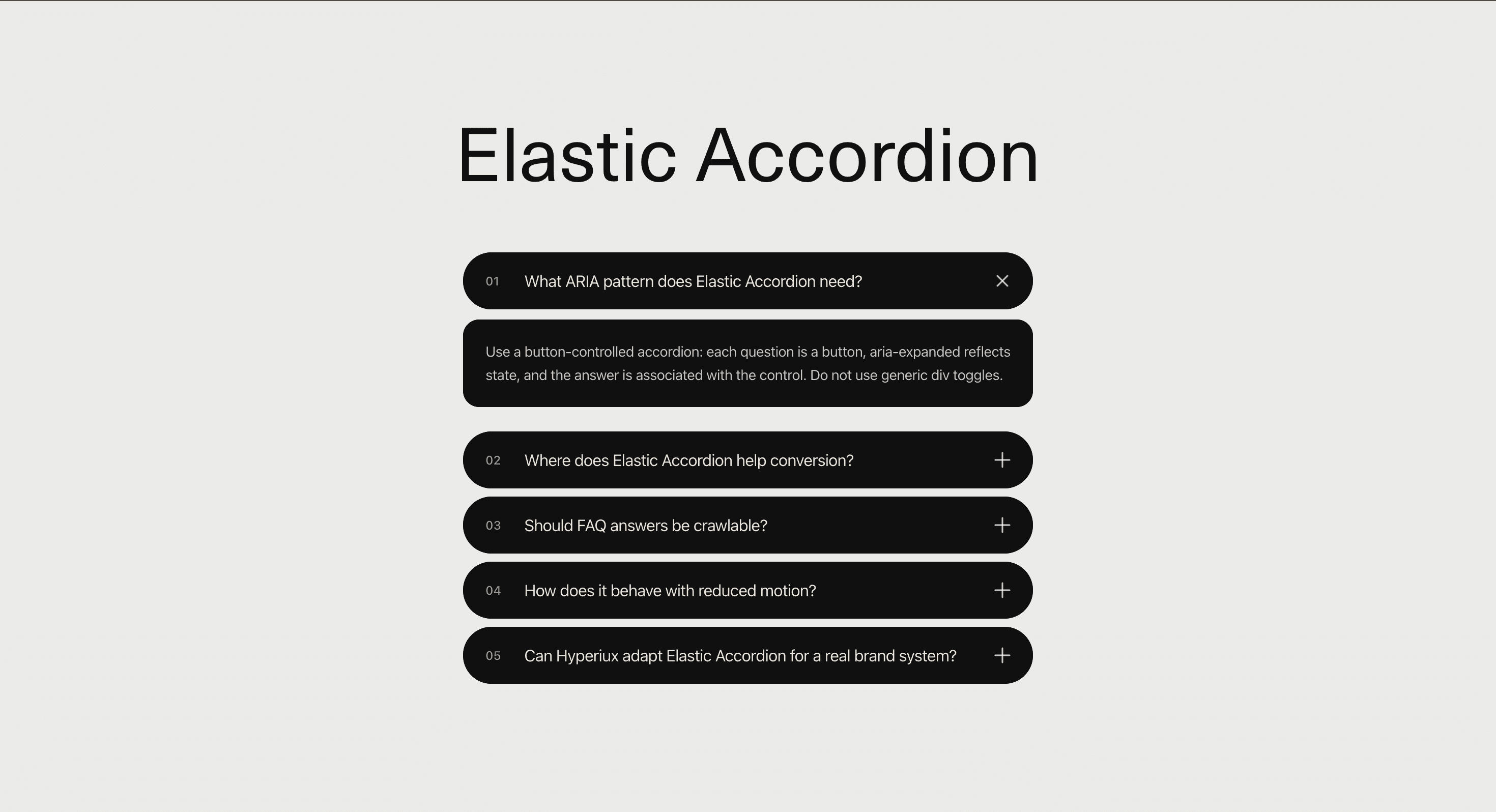
A button-controlled accordion component for FAQ sections, pricing objections, feature explanations, product proof, service pages, and help content where answers should expand cleanly without feeling stiff.
Published On: September 10, 2026
Last Updated: September 10, 2026
gsap
Overview
Elastic Accordion turns stacked questions into a compact interactive section.
Each row stays collapsed until selected. When opened, the answer panel expands with an elastic motion that feels responsive rather than mechanical. The interaction gives short explanations a better sense of weight while keeping the page easy to scan.
Use Elastic Accordion when a page needs to hold supporting information without overwhelming the layout. It works for FAQs, pricing questions, product objections, service explainers, feature details, onboarding notes, comparison pages, and conversion sections where visitors need quick access to answers.
The page job is clarity on demand. The accordion should help users open the answer they need, understand it quickly, and keep moving. The elastic motion should make the interaction feel polished, not turn every answer into a little trampoline routine.
Install Command
This is a Pro Effect.
You can preview it now. Upgrade to Pro for instant install access.
Usage Code
This is a Pro Effect.
You can preview it now. Upgrade to Pro for instant install access.
Component Code
This is a Pro Effect.
You can preview it now. Upgrade to Pro for instant install access.
Example Production Use Case
A pricing page can use Elastic Accordion below the plan cards to answer objections about licensing, updates, cancellation, support, refunds, team usage, and implementation fit. The section keeps the pricing area clean while still giving serious buyers the detail they need before conversion.
The outcome is lower friction. Visitors do not have to leave the page, open support, or scan a documentation section just to answer the question blocking the purchase.
A service page can use the same component to explain deliverables, timelines, ownership, collaboration style, and handoff expectations without crowding the main sales narrative.
Best Used For
• Pricing FAQs and purchase objections.
• Product pages where technical questions need compact answers.
• Service pages where buyers need detail without losing the main narrative.
• Comparison pages where objections and fit questions matter.
• Documentation summaries, onboarding guidance, and support content.
• Conversion sections where answers should stay close to the CTA.
Not For
Not for hiding essential information users must see before acting.
Not for long documentation, legal clauses, dense tables, product specs, or content that needs side-by-side comparison.
Not for pages where every section becomes an accordion because the layout has not made a decision. Collapsing everything is not information architecture. It is avoidance with rounded corners.
Performance Budget
Keep the accordion lightweight. Avoid measuring every panel repeatedly, avoid animating layout-heavy properties across many open items, and clean up resize listeners when used. For long FAQ sets, consider grouping, search, or pagination instead of rendering a massive animated stack.
Animate height, opacity, and transform with restraint. Elastic movement should feel responsive, not slow.
Accessibility and Mobile
Use button triggers, visible focus states, keyboard support, and correct expanded state. Keep the answer text in a logical reading order and ensure icons are decorative unless they communicate meaningful state.
On mobile, make rows easy to tap, keep answer width comfortable, and avoid tiny icons. For reduced motion, remove bounce, stretch, spring overshoot, and long panel travel. The answer should simply open.
Common Mistakes
• Using clickable divs instead of buttons.
• Hiding important conversion information inside collapsed panels.
• Writing answers that are too long.
• Making the elastic motion too bouncy.
• Forgetting keyboard and focus states.
• Breaking FAQ schema by marking up hidden or mismatched content.
• Letting panel height animation cause layout jank.
Changelog
v1.0.0
Sep 10, 2026Initial release
Props
| Prop | Type | Default | Description |
|---|---|---|---|
duration | number | 0.8 | Expansion animation duration in seconds. |
goo | number | 9 | Strength of the gooey connection between question and answer. |
stagger | number | 0.05 | Delay between answer line reveals in seconds. |
multiple | boolean | false | Allows multiple answers to remain open. |
startOpen | number | 0 | Initially open item index; -1 closes all items. |
bgColor | color | #ebebe9 | Background color. |
panelColor | color | #101010 | Question and answer panel color. |
textColor | color | #fffaf2 | Text and icon color; secondary elements use reduced opacity. |
Frequently Asked Questions
What is Elastic Accordion?
Elastic Accordion is a React component for expandable FAQ or detail rows with a soft elastic open and close motion.
When should I use Elastic Accordion?
Use it for FAQs, pricing objections, product questions, service explainers, onboarding notes, and compact support content where users need detail on demand.
Is Elastic Accordion accessible?
It can be, provided the implementation uses real button triggers, keyboard support, visible focus states, correct expanded state, and properly associated answer panels.
Should accordion answers be visible to search engines?
Yes. Important answer text should render as real HTML. Avoid storing meaningful FAQ content only inside decorative animation layers or client-only fragments.
Can Elastic Accordion support multiple open items?
Yes, depending on the implementation. Some accordions allow one item open at a time, while others allow multiple panels to remain expanded.
Is Elastic Accordion good for long documentation?
No. Use accordions for compact answers. Long documentation usually needs headings, anchors, navigation, search, or a dedicated page.
Request a Custom Creative Component Animation
Need a custom effect? Tell us what to create.

