Loading
Ring Carousel
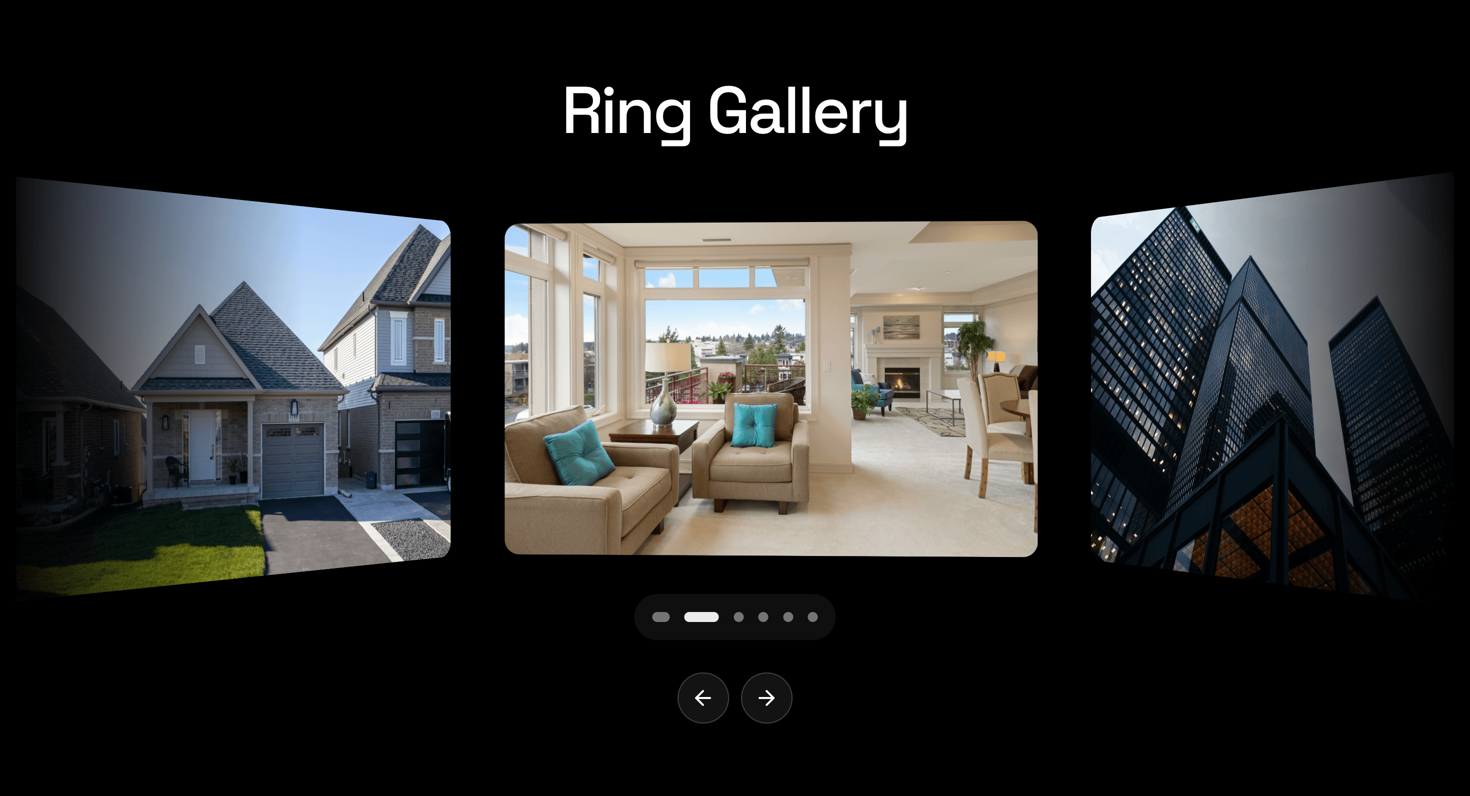
Arrange a small visual set around a circular focus point, keeping the active item prominent while the collection stays in view.
Published On: June 4, 2026
Last Updated: August 17, 2026
GSAPLucide-react
Overview
Ring Carousel turns a slide set into a circular gallery. The active image takes focus while the rest of the set stays in orbit.
Use Ring Carousel when a visual showcase should feel spatial but still controlled. It works for portfolios, campaign imagery, product moods, and curated galleries where the relationship between images matters. The page job is focus with context: the current item should lead, but the surrounding set should still feel present.
The production risk is orientation. Circular layouts can confuse users if the active slide, controls, and reading order are not obvious. The carousel needs visible navigation, a clear active state, and a flat fallback that preserves every item.
Install Command
This is a Pro Effect.
You can preview it now. Upgrade to Pro for instant install access.
Usage Code
This is a Pro Effect.
You can preview it now. Upgrade to Pro for instant install access.
Component Code
This is a Pro Effect.
You can preview it now. Upgrade to Pro for instant install access.
This is a Pro Effect.
You can preview it now. Upgrade to Pro for instant install access.
Example Production Use Case
A creative portfolio can use Ring Carousel to present six selected project images around a central focus. The outcome is context: visitors can browse one image at a time while still sensing the full collection.
Best Used For
- Curated visual galleries where a circular composition fits the art direction.
- Portfolio or campaign sections with a small number of equal-weight images.
- Pages where one active item should stay framed by the surrounding set.
Not For
Not for large archives, pricing, testimonials, dense text, or product sets that require side-by-side comparison.
Not for mobile-first pages unless the ring collapses into a simple swipeable or stacked layout.
Performance Budget
Keep the slide count controlled, pre-size images, animate transforms instead of layout, and avoid heavy blur or shadow effects across the full ring.
Accessibility and Mobile
Use real controls, keyboard support, visible focus states, and a logical slide order. On mobile, flatten the ring into a swipeable carousel or stacked gallery. Reduced-motion users should get the same images without circular motion.
Common Mistakes
- Making the circular layout the only way to understand the slide order.
- Hiding controls because the ring looks “obvious.”
- Using too many images until the carousel becomes a decorative wheel.
Changelog
v1.0.1
Jul 22, 2026Added reduced-motion support and fixed drag response being throttled along with momentum/inertia.
v1.0.0
Jun 4, 2026Initial release
Props
| Prop | Type | Default | Description |
|---|---|---|---|
snap | boolean | true | Snaps the ring to the nearest item after drag. |
autoPlay | boolean | true | Rotates the carousel automatically. |
pauseOnHover | boolean | true | Pauses autoplay while the carousel is hovered. |
showNavigation | boolean | true | Shows previous and next buttons. |
showDots | boolean | true | Shows pagination dots. |
cardSize | number | 1 | Multiplier applied to carousel card width and height. |
cardWidth | number | 720 | Carousel card width in pixels. |
cardHeight | number | 450 | Carousel card height in pixels. |
roundedness | number | 20 | Carousel card corner radius in pixels. |
Frequently Asked Questions
When should I use Ring Carousel?
Use it when a small visual set should feel spatial, circular, and curated rather than linear.
How many items work best?
A small set works best. Five to eight images usually keeps the ring readable; large archives should use a grid.
Should Ring Carousel support keyboard navigation?
Yes. Arrow keys, visible buttons, or clear tab/focus behavior should reach every slide predictably.
What should happen on mobile?
Use swipe controls, stacked images, or a simpler flat carousel. Do not force a crowded ring onto a narrow screen.
What should reduced motion do?
Remove circular rotation and show a static active slide, simple fade, or flat list.
Can Hyperiux adapt Ring Carousel for a real brand system?
Yes. A custom version should define ring geometry, image treatment, controls, accessibility behavior, mobile fallback, source handoff, and implementation notes.
Request a Custom Carousel Animation
Need a custom effect? Tell us what to create.


