Loading
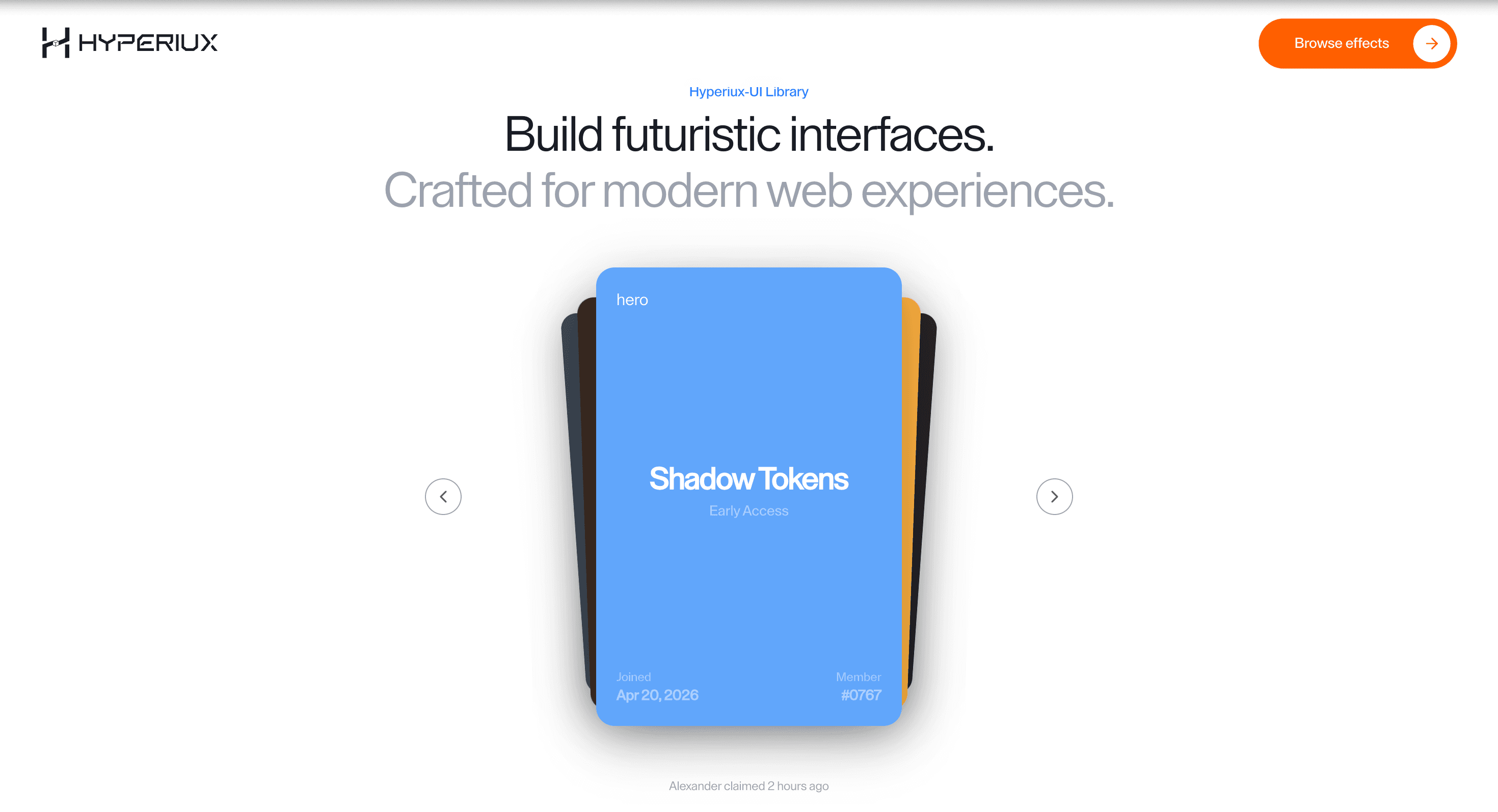
Depth Card Stack
A layered card stack component that adds shallow depth to service, feature, and proof card groups.
Published On: June 4, 2026
Last Updated: August 17, 2026
GSAP
Overview
Depth Card Stack adds motion to a component that already has a job: cards stack with shallow depth.
Use Depth Card Stack when a small group of service, proof, or feature cards should feel deliberately layered. The stack should clarify hierarchy while keeping every card readable as normal HTML.
The main risk is hiding the lower cards behind style. Depth should stay shallow, focus states must remain visible, and the section must collapse into a clean stack on mobile.
Install Command
This is a Pro Effect.
You can preview it now. Upgrade to Pro for instant install access.
Usage Code
This is a Pro Effect.
You can preview it now. Upgrade to Pro for instant install access.
Component Code
This is a Pro Effect.
You can preview it now. Upgrade to Pro for instant install access.
This is a Pro Effect.
You can preview it now. Upgrade to Pro for instant install access.
This is a Pro Effect.
You can preview it now. Upgrade to Pro for instant install access.
Example Production Use Case
A SaaS service page can use Depth Card Stack to group three or four proof cards into a layered sequence. The depth makes the group feel curated while every card heading, link, and description remains available.
Best Used For
- Service, feature, or proof groups where a small card set should feel layered and curated.
- Sections where every card still needs a real heading, copy, and link in document order.
- Feature or proof groups where layered depth improves hierarchy without hiding any card.
Not For
Not for long comparison sets, dense pricing matrices, or card groups where users need to scan every item quickly.
Performance Budget
Keep the card count small, animate transform and opacity rather than layout, and avoid re-rendering the entire stack when one card receives focus or hover.
Accessibility and Mobile
Cards need real headings and links in source order. On mobile, flatten depth into a simple vertical stack or swipe-free card group.
Common Mistakes
- Using depth to hide lower-priority cards.
- Making hover the only way to reveal card content.
- Letting stacked cards overlap focus rings or links.
Changelog
v1.0.1
Jul 30, 2026Added reduced-motion support.
v1.0.0
Jul 21, 2026Initial release
Props
| Prop | Type | Default | Description |
|---|---|---|---|
duration | number | 0.55 | Card navigation transition duration. |
mouseInteraction | boolean | true | Enables pointer tilt and texture reveal on the active card. |
lerp | number | 0.18 | Pointer-follow smoothing amount; higher values track faster. |
smoothness | number | 0.4 | Hover enter/leave smoothing duration for card tilt and texture reveal. |
Frequently Asked Questions
When should I use Depth Card Stack?
Use it when a service, feature, or proof group needs layered, shallow-depth browsing.
What accessibility details matter for Depth Card Stack?
Keep each card as normal HTML with a heading, readable copy, link or button where needed, and a visible focus state. Depth should never hide focus rings or make the keyboard order feel different from the DOM order.
How should Depth Card Stack behave on mobile?
Flatten the layout into a clean vertical card stack with shallow or no overlap. Touch users should be able to read and open every card without relying on hover or depth.
Can Depth Card Stack improve a proof section?
Yes, when a small set of service, feature, or proof cards needs stronger hierarchy. It hurts the section when depth hides content or slows scanning.
What should reduced motion do for Depth Card Stack?
Keep state changes visible and instant while removing decorative movement.
Request a Custom Carousel Animation
Need a custom effect? Tell us what to create.


