Loading
Spotlight Button
A cursor-reactive button component for hero CTAs, product actions, pricing sections, waitlist prompts, and premium landing pages where the primary action should feel lit, focused, and ready to press.
Published On: September 16, 2026
Last Updated: September 16, 2026
CSS
Overview
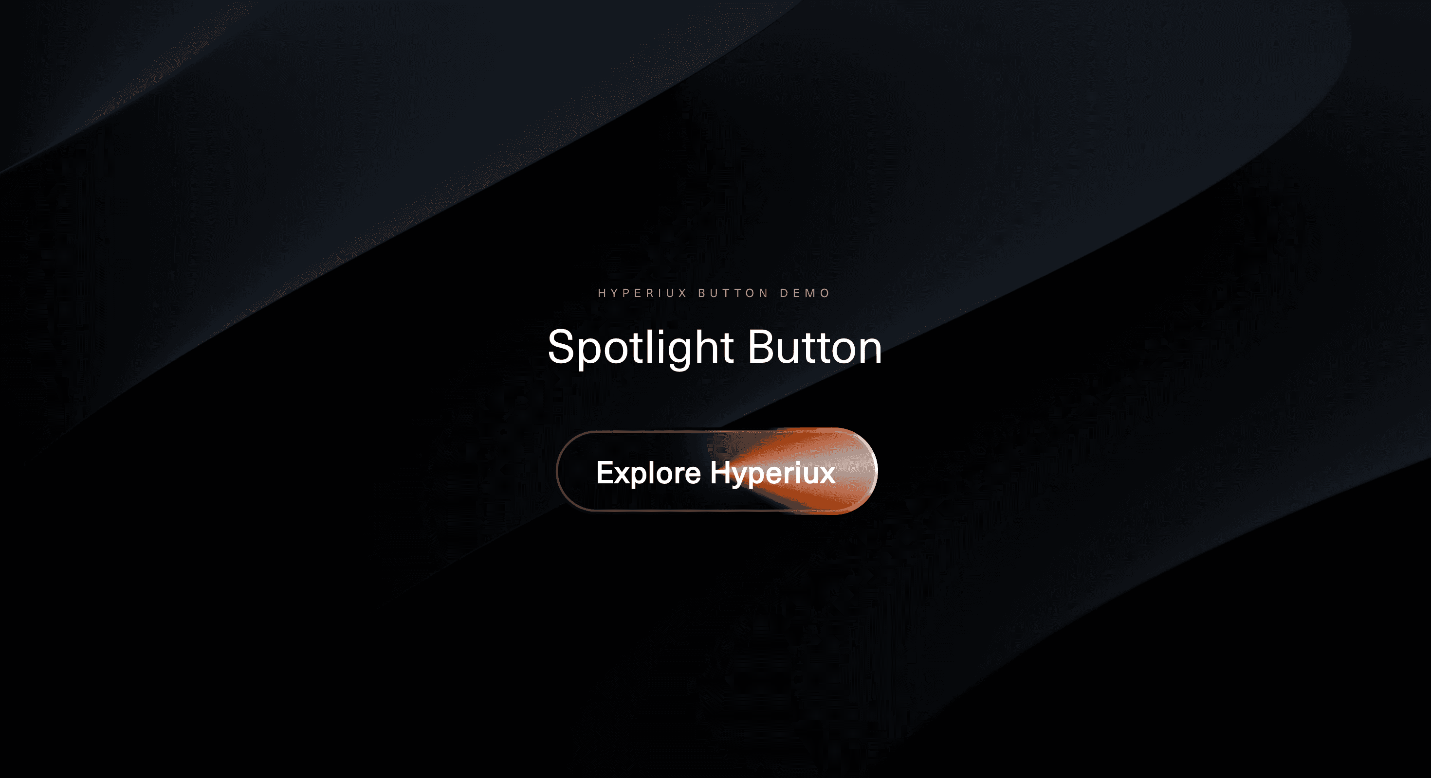
Spotlight Button turns a normal CTA into a focused interaction surface.
The button uses a moving highlight, soft glow, border illumination, and surface fill to create the feeling of light travelling across the action. The label remains readable while the spotlight treatment gives the button a stronger sense of depth and attention.
Use Spotlight Button when one action needs to feel more active than the rest of the interface. It works for SaaS hero sections, AI product launches, premium-access prompts, pricing CTAs, template purchases, booking actions, waitlist flows, and dark interface sections where light can create clear hierarchy.
The page job is attention direction. The button should feel like the obvious next action without becoming noisy. A good spotlight makes the CTA feel considered. A bad one makes the button look like it is being interrogated.
Install Command
This is a Pro Effect.
You can preview it now. Upgrade to Pro for instant install access.
Usage Code
This is a Pro Effect.
You can preview it now. Upgrade to Pro for instant install access.
Component Code
This is a Pro Effect.
You can preview it now. Upgrade to Pro for instant install access.
Example Production Use Case
A SaaS homepage can use Spotlight Button as the main hero CTA. The surrounding interface stays calm, while the primary action receives a focused light treatment that responds to attention and reinforces hierarchy.
The outcome is pull. The button feels more deliberate without needing extra arrows, badges, or loud supporting copy.
A product launch page can use the same component for early access, template previews, demo booking, or premium upgrades where the CTA needs a stronger visual finish but still has to feel trustworthy.
Best Used For
• Primary CTAs in hero sections.
• Pricing, upgrade, booking, and premium-access actions.
• SaaS, AI, developer-tool, and digital-product pages.
• Dark UI sections where light can create strong button separation.
• Product launches and waitlist flows where the CTA needs more presence.
Not For
Not for every button on the page.
Not for destructive actions, legal confirmations, dense dashboards, quiet navigation links, or form controls that need utility more than atmosphere.
Not for unclear CTA copy. A spotlight can draw attention to the button, but it cannot make “Submit” feel like a strategy.
Performance Budget
Keep the spotlight effect lightweight. Prefer CSS gradients, opacity, transform, and masks over heavy filters or constant JavaScript work. If pointer tracking is used, throttle updates or keep motion outside React state where possible.
Disable pointer-follow calculations when the button is offscreen, inactive, disabled, or on touch devices. The button should feel responsive, not like a tiny lighting engine with conversion goals.
Accessibility and Mobile
Use real button or anchor semantics, readable labels, visible focus states, sufficient contrast, and clear disabled or loading states. The spotlight should never reduce label clarity.
On touch devices, use a static highlight, pressed state, or simplified glow instead of cursor-led movement. For reduced motion, freeze the spotlight, remove sweeping light movement, and keep a static illuminated surface.
Common Mistakes
• Applying spotlight treatment to every CTA.
• Letting the glow reduce label readability.
• Using pointer-follow lighting without a mobile fallback.
• Forgetting keyboard focus states.
• Making the spotlight look like a loading state.
• Letting decorative layers block clicks.
• Using the effect to compensate for weak CTA hierarchy.
Changelog
v1.0.0
Sep 16, 2026Initial release
Props
| Prop | Type | Default | Description |
|---|---|---|---|
haloColor | string | #ff5f00 | Main color of the orbiting halo. |
haloCoreColor | string | #ff9253 | Bright core color on hover and keyboard focus. |
spotlightIntensity | number | 1 | Strength of the border spotlight and glow. |
orbitDuration | number | 3 | Seconds for one full orbit. |
settleDuration | number | 0.8 | Hover and focus transition duration in seconds. |
haloWidth | number | 5 | Width of each halo gradient segment as a percentage of the sweep. |
Frequently Asked Questions
What is Spotlight Button?
Spotlight Button is a React button component that adds a moving light, glow, or cursor-reactive highlight to a CTA surface.
When should I use Spotlight Button?
Use it for high-priority actions such as hero CTAs, pricing buttons, product launch actions, upgrade prompts, waitlist buttons, and booking CTAs.
Should every CTA use Spotlight Button?
No. Use it sparingly. Spotlight Button works best when one action needs to stand out from quieter secondary actions.
Does Spotlight Button need JavaScript?
The base visual treatment can be CSS-driven. Cursor-reactive spotlight movement usually needs client-side pointer handling in React.
Can Spotlight Button work as a link?
Yes. If the CTA navigates to another page, render it as an anchor. If it performs an action, render it as a button.
What should reduced motion do?
Reduced motion should remove cursor-follow movement, sweeping highlights, and animated glow travel. Use a static illuminated state instead.
Request a Custom Button Animation
Need a custom effect? Tell us what to create.


