Loading
Shiny Button
A glossy animated button component for hero CTAs, pricing actions, upgrade prompts, product launches, and conversion sections where the primary action needs a little more pull.
Published On: September 15, 2026
Last Updated: September 15, 2026
Overview
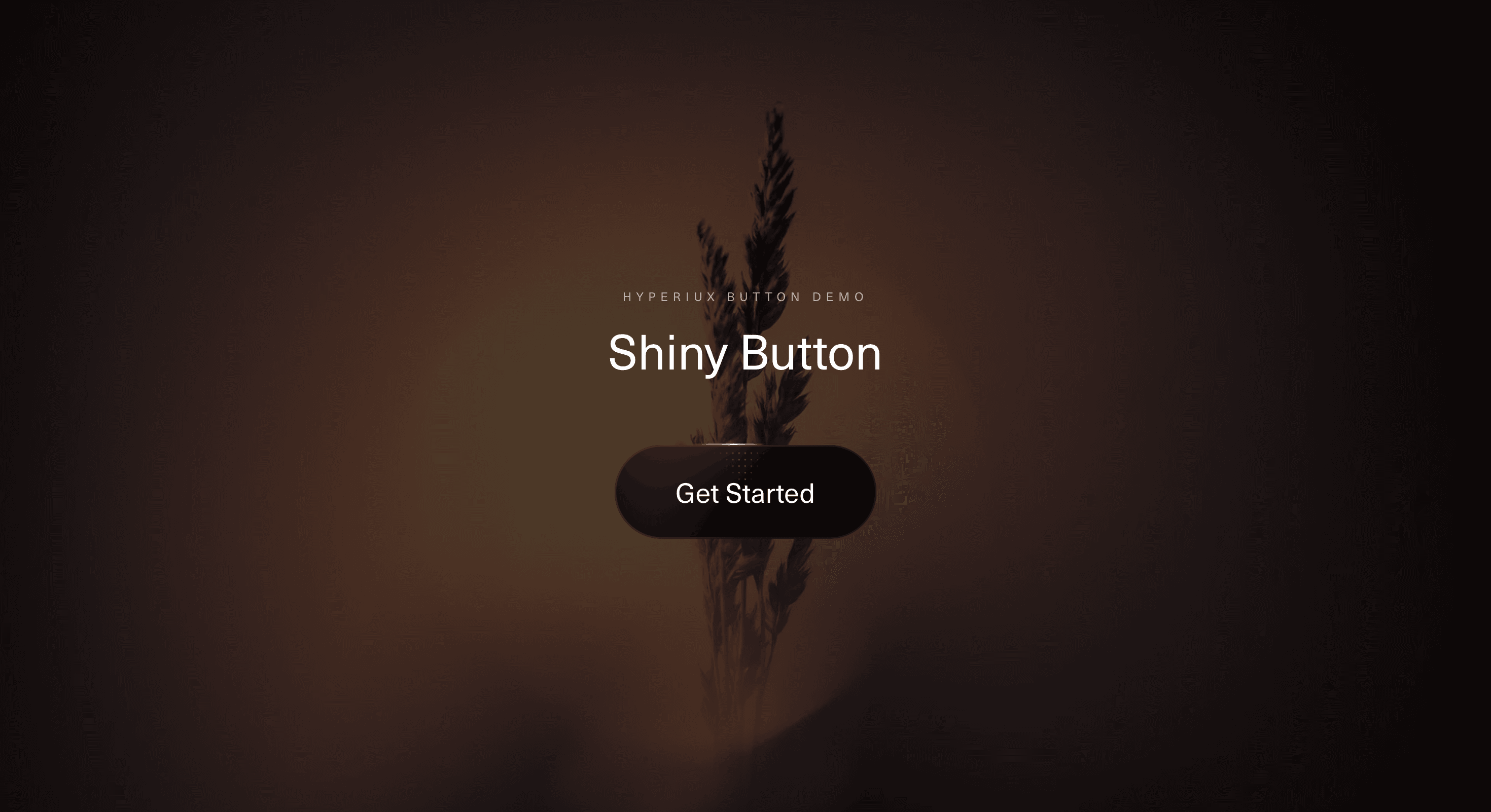
Shiny Button gives a standard CTA a controlled light pass.
The button uses glow, gradient movement, surface shine, and soft edge illumination to create a polished interaction state. The label remains stable while the visual surface moves around it, so the user still reads the action clearly.
Use Shiny Button when a page needs one CTA to feel more desirable than the surrounding interface. It works for SaaS pricing pages, account upgrade flows, premium-access prompts, product launches, checkout starts, waitlist buttons, and hero sections where the primary action needs a stronger visual cue.
The page job is conversion emphasis. The shine should make the button feel active and intentional. It should not make the user wonder whether the CTA is clickable, loading, disabled, or auditioning for a sci-fi dashboard.
Install Command
npx hyperiux add shiny-buttonUsage Code
page.jsx
import ShinyButton from "@/components/effects/shiny-button";

export default function Page() {
    return (
        <>
        <div className="h-screen w-screen flex items-center justify-center relative">
                  <ShinyButton/>
</div>
        </>

    );
}
Component Code
index.jsx
"use client";
import { useId, useSyncExternalStore } from "react";
const REDUCED_MOTION_QUERY = "(prefers-reduced-motion: reduce)";
function prefersReducedMotion() {
    if (typeof window === "undefined")
        return false;
    return window.matchMedia?.(REDUCED_MOTION_QUERY)?.matches ?? false;
}
function subscribeToReducedMotion(callback) {
    if (typeof window === "undefined")
        return () => { };
    const mediaQueryList = window.matchMedia(REDUCED_MOTION_QUERY);
    mediaQueryList.addEventListener("change", callback);
    return () => mediaQueryList.removeEventListener("change", callback);
}
function getServerReducedMotionSnapshot() {
    return false;
}
function usePrefersReducedMotion() {
    return useSyncExternalStore(subscribeToReducedMotion, prefersReducedMotion, getServerReducedMotionSnapshot);
}
export function ShinyButton({ label = "Get Started", onClick, className = "", fillColor = "#000000", labelColor = "#ffffff", accentColor = "#ff5f00", accentSoftColor = "#ff9253", sweepDuration = 3, easeDuration = 0.8, arcWidth = 5, cornerRadius = 32, showSpeckle = true, showSheen = true, speckleOpacity = 0.4, }) {
    const reducedMotion = usePrefersReducedMotion();
    const instanceId = useId().replace(/[^a-zA-Z0-9]/g, "");
    const scope = `gleam-edge-${instanceId}`;
    const css = `
    @property --gradient-angle-${instanceId} {
      syntax: "<angle>";
      initial-value: 0deg;
      inherits: false;
    }
    @property --gradient-angle-offset-${instanceId} {
      syntax: "<angle>";
      initial-value: 0deg;
      inherits: false;
    }
    @property --gradient-percent-${instanceId} {
      syntax: "<percentage>";
      initial-value: ${arcWidth}%;
      inherits: false;
    }
    @property --gradient-shine-${instanceId} {
      syntax: "<color>";
      initial-value: white;
      inherits: false;
    }

    .${scope} {
      --gleam-base: ${fillColor};
      --gleam-inset: #1a1818;
      --gleam-label: ${labelColor};
      --gleam-accent: ${accentColor};
      --gleam-accent-soft: ${accentSoftColor};
      --animation: gradient-angle-${instanceId} linear infinite;
      --duration: ${sweepDuration}s;
      --shadow-size: 2px;
      --transition: ${easeDuration}s cubic-bezier(0.25, 1, 0.5, 1);

      isolation: isolate;
      position: relative;
      overflow: hidden;
      cursor: pointer;
      outline-offset: 4px;
      padding: 1.25rem 2.5rem;
      font-size: 1.125rem;
      line-height: 1.2;
      font-weight: 500;
      border: 1px solid transparent;
      border-radius: ${cornerRadius}px;
      color: var(--gleam-label);
      background:
        linear-gradient(var(--gleam-base), var(--gleam-base)) padding-box,
        conic-gradient(
          from calc(var(--gradient-angle-${instanceId}) - var(--gradient-angle-offset-${instanceId})),
          transparent,
          var(--gleam-accent) var(--gradient-percent-${instanceId}),
          var(--gradient-shine-${instanceId}) calc(var(--gradient-percent-${instanceId}) * 2),
          var(--gleam-accent) calc(var(--gradient-percent-${instanceId}) * 3),
          transparent calc(var(--gradient-percent-${instanceId}) * 4)
        ) border-box;
      box-shadow: inset 0 0 0 1px var(--gleam-inset);
      transition: var(--transition);
      transition-property:
        --gradient-angle-offset-${instanceId},
        --gradient-percent-${instanceId},
        --gradient-shine-${instanceId};
    }

    .${scope}::before,
    .${scope}::after,
    .${scope} span::before {
      content: "";
      pointer-events: none;
      position: absolute;
      inset-inline-start: 50%;
      inset-block-start: 50%;
      translate: -50% -50%;
      z-index: -1;
    }

    .${scope}:active {
      translate: 0 1px;
    }

    .${scope}::before {
      --size: calc(100% - var(--shadow-size) * 3);
      --position: 2px;
      --space: calc(var(--position) * 2);
      width: var(--size);
      height: var(--size);
      background: radial-gradient(
        circle at var(--position) var(--position),
        white calc(var(--position) / 4),
        transparent 0
      ) padding-box;
      background-size: var(--space) var(--space);
      background-repeat: space;
      mask-image: conic-gradient(
        from calc(var(--gradient-angle-${instanceId}) + 45deg),
        black,
        transparent 10% 90%,
        black
      );
      border-radius: inherit;
      opacity: ${showSpeckle ? speckleOpacity : 0};
      z-index: -1;
    }

    .${scope}::after {
      --animation: shimmer-${instanceId} linear infinite;
      width: 100%;
      aspect-ratio: 1;
      background: linear-gradient(
        -50deg,
        transparent,
        var(--gleam-accent),
        transparent
      );
      mask-image: radial-gradient(circle at bottom, transparent 40%, black);
      opacity: ${showSheen ? 0.6 : 0};
    }

    .${scope} span {
      z-index: 1;
    }

    .${scope} span::before {
      --size: calc(100% + 1rem);
      width: var(--size);
      height: var(--size);
      box-shadow: inset 0 -1ex 2rem 4px var(--gleam-accent);
      opacity: 0;
      transition: opacity var(--transition);
      animation: calc(var(--duration) * 1.5) breathe-${instanceId} linear infinite;
    }

    .${scope},
    .${scope}::before,
    .${scope}::after {
      animation:
        var(--animation) var(--duration),
        var(--animation) calc(var(--duration) / 0.4) reverse paused;
      animation-composition: add;
    }

    .${scope}:is(:hover, :focus-visible) {
      --gradient-percent-${instanceId}: 20%;
      --gradient-angle-offset-${instanceId}: 95deg;
      --gradient-shine-${instanceId}: var(--gleam-accent-soft);
    }

    .${scope}:is(:hover, :focus-visible),
    .${scope}:is(:hover, :focus-visible)::before,
    .${scope}:is(:hover, :focus-visible)::after {
      animation-play-state: running;
    }

    .${scope}:is(:hover, :focus-visible) span::before {
      opacity: 1;
    }

    @keyframes gradient-angle-${instanceId} {
      to {
        --gradient-angle-${instanceId}: 360deg;
      }
    }

    @keyframes shimmer-${instanceId} {
      to {
        rotate: 360deg;
      }
    }

    @keyframes breathe-${instanceId} {
      from,
      to {
        scale: 1;
      }
      50% {
        scale: 1.2;
      }
    }

    @media (prefers-reduced-motion: reduce) {
      .${scope},
      .${scope}::before,
      .${scope}::after,
      .${scope} span::before {
        animation: none !important;
      }

      .${scope}:is(:hover, :focus-visible),
      .${scope}:is(:hover, :focus-visible)::before,
      .${scope}:is(:hover, :focus-visible)::after {
        animation-play-state: paused !important;
      }

      .${scope}:is(:hover, :focus-visible) span::before {
        opacity: 0;
      }

      .${scope} {
        transition: none;
      }
    }
  `;
    return (<>
      <style>{css}</style>
      <button type="button" className={`${scope} ${className}`} onClick={onClick} aria-label={label} data-reduced-motion={reducedMotion ? "true" : undefined}>
        <span>{label}</span>
      </button>
    </>);
}
export default ShinyButton;
Example Production Use Case
A SaaS pricing page can use Shiny Button on the paid-plan CTA. The surrounding interface stays calm, while the main action carries a subtle animated gloss that reinforces priority.
The outcome is hierarchy. Visitors understand which button matters most without the page needing another arrow, badge, or desperate “most popular” treatment trying to carry the whole conversion path.
A product launch page can use the same component for a waitlist or early-access CTA where the action should feel alive but still trustworthy.
Best Used For
• Primary CTAs in hero sections.
• Pricing, checkout, upgrade, and premium-access actions.
• Launch pages where one action needs stronger pull.
• SaaS, AI, developer-tool, and digital-product interfaces.
• Dark UI sections where glow and shine can create clean contrast.
Not For
Not for every button on the page.
Not for destructive actions, legal confirmations, subtle secondary links, dense dashboards, form controls, or navigation items that should stay quiet.
Not for CTAs with unclear copy. Shine can attract attention, but it cannot make “Click here” worth clicking.
Performance Budget
Keep the visual layer lightweight. Prefer CSS gradients, masks, opacity, and transform over heavy filters or constant JavaScript-driven animation. Avoid running pointer calculations when the button is offscreen or inactive.
Limit glow blur and animated texture density. A CTA should feel polished, not like it brought its own rendering engine to a checkout flow.
Accessibility and Mobile
Use real button or anchor semantics, readable labels, visible focus states, and sufficient contrast. The shine should never reduce label clarity.
On touch devices, use a stable active or hover-safe visual state instead of relying on cursor position. For reduced motion, freeze the shine, remove continuous movement, or show a static polished surface.
Common Mistakes
• Applying shiny treatment to every CTA.
• Letting the animated surface reduce label readability.
• Using divs instead of real buttons or anchors.
• Forgetting focus-visible states.
• Making the shine look like a loading indicator.
• Running pointer-driven animation on touch devices without fallback.
• Styling a weak CTA instead of improving the action copy.
Changelog
v1.0.0
Sep 15, 2026Initial release
Props
| Prop | Type | Default | Description |
|---|---|---|---|
label | string | Get Started | Button label text. |
fillColor | color | #000000 | Button fill colour inside the animated border. |
labelColor | color | #ffffff | Label colour. |
accentColor | color | #ff5f00 | Colour of the rotating border arc, inner shimmer, and hover glow. |
accentSoftColor | color | #ff9253 | Shine colour the border eases into while hovered. |
sweepDuration | number | 3 | Seconds for one full rotation of the border gradient. |
easeDuration | number | 0.8 | Seconds for the hover ease into the wider, brighter border. |
arcWidth | number | 5 | Resting width of the bright border arc, as a percentage. |
cornerRadius | number | 32 | Corner radius in pixels; 32 and above render as a full pill at the default height. |
showSpeckle | boolean | true | Shows the masked dot pattern layer. |
showSheen | boolean | true | Shows the rotating inner sheen. |
speckleOpacity | number | 0.4 | Strength of the dot pattern layer. |
Frequently Asked Questions
What is Shiny Button?
Shiny Button is a React button component that adds a glossy animated shine, glow, or light-pass treatment to a CTA.
When should I use Shiny Button?
Use it for primary actions that deserve extra visual emphasis, such as pricing CTAs, upgrade buttons, product launch actions, checkout starts, and premium-access prompts.
Should every button use Shiny Button?
No. Use it on one or two high-priority actions. Too many shiny buttons weaken hierarchy and make the page feel noisy.
Does Shiny Button work with links?
Yes. If the action navigates to another page, render it as an anchor. If it performs an action, render it as a button.
How do I keep Shiny Button accessible?
Use semantic elements, readable labels, visible focus styles, sufficient contrast, and decorative shine layers that do not block interaction or duplicate text.
Request a Custom Button Animation
Request a Custom Button Animation


