Loading
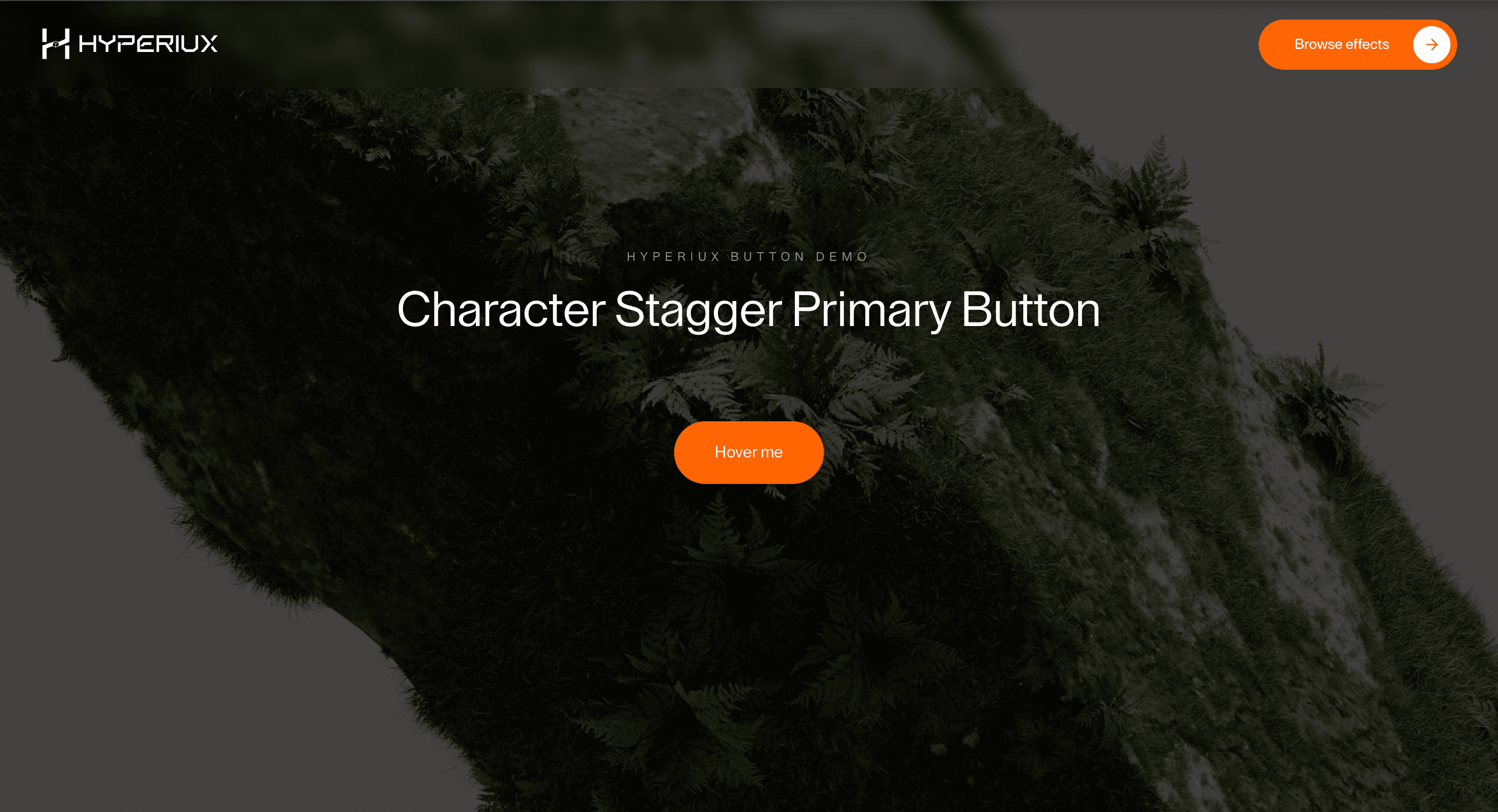
Character Stagger Primary Button
A primary CTA button with controlled character-stagger motion for hero sections, launch pages, and conversion-focused actions.
Published On: June 4, 2026
Last Updated: August 17, 2026
Lucide-react
Overview
Character Stagger Primary Button gives a button or link a small, useful moment of feedback: a primary CTA gets a controlled typographic lift.
Use it where a CTA needs to feel responsive and intentional, not theatrical. A button should confirm action, state, or direction; it should not become a tiny stage play that delays the click.
The risk in production is keeping the markup honest. Use genuine button and anchor elements, preserve focus, fire instantly, and make loading and disabled states obvious. The animation decorates the action; it is never the action.
Install Command
This is a Pro Effect.
You can preview it now. Upgrade to Pro for instant install access.
Usage Code
This is a Pro Effect.
You can preview it now. Upgrade to Pro for instant install access.
Component Code
This is a Pro Effect.
You can preview it now. Upgrade to Pro for instant install access.
Example Production Use Case
Use this as button-interaction implementation guidance. Verify the shipped element semantics, anchor/button mode, disabled and loading states, focus-visible behavior, keyboard activation, and reduced-motion handling before relying on exact props, defaults, imports, or installation steps.
Best Used For
- Hero CTAs where the primary action needs a polished but immediate response.
- Launch pages that want typographic craft without making conversion wait.
- Character Stagger Primary Button adds feedback to an action without weakening semantics, focus, or activation speed.
Not For
Not for destructive actions, unclear states, or places where animation hides the label or delays activation.
Performance Budget
Keep feedback fast, avoid layout-triggering letter movement, and preserve instant activation.
Accessibility and Mobile
Use real buttons or anchors, visible focus-visible styles, and clear loading/disabled states. Touch targets should stay large enough on mobile.
Common Mistakes
- Building Character Stagger Primary Button with divs instead of real buttons or links.
- Hiding the label during hover.
- Forgetting loading and disabled states.
Changelog
v1.1.0
Jul 21, 2026Added prefers-reduced-motion support: the hover character-stagger animation is skipped when the user has reduced motion enabled
v1.0.0
Jun 4, 2026Initial release
Props
| Prop | Type | Default | Description |
|---|---|---|---|
btnText | string | Hover me | Button label text. |
staggerStep | number | 0.01 | Delay between each character's hover motion. |
hoverColor | color | #ffffff | Text color while hovered. |
showArrow | boolean | false | Shows the optional arrow icon. |
Frequently Asked Questions
When should I use the Character Stagger Primary Button?
Use it when a hero CTA needs a controlled typographic lift — without delaying the action.
Should Character Stagger Primary Button use a real button or link?
Yes. Use `<button>` for actions and `<a>` for navigation.
How should Character Stagger Primary Button handle focus?
Use visible focus-visible styles and support keyboard activation.
How should loading states work with Character Stagger Primary Button?
Loading should be visually clear and programmatically communicated without hiding the label.
What should reduced motion do for Character Stagger Primary Button?
Remove long staggers, scrambles, and looping emphasis while keeping instant state feedback.
Request a Custom Button Animation
Need a custom effect? Tell us what to create.


